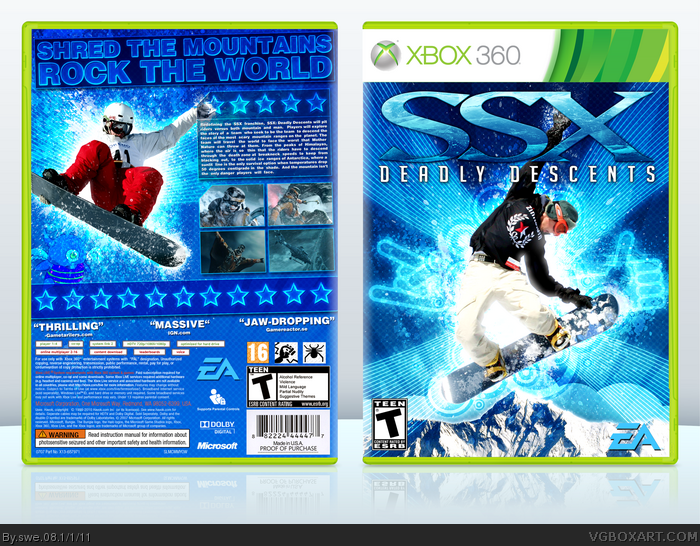
I know that this box doesn't represent the new modern and hardcore style the series has taken. But hopefully, EA will change it back so it'll be like SSX: Tricky (one of my all time favourites).
Anyway, I hope you like the box. View in full size. (Here's a bigger version. link )
Very nice. Reminds me of Tricky. SSX is pretty much my favorite sports game series ever, and while SSX 3 was the best, as far as I'm concerned, Tricky was amazing beyond measure, and this really captures the feeling that game had. Nice work.
#5, Same here. SSX 3 was amazing. Great soundtrack and everything. SSX Tricky was awesome. I want them to port it to 360 and PS3. This new one looks too serious and like their trying to make it more realistic. I hope they keep it like the 3rd and 2nd one.
I didn't even realize this was an actual game... I thought you had made up the title. Just watched the trailer. It looks more like Modern Warfare 2 than SSX... and reminds me more of SSX On Tour than SSX 3 or Tricky. So I suppose your box could be considered more hopeful optimism than a true representation of the game. Either way, I approve. Worried about the game, though. SSX hasn't been fun since 3, and On Tour and Blur took it in horrible directions. Hopefully if they ruin it Nintendo will at least bring back 1080 in a great form for the Wii.
Captures the more light-hearted feel of previous entries rather than the actual new game itself, which is perfectly fine like I said before. Awesome colors and overall style.
I'm waiting on the announcement of guns and auto-regenerating health for this, it'll be great.
I agree with #8, looks great. If you took away the "Deadly Descents" part of the logo I think you'd have a winner, 'cause right now it doesn't look too "deadly." :P
This is actually a really nice design! I love the way you managed to use the brushes, the effects and also the color scheme; altough for some reason the logo don't seem to me to fit quite as good as it should.
 SSX: Deadly Descents Box Cover Comments
I know that this box doesn't represent the new modern and hardcore style the series has taken. But hopefully, EA will change it back so it'll be like SSX: Tricky (one of my all time favourites).
Anyway, I hope you like the box. View in full size. (Here's a bigger version. link )
Credits to Scorpion Soldier for templete.
[ Reply ]
So clean and the colours are lovely.
[ Reply ]
Very Nice. Cool Blue is the best colors on game covers.
[ Reply ]
#3, #2, thanks!
[ Reply ]
Very nice. Reminds me of Tricky. SSX is pretty much my favorite sports game series ever, and while SSX 3 was the best, as far as I'm concerned, Tricky was amazing beyond measure, and this really captures the feeling that game had. Nice work.
[ Reply ]
#5, Same here. SSX 3 was amazing. Great soundtrack and everything. SSX Tricky was awesome. I want them to port it to 360 and PS3. This new one looks too serious and like their trying to make it more realistic. I hope they keep it like the 3rd and 2nd one.
[ Reply ]
I didn't even realize this was an actual game... I thought you had made up the title. Just watched the trailer. It looks more like Modern Warfare 2 than SSX... and reminds me more of SSX On Tour than SSX 3 or Tricky. So I suppose your box could be considered more hopeful optimism than a true representation of the game. Either way, I approve. Worried about the game, though. SSX hasn't been fun since 3, and On Tour and Blur took it in horrible directions. Hopefully if they ruin it Nintendo will at least bring back 1080 in a great form for the Wii.
[ Reply ]
Captures the more light-hearted feel of previous entries rather than the actual new game itself, which is perfectly fine like I said before. Awesome colors and overall style.
I'm waiting on the announcement of guns and auto-regenerating health for this, it'll be great.
[ Reply ]
#7, Exactly. SSX needs to get back on track.
[ Reply ]
I agree with #8, looks great. If you took away the "Deadly Descents" part of the logo I think you'd have a winner, 'cause right now it doesn't look too "deadly." :P
[ Reply ]
I love everything about this box. o.o
[ Reply ]
Very clean... I love it.
[ Reply ]
Thanks guys!
[ Reply ]
Great job! :D
[ Reply ]
This is actually a really nice design! I love the way you managed to use the brushes, the effects and also the color scheme; altough for some reason the logo don't seem to me to fit quite as good as it should.
[ Reply ]
The colors and effects are really nice.
[ Reply ]
Awesome Effects!
[ Reply ]
Real nice design, I'd like to see the tutorial you used.
[ Reply ]
Why is this not HoF? Man, swe_08 you're one of the most underrated boxartists on this site.
[ Reply ]
#19, Thanks man!
#18, I think it was an effect from : link
[ Reply ]
Congrats on the Hall! *claps*
[ Reply ]
I could have swore I faved this before....
Awesome job dude, this is fantastic.
[ Reply ]
Thanks for the hall!
[ Reply ]
Wow, I really thought I fav'd this.
[ Reply ]