[QUICK CONVO]
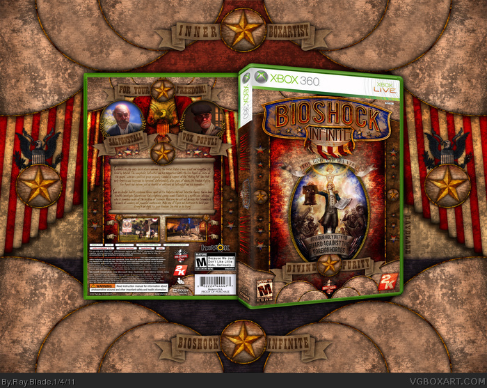
Okay, first off, I would like to say that making this box has been the best experience I have had out of all my others. For some reason, I was just spilling over the brim with inspiration in the past month and when I saw the Trailer and 10 Minute Gameplay videos for Bioshock Infinite, I was completely in love with the concept of the new game. As usual, I started working on this just out of random fun, and it soon turned into cover artwork. :P Conception story aside, this box is probably the start of something new for me when it comes to artwork on a whole.
[Insert second story here about professional graphic designer criticizing me for not using 100% original art]
From this point on, I'd like to incorporate more original art into my designs, as I think it's very impressive, but also very fun to find new challenges when designing. I'm not so sure if everyone here has been there, but as an artist I actually hit an invisible wall. You know the one where you disappoint yourself with all of your designs? [Begin Hiatus!] But I learned something new by hitting it, and that in-turn has matured me.
[THE BOX]
The box in it's entirety was created using about 90% original artwork, which includes textures, shapes, patterns, and the like. The few images I did take from other sources (primarily google xD) are quite heavily edited too. Unfortunately I had to resize this down to 65% of the original. :/ (If possible I'll upload a full sized PNG of the box under the printable section)
As there isn't much concept artwork for the game I kind of had to use just what was available, which kind of irked me because some of the art here was already incorporated into other boxes, but I think I've bent the approach enough to say it's original. Everyone's not going to like this, but I hope everyone can appreciate the effort I've put in!
[SPECIAL THANKS]
I'd like to thank EVERYONE who posted and looked at the WIP thread! You guys are great and very helpful, as always! YoshiStar, for being awesome, and setting a pace for original artwork designs, and all of my family, friends, and fans, here and abroad! Thanks everyone, and enjoy!
Really great job on this!
But I agree with Jevangod about the presentation, and -seems to me- the perspective of the spine makes it look kinda too fat.
+Fav
Simply amazing. Attention to detail is crazy and very fitting for this upcoming (and very awesome) game.
However, I do agree with few people above about the presentation being a bit too much maybe...
I would love to see a printable for highest res image.
All in all, great job & hope this gets you a Masterworks!
A really good job, one thing I noticed, it looks odd when the front ESRB label is grungy and the back isn't, and the spine is off, but those are minor.
Wow! Thank you guys! :) and I've gotta say, I myself think the presentation is a bit distracting too. :P but then again, that's my style I suppose, I seem to get that on 90% of my boxes. xD
Oh and I'm so sorry I forgot to mention earlier! The bottom back box info is a variant of Scorpion Soldiers, I used his template and changed it a tad. :) Thanks Scorpion Soldier!
Thank you everyone for the comments and crits!
#16, Yeah, I was thinking that too, but for the sake of practicality, I left the back one in it's original state. :p and I'll be working on a printable soon, although I have this image, (box + pres) in a much higher res.
xD thanks for the support guys, and SC you really don't have to. :P
Haha I'm amazed to see the way some of the distinguished artists of the site are reacting to the design! :P
Finalfantaseer22 said it was weird! xD and Jevangod said the presentation ruins the box xD haha post some crits guys! Criticism is the path to perfection!
This is incredible, one of the best custom designs I've seen on the site, and definitely my favorite 360 box. All of the detail you put into this really shows, and it's just perfect. I don't have a problem with the presentation either, it doesn't distract at all to me.
I agree with Jev, the presentation is overkill. The star symbol appears 3 times in the box itself, and then you have it included in the presentation 4 more times.
In terms of the actual box, I think everything is fantastic except the spine. Having the Bioshock Infinite logo sandwiched between more Bioshock Infinite text doesn't make sense. Pick one or the other.
:) thanks for the crit hesit8, and I agree about the spine! Perhaps I'll change it in the printable.
And I know people are having mixed feelings about the presentation, but I really like the way it came out as a piece aside from the box. Together with the box I think it accentuates the design with it's symmetry. In comparison to the architecture of the box itself, it's actually quite simply made. It looks complex and busy I agree, but I really don't see how it takes away from the box or is that distracting... While the presentation is here in the picture, it wouldn't exist if this were on a GameStop shelf. I dunno, but it's a matter of design taste I suppose. But thank you for the Hall, critiques and compliments guys! :)
This came along nicely in the WIP thread, your work with textures is top quality and the patriotic colors (especially the front) look great. I'd prefer if the developer and ESRB logos weren't blended with the textures and colors, but that's a personal nitpick. Although the ESRB's dimensions are a bit stretched.
I agree with the others that the presentation is a bit distracting, but the design itself is just spectacular on so many levels. The style is amazing, and you've managed to capture the game in so few key images and lines. Very nice work, you do Bioshock proud.
Saw this through the WIP and it's pretty impressive, boxes these days don't impress me much but this is pretty good. My only complaints are the icons on the front, I don't like them blending in like that, and not a problem with the box but the 3D on the spine looks bad. Also I agree that the presentation is a bit much, if only because of the repeating graphics.
 BioShock Infinite Box Cover Comments
[QUICK CONVO]
Okay, first off, I would like to say that making this box has been the best experience I have had out of all my others. For some reason, I was just spilling over the brim with inspiration in the past month and when I saw the Trailer and 10 Minute Gameplay videos for Bioshock Infinite, I was completely in love with the concept of the new game. As usual, I started working on this just out of random fun, and it soon turned into cover artwork. :P Conception story aside, this box is probably the start of something new for me when it comes to artwork on a whole.
[Insert second story here about professional graphic designer criticizing me for not using 100% original art]
From this point on, I'd like to incorporate more original art into my designs, as I think it's very impressive, but also very fun to find new challenges when designing. I'm not so sure if everyone here has been there, but as an artist I actually hit an invisible wall. You know the one where you disappoint yourself with all of your designs? [Begin Hiatus!] But I learned something new by hitting it, and that in-turn has matured me.
[THE BOX]
The box in it's entirety was created using about 90% original artwork, which includes textures, shapes, patterns, and the like. The few images I did take from other sources (primarily google xD) are quite heavily edited too. Unfortunately I had to resize this down to 65% of the original. :/ (If possible I'll upload a full sized PNG of the box under the printable section)
As there isn't much concept artwork for the game I kind of had to use just what was available, which kind of irked me because some of the art here was already incorporated into other boxes, but I think I've bent the approach enough to say it's original. Everyone's not going to like this, but I hope everyone can appreciate the effort I've put in!
[SPECIAL THANKS]
I'd like to thank EVERYONE who posted and looked at the WIP thread! You guys are great and very helpful, as always! YoshiStar, for being awesome, and setting a pace for original artwork designs, and all of my family, friends, and fans, here and abroad! Thanks everyone, and enjoy!
[ Reply ]
wow.
[ Reply ]
Literally amazing.
[ Reply ]
Just pure awesomeness. If this doesnt get masterworks I will shit my pants.
[ Reply ]
this is so weird!
[ Reply ]
Fantastic work.
[ Reply ]
Probably my favorite 360 box on the site. Its just so, awesome.
[ Reply ]
Masterworks!
[ Reply ]
Absolutely phenomenal. This is probably one of my favorite boxes on the site. Fav + author fav.
[ Reply ]
This box is fantastic, I don't really know what's left to say...
(The presentation is a bit to detailed and big for my taste, though)
[ Reply ]
Yea. The box is nice, but the presentation ruins it.
[ Reply ]
Love <3
[ Reply ]
#11, not necessarily. I think the presentation suits quite well, if a little distracting.
Very nice work.
[ Reply ]
Really great job on this!
But I agree with Jevangod about the presentation, and -seems to me- the perspective of the spine makes it look kinda too fat.
+Fav
[ Reply ]
Simply amazing. Attention to detail is crazy and very fitting for this upcoming (and very awesome) game.
However, I do agree with few people above about the presentation being a bit too much maybe...
I would love to see a printable for highest res image.
All in all, great job & hope this gets you a Masterworks!
[ Reply ]
A really good job, one thing I noticed, it looks odd when the front ESRB label is grungy and the back isn't, and the spine is off, but those are minor.
[ Reply ]
Do you have a printable?
[ Reply ]
Wow! Thank you guys! :) and I've gotta say, I myself think the presentation is a bit distracting too. :P but then again, that's my style I suppose, I seem to get that on 90% of my boxes. xD
Oh and I'm so sorry I forgot to mention earlier! The bottom back box info is a variant of Scorpion Soldiers, I used his template and changed it a tad. :) Thanks Scorpion Soldier!
Thank you everyone for the comments and crits!
[ Reply ]
#16, Yeah, I was thinking that too, but for the sake of practicality, I left the back one in it's original state. :p and I'll be working on a printable soon, although I have this image, (box + pres) in a much higher res.
[ Reply ]
This better get Masterworks. I'm promoting this just in case.
[ Reply ]
xD thanks for the support guys, and SC you really don't have to. :P
Haha I'm amazed to see the way some of the distinguished artists of the site are reacting to the design! :P
Finalfantaseer22 said it was weird! xD and Jevangod said the presentation ruins the box xD haha post some crits guys! Criticism is the path to perfection!
[ Reply ]
I'm not a big fan of the old scroll, it makes the depth in the back llok weird. I'd rather see an old paper instead.
But this box should get MW!
[ Reply ]
*look
[ Reply ]
This is incredible, one of the best custom designs I've seen on the site, and definitely my favorite 360 box. All of the detail you put into this really shows, and it's just perfect. I don't have a problem with the presentation either, it doesn't distract at all to me.
[ Reply ]
I agree with Jev, the presentation is overkill. The star symbol appears 3 times in the box itself, and then you have it included in the presentation 4 more times.
In terms of the actual box, I think everything is fantastic except the spine. Having the Bioshock Infinite logo sandwiched between more Bioshock Infinite text doesn't make sense. Pick one or the other.
[ Reply ]
And btw, in thumbnail view the portrait on the front looks like a skull. Pretty wicked.
[ Reply ]
:) thanks for the crit hesit8, and I agree about the spine! Perhaps I'll change it in the printable.
And I know people are having mixed feelings about the presentation, but I really like the way it came out as a piece aside from the box. Together with the box I think it accentuates the design with it's symmetry. In comparison to the architecture of the box itself, it's actually quite simply made. It looks complex and busy I agree, but I really don't see how it takes away from the box or is that distracting... While the presentation is here in the picture, it wouldn't exist if this were on a GameStop shelf. I dunno, but it's a matter of design taste I suppose. But thank you for the Hall, critiques and compliments guys! :)
[ Reply ]
This came along nicely in the WIP thread, your work with textures is top quality and the patriotic colors (especially the front) look great. I'd prefer if the developer and ESRB logos weren't blended with the textures and colors, but that's a personal nitpick. Although the ESRB's dimensions are a bit stretched.
[ Reply ]
I agree with the others that the presentation is a bit distracting, but the design itself is just spectacular on so many levels. The style is amazing, and you've managed to capture the game in so few key images and lines. Very nice work, you do Bioshock proud.
[ Reply ]
Wow thanks sd1833 & Koop. :) I tried. :P
[ Reply ]
Congratulations
[ Reply ]
epic win!
[ Reply ]
Saw this through the WIP and it's pretty impressive, boxes these days don't impress me much but this is pretty good. My only complaints are the icons on the front, I don't like them blending in like that, and not a problem with the box but the 3D on the spine looks bad. Also I agree that the presentation is a bit much, if only because of the repeating graphics.
[ Reply ]
Incredible...I've already said everything I needed to say, so there isn't much left to do other than fave :P
[ Reply ]
Congrats on Hall.
[ Reply ]
Thank you guys. :)
[ Reply ]
I see this box getting MasterWorks no problem :)
[ Reply ]
MW, now
[ Reply ]
xD The 50th fav on this box gave me 666 total. Thanks for the support everyone!
[ Reply ]
wow. really extraordinary,
a printable please!
[ Reply ]