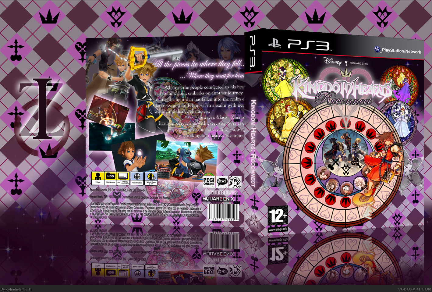
So my even later latest box, and my first 2011 box.The pattern with the symbols was a mimic of the original that i composed completely from scratch which took me ages. The biggest platform on the front was made entirely from scratch as well and took even longer. I edited the chain of memories Sora, and made his eyes closed instead of open and edited his right hand to make it rest on his leg rather than hold cards and the last thing i completely recomposed was the logo. It took me forever. First i had to find kingdom hearts font but i couldnt find the birth by sleep one so i had to make do with what i could and make it look as much as BBS and 358/2 days. Then the heart was created from so many of the hearts and improvised where the words 'Kingdom Hearts' are. And that is pretty much it. I hope you all enjoy.
I know nothing about Kingdom Hearts in terms of storyline, so this is strictly about the box itself, and its own qualities, rather than how well it fits the game. For one thing, the presentation ruins it. Even if it was the most amazing box on the site, that presentation background is far too complex and it completely takes away from the box itself. As for the back, the tagline is difficult to read, given both that you have a difficult to read script font used for it, and you've given it a very heavy white shadow, also making it difficult to read. The descriptive text is also difficult to read over such a complex background, and should be given some sort of text box or at the very least a less complex background to make it stand out more. As for the front, I can't really comment. I'm assuming it has something to do with the game itself, that I need to be familiar with. Other than that, the logo is pretty difficult to read, and the contrast on it should be higher. Also, make sure you center your box in your presentation next time. It looks more professional.
Pretty decent box. The front is pretty good but I don't like the back much. For example, screenshots could use some borders and tagline could be more visible. Presentation is also distracting.
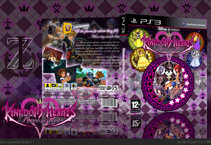
Okay, pardon the pun but i've had a change of heart. This final update doesnt have the original platform thing i had on the front. I created a new one that would have a little more meaning to the game, just sporting a different character on it. The back is unchanged, but i did what i thought impossible for ages. The logo style i wanted was that of BBS logo, but in order to do that i had to cut out the KH wordmark which was fairly eaten at by the words 358/2 days and Birth By Sleep, and reconstruct the whole thing. Thank goodness for my drawing tablet. Enjoy, i really feel like this is a great accomplishment.
 Kingdom Hearts Reconnect Box Cover Comments
So my even later latest box, and my first 2011 box.The pattern with the symbols was a mimic of the original that i composed completely from scratch which took me ages. The biggest platform on the front was made entirely from scratch as well and took even longer. I edited the chain of memories Sora, and made his eyes closed instead of open and edited his right hand to make it rest on his leg rather than hold cards and the last thing i completely recomposed was the logo. It took me forever. First i had to find kingdom hearts font but i couldnt find the birth by sleep one so i had to make do with what i could and make it look as much as BBS and 358/2 days. Then the heart was created from so many of the hearts and improvised where the words 'Kingdom Hearts' are. And that is pretty much it. I hope you all enjoy.
[ Reply ]
By the way(for some reason my browser won't let me edit comments) Thanks to RoarShark, Mariolee, and Spiner in the WIP forums
[ Reply ]
#2, Comments are able to be edited any more on the site.
[ Reply ]
I know nothing about Kingdom Hearts in terms of storyline, so this is strictly about the box itself, and its own qualities, rather than how well it fits the game. For one thing, the presentation ruins it. Even if it was the most amazing box on the site, that presentation background is far too complex and it completely takes away from the box itself. As for the back, the tagline is difficult to read, given both that you have a difficult to read script font used for it, and you've given it a very heavy white shadow, also making it difficult to read. The descriptive text is also difficult to read over such a complex background, and should be given some sort of text box or at the very least a less complex background to make it stand out more. As for the front, I can't really comment. I'm assuming it has something to do with the game itself, that I need to be familiar with. Other than that, the logo is pretty difficult to read, and the contrast on it should be higher. Also, make sure you center your box in your presentation next time. It looks more professional.
[ Reply ]
#4 is that better? I didnt do anything for the logo, because i wanted it to be light and its really hard to make it darker.
[ Reply ]
Pretty decent box. The front is pretty good but I don't like the back much. For example, screenshots could use some borders and tagline could be more visible. Presentation is also distracting.
[ Reply ]
Underrated.
[ Reply ]
Thanks MS. Thanks everyone for the faves and comments. Ill try making my future boxes better.
[ Reply ]
This box is BEAST, but I would maybe add some borders around screenshots, and maybe make the tagline more visible.
[ Reply ]
Okay, pardon the pun but i've had a change of heart. This final update doesnt have the original platform thing i had on the front. I created a new one that would have a little more meaning to the game, just sporting a different character on it. The back is unchanged, but i did what i thought impossible for ages. The logo style i wanted was that of BBS logo, but in order to do that i had to cut out the KH wordmark which was fairly eaten at by the words 358/2 days and Birth By Sleep, and reconstruct the whole thing. Thank goodness for my drawing tablet. Enjoy, i really feel like this is a great accomplishment.
[ Reply ]
Dang.
[ Reply ]