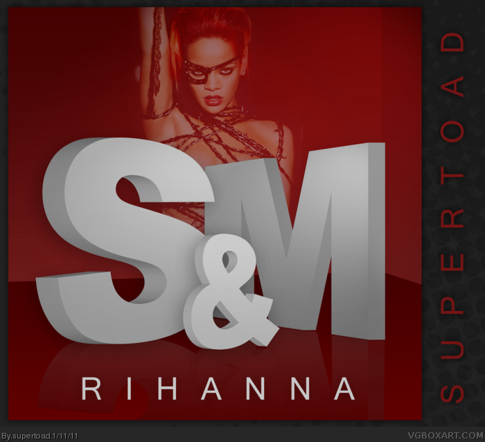
Agreed with Soundwave. Rihanna said she would keep Loud more positive than Rated R (which is clearly seen to be dark by this picture of her you used), so why not use a picture from the Loud era? You know, red hair and all.
I do love that logo though.
And well, to be honest this box looks just like a picture with letters above. Aside, the letters aren't well proportioned, seeing the perspectivve you put 'em in.
I know the picture is from the Rated R era (actually the Russian Roulette cover image but that's besides the point!) but I used it based on the lyrics of the song, I wanted a kind of darker image. This one suited it because of the "chains and whips excite me" lyric, IMO. I'm not pleased with it's positioning at all, but I did want her somewhere on it and it fitted best there.
#4, I'm not sure about it being a Metallica album, but I wouldn't be at all surprised if it was if you consider it's definition ;)
Rihanna is sexy as hell, lol.
The cover is pretty good but I agree with others about the picture.
And the text doesn't look quite right either, just something wrong with the 3D.
 Rihanna - S&M Cover Comments
Rihanna's next single, it got me excited when I heard it was confirmed :)
Sorry about all the music boxes, I would try to stop but I have another one planned! I'll try and halt them after that.
[ Reply ]
The image of Rihanna is from the Rated R era, it doesnt really make sense. Like the typography though, its stylish :)
[ Reply ]
Agreed with Soundwave. Rihanna said she would keep Loud more positive than Rated R (which is clearly seen to be dark by this picture of her you used), so why not use a picture from the Loud era? You know, red hair and all.
I do love that logo though.
[ Reply ]
Was't S&M a Metallica album?
And well, to be honest this box looks just like a picture with letters above. Aside, the letters aren't well proportioned, seeing the perspectivve you put 'em in.
[ Reply ]
I know the picture is from the Rated R era (actually the Russian Roulette cover image but that's besides the point!) but I used it based on the lyrics of the song, I wanted a kind of darker image. This one suited it because of the "chains and whips excite me" lyric, IMO. I'm not pleased with it's positioning at all, but I did want her somewhere on it and it fitted best there.
#4, I'm not sure about it being a Metallica album, but I wouldn't be at all surprised if it was if you consider it's definition ;)
Thanks for the faves as well.
[ Reply ]
Rihanna is sexy as hell, lol.
The cover is pretty good but I agree with others about the picture.
And the text doesn't look quite right either, just something wrong with the 3D.
[ Reply ]
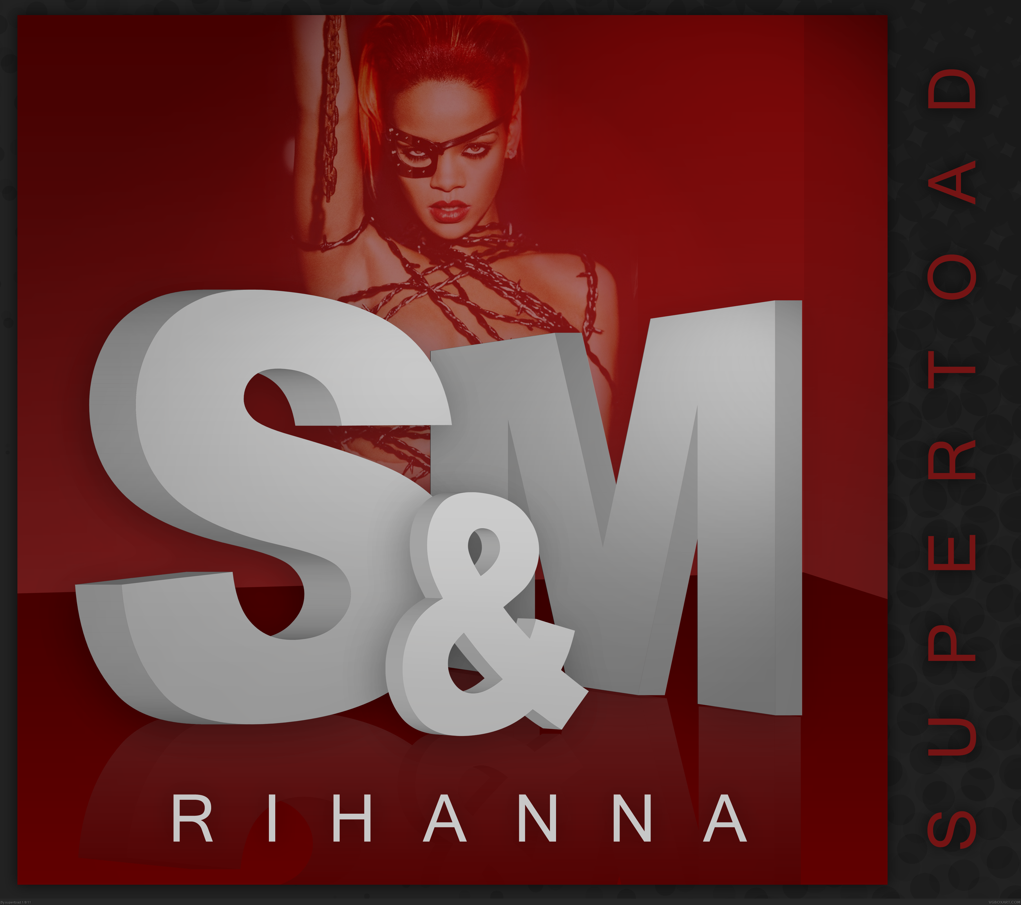
3D fixed? Hopefully anyway. I can't do much about it since I deleted the PSD file.
[ Reply ]
#7, No, It's not fixed.
[ Reply ]
#8, Well I'm sorry then but I don't know what the problem is. If you're talking letter heights then that was intentional.
[ Reply ]