I Think is one of my best box.... It took me forever to post it because of internet problems... so I started it like 2 months ago after finished it 2 weeks ago, and uploading it now. Enjoy!?
#3, Well, There isn't much you can put on the front of a Call of Duty Box... Using in game character renders usually makes it look Generic, or Fake.... Thats why i tried to make it more original, by giving it a nice gray scale effect.
as for the back... I see what your saying, but i couldn't really think of anything to put there, but i thought it wasn't good... but it wasn't bad either, just very average...
And there is still quite some things for me to learn in GIMP, as far as effects.
I think the screenshot borders could use a much more Gun themed border. It would add that Shooter feel to the game, and another gun pointing render would certainly make it much more active on the back. Maybe a few bullet shells, and rugged texture to the background.
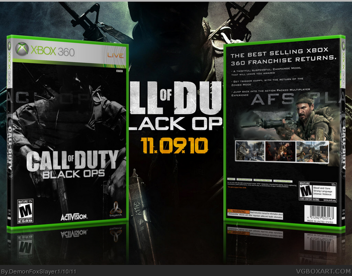
 Call of Duty: Black Ops Box Cover Comments
I Think is one of my best box.... It took me forever to post it because of internet problems... so I started it like 2 months ago after finished it 2 weeks ago, and uploading it now. Enjoy!?
Credit:
Black Ops Logo - -J1mB0- (planetreders)
Soldier on Front - RealTimeGD (planetrenders)
Treyarch Logo - Javengod
Activision Logo - Cerium
Rated T for Teen(Back and Fromt) - ADFD
[ Reply ]
Since I keep getting an error everytime I try to Edit by post above:
I meant to say rated M for Mature.
[ Reply ]
Front is very original, back is pretty boring. I would suggest making the title on the back more exciting or add a better description.
[ Reply ]
isn't*
[ Reply ]
#3, Well, There isn't much you can put on the front of a Call of Duty Box... Using in game character renders usually makes it look Generic, or Fake.... Thats why i tried to make it more original, by giving it a nice gray scale effect.
as for the back... I see what your saying, but i couldn't really think of anything to put there, but i thought it wasn't good... but it wasn't bad either, just very average...
And there is still quite some things for me to learn in GIMP, as far as effects.
[ Reply ]
I agree with Synthesis, the back is kinda boring, and the front is kinda unoriginal. But you have a point all of the Call of Duty boxes look similar.
[ Reply ]
I like the simple look to the back, I really do.
[ Reply ]
#7, I'd usually think someone who says this would be Kidding, but I see you fav'd it so thanks.
[ Reply ]
I like it!
I think the screenshot borders could use a much more Gun themed border. It would add that Shooter feel to the game, and another gun pointing render would certainly make it much more active on the back. Maybe a few bullet shells, and rugged texture to the background.
[ Reply ]
#9, LATE REPLY. Thanks a lot! Borders, to match this game were hard to find. So I made my own border.
[ Reply ]
pretty bad iv gotta say ir gay
[ Reply ]