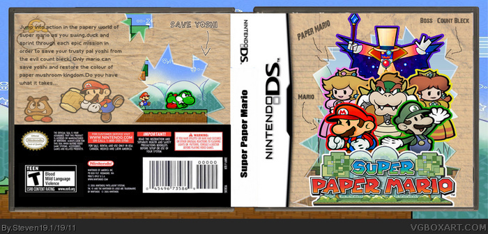
well guys this is my second box which i'm actually quite pleased with.
i also tried to go for the papery mario type which gradually builds the effect to the covers
what inspired me was sd1833's paper mario box which joined the hof entry recently
so please tell me waht you think...
#2, wow thank you
about your improvements, sorry about the spine because i was confused too which correct way should it go and i'll change the capitals on the back too and soon update the new version
This is a VERY big improvement over your last box. I really like it.
There are a fer other things that you should fix.
Because you have flipped luigi, his L on his cap is backwards. There are two things you could do about this:
-Either flip him and mario around so that luigi is on the left and mario is on the right
-Or, you could edit Luigi's hat with photoshop or whatever program you are using.
Secondly, Mario, Luigi, Peach and Daisy are all a little bit squashed. Try making them a little bit taller so they look more proportional. Remember, when you are resizing an image, always hold down ctrl so that the image does not get stretched :)
If you have any troubles with this box or any ones in the future, feel free to PM me through the forums if you want some advice or some help.
I'd like to add that yoshi isn't looking like he's in need for any help on the screenshot O__o or does he need help with some kind of "occlusion"? Just asking.
btw: you did remove some saturation at the characters except mario, right? I'd try to balance that one, so make mario a bit more bleached out or add more color to the others.
#7, no that was intentional because the point of the game is that the characters lose color as yoshi is captured and mario has iis colors because he's the only one that can stop count blek and rescue yoshi
if you read the description on the back then you'll know why i intended this
btw #6 if you think it's infantile then why did you fave...you really do remind me of 5 star general as you have used the same words like he would say like infantile which he said in one of my prev boxes and something like you can do that in your sleep whcih he usually says.
And then all of a sudden he faves it
 Paper Mario Box Cover Comments
well guys this is my second box which i'm actually quite pleased with.
i also tried to go for the papery mario type which gradually builds the effect to the covers
what inspired me was sd1833's paper mario box which joined the hof entry recently
so please tell me waht you think...
[ Reply ]
I like it! It's a big improvement over your previous box. Fav'd! I do have a couple issues with it.
1. Your title on the spine should go from top to bottom, not bottom to top.
2. You should capitalize the first letter of the proper nouns in your paragraph on the back.
[ Reply ]
#2, wow thank you
about your improvements, sorry about the spine because i was confused too which correct way should it go and i'll change the capitals on the back too and soon update the new version
[ Reply ]
This is a VERY big improvement over your last box. I really like it.
There are a fer other things that you should fix.
Because you have flipped luigi, his L on his cap is backwards. There are two things you could do about this:
-Either flip him and mario around so that luigi is on the left and mario is on the right
-Or, you could edit Luigi's hat with photoshop or whatever program you are using.
Secondly, Mario, Luigi, Peach and Daisy are all a little bit squashed. Try making them a little bit taller so they look more proportional. Remember, when you are resizing an image, always hold down ctrl so that the image does not get stretched :)
If you have any troubles with this box or any ones in the future, feel free to PM me through the forums if you want some advice or some help.
[ Reply ]
nice...just do what #4 and #2 did and it'll look even better
[ Reply ]
This is infantile. I could have done this with my toes during my sleep.
[ Reply ]
I'd like to add that yoshi isn't looking like he's in need for any help on the screenshot O__o or does he need help with some kind of "occlusion"? Just asking.
btw: you did remove some saturation at the characters except mario, right? I'd try to balance that one, so make mario a bit more bleached out or add more color to the others.
[ Reply ]
#7, no that was intentional because the point of the game is that the characters lose color as yoshi is captured and mario has iis colors because he's the only one that can stop count blek and rescue yoshi
if you read the description on the back then you'll know why i intended this
btw #6 if you think it's infantile then why did you fave...you really do remind me of 5 star general as you have used the same words like he would say like infantile which he said in one of my prev boxes and something like you can do that in your sleep whcih he usually says.
And then all of a sudden he faves it
kid you seem like an alt...
[ Reply ]
#8 once again you have persued the easy option and slapped a couple of renders on a canvas. I'm getting tired of this as it is becoming repeatative.
I also noticed you faved it yourself ddn't you Tempah you descreptable litle weasel.
[ Reply ]
#9, whatever you say 5 star general...
[ Reply ]