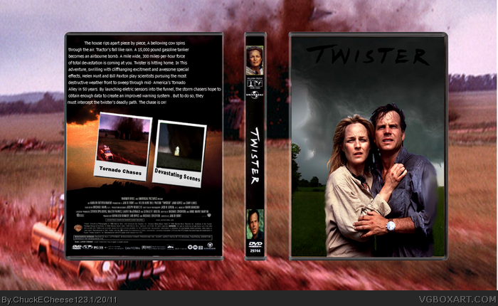
I can see some skills, but also some... "meh". Biggest complain: Black text on (almost) black fond. C'mon, you don't have to be a genius to see that's not working very well and squeezing images is also not very good.
I agree with wasa-bi here, but there are also some very big problems that he didnt mention here. For starters, the entire layout is generic. But I am not going to ask you to change your whole design. But you should definitely change the black text to white to make it more legible. The back is also very plain and it has wayy too much text. But your biggest problem, is when you view it in full view, the whole thing is low quality. As well as every image and piece of text being very blurry, including the background and the presentation, the man's arm and the womans side have been smudged with the smudge tool and it really doesnt work. Both the man and woman's hair are also very badly rendered out.
Everything is really low quality, the text on the back is very plain, the render on the front is really choppy in some spots, and then really blurry in others.
Renders look slapped onto the front while the logo is hard to see. Also for the back, try organizing it better and arranging the screenshots with a different border. Other than that it looks pretty good
 Twister Box Cover Comments
Template - Jevangod
Render- Rex-the-dinosaur
[ Reply ]
I can see some skills, but also some... "meh". Biggest complain: Black text on (almost) black fond. C'mon, you don't have to be a genius to see that's not working very well and squeezing images is also not very good.
[ Reply ]
I agree with wasa-bi here, but there are also some very big problems that he didnt mention here. For starters, the entire layout is generic. But I am not going to ask you to change your whole design. But you should definitely change the black text to white to make it more legible. The back is also very plain and it has wayy too much text. But your biggest problem, is when you view it in full view, the whole thing is low quality. As well as every image and piece of text being very blurry, including the background and the presentation, the man's arm and the womans side have been smudged with the smudge tool and it really doesnt work. Both the man and woman's hair are also very badly rendered out.
[ Reply ]
#3, yeah, I did skip a lot of stuff. Have to concentrate on Knarrenheinz XD
[ Reply ]
Very nice, I really like the back!
I really like that render also :p
[ Reply ]
The logo is unreadable.
[ Reply ]
Exactly what #3 said.
I can see a little bit of potential here though.
[ Reply ]
Everything is really low quality, the text on the back is very plain, the render on the front is really choppy in some spots, and then really blurry in others.
[ Reply ]
I pretty much agree with all the above comments.
[ Reply ]
Renders look slapped onto the front while the logo is hard to see. Also for the back, try organizing it better and arranging the screenshots with a different border. Other than that it looks pretty good
[ Reply ]