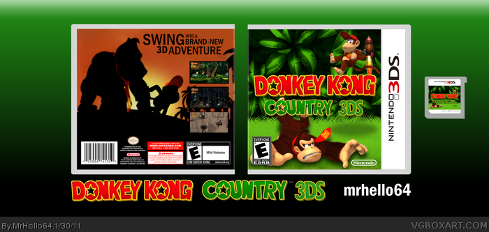
Errr... what do I get? A cover that's showing skill but is very expressionless too? Don#t get me wrong it's not a bad idea and it's well executed, but the front kinda "empty". It seems more like some battle between Donkey and Diddy and IMO that's not what the game is supposed to be? Or is it? Maybe add some synopsis on the back to make that clear.
As for the back: As much as I like the silhouette-levels it's not working as a back with your front (I do think the silhouettes are overused at DKC-packages these days too), because it is a big change in style. It makes the box appear less smooth.
I'd recommend to remove one of the screens and make the others bigger in exchange for that.
#2, Well, it wasn't intended to look like a "battle", but I guess it is a matter of opinion as to how you interpret it. The silhouette thing doesn't bother me, but I think a spine might help it. I actually tried it with three screens and I thought it looked a bit empty, but I guess it may be worth another shot.
 Donkey Kong Country 3DS Box Cover Comments
This is what you get with the combination of a good idea and a lot of procrastination. Enjoy.
[ Reply ]
Errr... what do I get? A cover that's showing skill but is very expressionless too? Don#t get me wrong it's not a bad idea and it's well executed, but the front kinda "empty". It seems more like some battle between Donkey and Diddy and IMO that's not what the game is supposed to be? Or is it? Maybe add some synopsis on the back to make that clear.
As for the back: As much as I like the silhouette-levels it's not working as a back with your front (I do think the silhouettes are overused at DKC-packages these days too), because it is a big change in style. It makes the box appear less smooth.
I'd recommend to remove one of the screens and make the others bigger in exchange for that.
[ Reply ]
#2, Well, it wasn't intended to look like a "battle", but I guess it is a matter of opinion as to how you interpret it. The silhouette thing doesn't bother me, but I think a spine might help it. I actually tried it with three screens and I thought it looked a bit empty, but I guess it may be worth another shot.
[ Reply ]
Woah! This Box Is Amazing!!
[ Reply ]
#4 Thanks for the fav.
[ Reply ]
#5,
It's Okaay :)
[ Reply ]
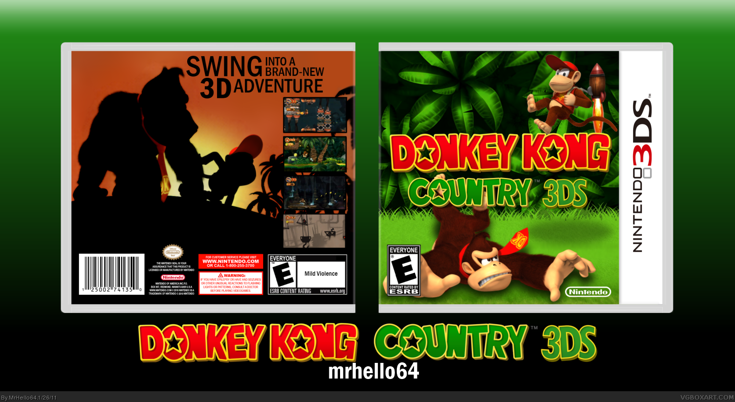
Slight update.
[ Reply ]
it seems kinda squeezed... why don't you add some pixels to the width and give the game(card) a bit more space?
[ Reply ]
#8, Updated it, better?
[ Reply ]
Not bad but, add more text on the back
[ Reply ]
great!
[ Reply ]
holy amazingness batman!!!!!
[ Reply ]