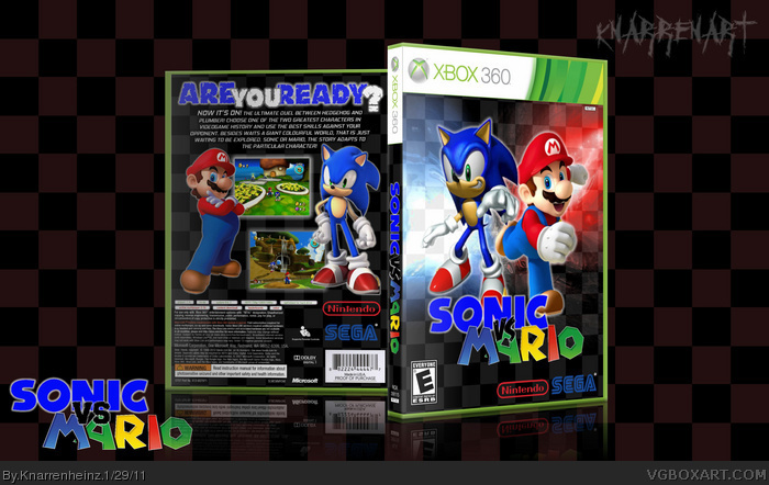
Well... sonic may be on xbox, but not mario... even though it's a fake box it should stock at least a bit more to reality.
anyways, the text makeup is way better, but there are still some issues.
Biggest complain go to the front: the developer-logos are way too big and the "vs" doesn't seem to fit. the whole logo seems patched together rather than having a real design.
The screens are a nice touch, even though sonic seems out of place and you used Mario Galaxy twice. How about using one screen fom mario Galaxy and the other one from Sonic Colors? This way it looks more like you could play both characters due to the different displays, like the displayed icon at the lives.
 Sonic vs. Mario Box Cover Comments
temp by ScorpionSoldier
=======================
enjoy! :D
[ Reply ]
Well... sonic may be on xbox, but not mario... even though it's a fake box it should stock at least a bit more to reality.
anyways, the text makeup is way better, but there are still some issues.
Biggest complain go to the front: the developer-logos are way too big and the "vs" doesn't seem to fit. the whole logo seems patched together rather than having a real design.
The screens are a nice touch, even though sonic seems out of place and you used Mario Galaxy twice. How about using one screen fom mario Galaxy and the other one from Sonic Colors? This way it looks more like you could play both characters due to the different displays, like the displayed icon at the lives.
[ Reply ]
BTW: Nintendos logo is no longer red - for years!!!
[ Reply ]
#2, i agree...you took the words out of my mouth
good on ya mate!!!
[ Reply ]
#4, poor parrot without a personal opinion
[ Reply ]
#5, It's actually not bad
but the sonic on the front doesn't match with mario or the sonic on the back
It's from Sonic Heroes, so it's pretty old
[ Reply ]