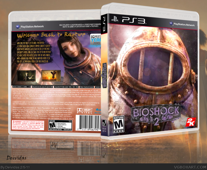
So this is my first game box art. I just beat Bioshock 2 like 2 days ago and got inspired. I know that most bioshock boxes have a very dark feel to it but I have to be honest and I was sick at looking at all of those. So i came up with a brighter theme to it and i think it worked quite well. Anyways tell me what you guys think. And P.S. I know that the image quality is not amazing...so please dont try to rate the box because of its sharpness but rather on the design. Thanks
I actually kinda like it, I like the colours. Having said that though, the colours don't really match up with the games art style and themes. They would, however suit the style of Bioshock Infinite.
#5, Yea i can see that too. But i was like really SICK of looking at all the boxes of Bioshock with the exact same color scheme, you know? lol I wanted to attempt something new, a little brighter side of Bioshock.
You are new so let me give you some typography hints.
Do not type body typeface in novelty fonts or fonts that are based off the logo. It makes people try to hard to read, making customers put down the product and move a long. Body text is meant to be easily read. so use a basic font.
Now you can use novelty fonts or logo fonts on headlines "Welcome to rapture" because that font is meant to grab attention but not meant to be read for long periods of time.
So you have Novelty headlines to get the attention of someone and then you have body text to inform someone. I'm in college typography and my professor says this a lot so I know it's not personal opinion. Take a look at the last 5 or 10 MasterWorks and you will see what I mean.
Not to bad for a first box though. I can tell you will improve a lot.
Also if you need help always look on link it's a helpful website for renders. It's ok to use them but I would credit. Seeing how the artist did a lot of work making the renders it's wise not to use way to many on a box because we want to see your talents too.
 Bioshock 2 Box Cover Comments
So this is my first game box art. I just beat Bioshock 2 like 2 days ago and got inspired. I know that most bioshock boxes have a very dark feel to it but I have to be honest and I was sick at looking at all of those. So i came up with a brighter theme to it and i think it worked quite well. Anyways tell me what you guys think. And P.S. I know that the image quality is not amazing...so please dont try to rate the box because of its sharpness but rather on the design. Thanks
[ Reply ]
Edited at 1 decade ago
[ Reply ]
Awesome, Simply Awesome for a very first box, it's kind of blurry, but other than that it's amazing.
[ Reply ]
#3, Thankss I appreciate it :)
[ Reply ]
I actually kinda like it, I like the colours. Having said that though, the colours don't really match up with the games art style and themes. They would, however suit the style of Bioshock Infinite.
[ Reply ]
#5, Yea i can see that too. But i was like really SICK of looking at all the boxes of Bioshock with the exact same color scheme, you know? lol I wanted to attempt something new, a little brighter side of Bioshock.
[ Reply ]
This is great. I can't wait to see more from you, as I see some great potential.
[ Reply ]
Nice For a first. +Fav.
Few things though, if something looks to blurry, sharpen it. I think you should of chose a different font for the back.
[ Reply ]
#7, Thanks :) Im actually trying to think of a new idea for my next project.
[ Reply ]
You are new so let me give you some typography hints.
Do not type body typeface in novelty fonts or fonts that are based off the logo. It makes people try to hard to read, making customers put down the product and move a long. Body text is meant to be easily read. so use a basic font.
Now you can use novelty fonts or logo fonts on headlines "Welcome to rapture" because that font is meant to grab attention but not meant to be read for long periods of time.
So you have Novelty headlines to get the attention of someone and then you have body text to inform someone. I'm in college typography and my professor says this a lot so I know it's not personal opinion. Take a look at the last 5 or 10 MasterWorks and you will see what I mean.
Not to bad for a first box though. I can tell you will improve a lot.
[ Reply ]
#10, Thank you for the tips. Will def make sure to use those pointers everyone is giving me. Thankssss :)
[ Reply ]
Also if you need help always look on link it's a helpful website for renders. It's ok to use them but I would credit. Seeing how the artist did a lot of work making the renders it's wise not to use way to many on a box because we want to see your talents too.
[ Reply ]
Never knew about that site. Sweet thanks :) And yea I would always credit the source, people deserve the recognition without a doubt!
[ Reply ]