[ Buy The Social N... at Amazon ] By MattStar 49 on February 7th, 2011 Download Printable [ Box updated on February 9th, 2011 ] [ original ] The Social Network Box Cover Comments Comment on MattStar's The Social Network Box Art / Cover. Cancel Reply beardedwalrus 41 [ 1 decade ago ] love [ Reply ] MattStar 49 [ 1 decade ago ] Ok so I know USA isn't "THE WORLD", but I tried hard to fit in more countries, but it never looked right. I hope you guys like. [ Reply ] Deividas 47 [ 1 decade ago ] I absolutely hate the movie...and I hate facebook as well (Just people bitching about their lives lol) but this is quite epic. Nice job man. [ Reply ] Ladykiller 42 [ 1 decade ago ] I like the concept, but the execution could have been a lot better. Still pretty cool. [ Reply ] YoshiStar 46 [ 1 decade ago ] Agree with ladykiller. Scanlines always kill a box, btw. Unless the lines are more spread apart. [ Reply ] MattStar 49 [ 1 decade ago ] #3-5, Thanks. [ Reply ] Steven19 1 [ 1 decade ago ] THE NEXUS LIKES THIS. BUT WILL THEY FAV? [ Reply ] YoshiStar 46 [ 1 decade ago ] I highly suggest re-doing this without the 1-px scanlines. Those only look good on screen where the size of something is constant, not on things that are resized up and down that change how the 1-px scanlines look (single colors and etc.) [ Reply ] MattStar 49 [ 1 decade ago ] #8, Ok I work on an update soon. [ Reply ] MattStar 49 [ 1 decade ago ] Updated. Pretty significant update here. I changed the style to fit Facebook better, and incorporated Europe on the back. Hope you'll fav. [ Reply ] aelixus 46 [ 1 decade ago ] nice update! [ Reply ] YoshiStar 46 [ 1 decade ago ] Sorryyy but don't like it. :( Last version matched FB so much more. The only problem was the scanlines.. [ Reply ] MattStar 49 [ 1 decade ago ] Well what does everyone think? I really like the update, but if you all like the first one, I can always remove the scanlines. [ Reply ] forbidden master is back 1 [ 1 decade ago ] #7, i don't know shall. shall we? does he deserve it? [ Reply ] jevangod 50 [ 1 decade ago ] #12, Same here. [ Reply ]
 The Social Network Box Cover Comments
love
[ Reply ]
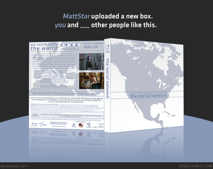
Ok so I know USA isn't "THE WORLD", but I tried hard to fit in more countries, but it never looked right. I hope you guys like.
[ Reply ]
I absolutely hate the movie...and I hate facebook as well (Just people bitching about their lives lol) but this is quite epic. Nice job man.
[ Reply ]
I like the concept, but the execution could have been a lot better. Still pretty cool.
[ Reply ]
Agree with ladykiller.
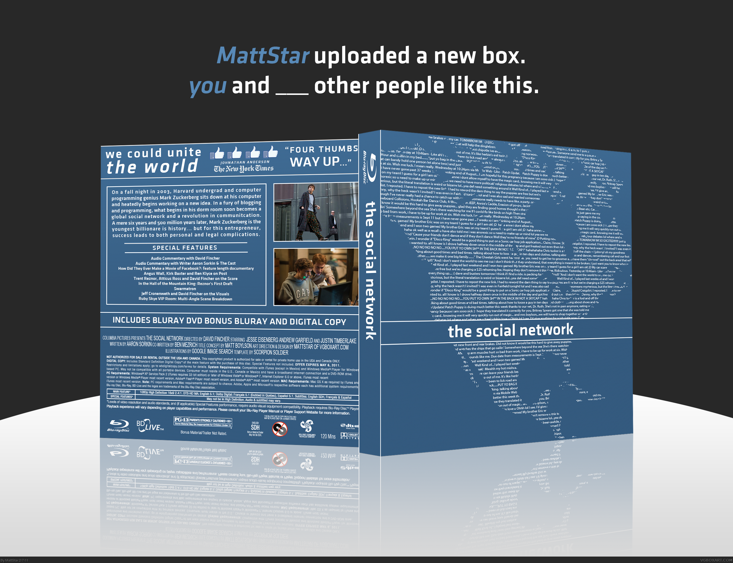
Scanlines always kill a box, btw. Unless the lines are more spread apart.
[ Reply ]
#3-5, Thanks.
[ Reply ]
THE NEXUS LIKES THIS.
BUT WILL THEY FAV?
[ Reply ]
I highly suggest re-doing this without the 1-px scanlines. Those only look good on screen where the size of something is constant, not on things that are resized up and down that change how the 1-px scanlines look (single colors and etc.)
[ Reply ]
#8, Ok I work on an update soon.
[ Reply ]
Updated. Pretty significant update here. I changed the style to fit Facebook better, and incorporated Europe on the back. Hope you'll fav.
[ Reply ]
nice update!
[ Reply ]
Sorryyy but don't like it. :( Last version matched FB so much more. The only problem was the scanlines..
[ Reply ]
Well what does everyone think? I really like the update, but if you all like the first one, I can always remove the scanlines.
[ Reply ]
#7, i don't know shall. shall we?
does he deserve it?
[ Reply ]
#12, Same here.
[ Reply ]