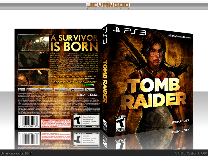
Alot of textures used in here. I really love how it came out. I wanted the colortone to be sort of dirty gold. The logo was pure white before so it was a bit of a struggle to get that to go along with the rest of the box. The info is the official. I found some magazine scans online from Game Informer that talks about this game. So I had to copy it out of there. Hope you guys like it.
The description text looks weird, because it's yellow, it looks hard to read because it has what appears to be either a black drop shadow or a black outer glow, which makes it blend into the background.
The back also seems crammed, I'm referring to the way the tagline the screenshots, and the text is organized.
#4, Yea. I can see that. Ill fix it on the printable. Cause you see, this is a very big file. I had to resize it cause the upload couldnt take it. So it looked alot better when it was bigger.
amazing work. different but fits the theme of the game really well. yeah the text in the back seems hard to read but i guess thats just the preview. anyways this is badass 8)
 Tomb Raider Box Cover Comments
Alot of textures used in here. I really love how it came out. I wanted the colortone to be sort of dirty gold. The logo was pure white before so it was a bit of a struggle to get that to go along with the rest of the box. The info is the official. I found some magazine scans online from Game Informer that talks about this game. So I had to copy it out of there. Hope you guys like it.
[ Reply ]
Purely amazing dude, fav.
(first fav xD)
[ Reply ]
wow!
this is a really cool box jevan.
can't wait to see more like this.
this is personally my favorite box from you so far.
+fav
[ Reply ]
The description text looks weird, because it's yellow, it looks hard to read because it has what appears to be either a black drop shadow or a black outer glow, which makes it blend into the background.
The back also seems crammed, I'm referring to the way the tagline the screenshots, and the text is organized.
[ Reply ]
The front is familiar, but still polished and attractive.
The back however, is bland and uninspired.
[ Reply ]
Nice job on this! The cover looks great.
[ Reply ]
#4, Yea. I can see that. Ill fix it on the printable. Cause you see, this is a very big file. I had to resize it cause the upload couldnt take it. So it looked alot better when it was bigger.
[ Reply ]
Nice work man, as always.
Dark grimy, grungy gold looks very suitable. :)
[ Reply ]
amazing work. different but fits the theme of the game really well. yeah the text in the back seems hard to read but i guess thats just the preview. anyways this is badass 8)
[ Reply ]
Thanks. Trust me guys. When I upload the printable, youll see how clear it is to read.
[ Reply ]
Fucking blocked Lara's breast. No fav. from me.
[ Reply ]
#11, eheh x)
[ Reply ]
The colors and texture work are a pleasure to look at, but I agree with sd, the back layout is pretty typical.
[ Reply ]
#13, Yea. I know the back is typical. But you guys should know me by now.
[ Reply ]
#7, I see.
[ Reply ]
Too big to upload the printable. Thats why I uploaded it on Deviantart. Here we go link
[ Reply ]
Nice Jog! ^^
[ Reply ]
Well deserved...
[ Reply ]
This could be the special edition design :o awesome !
[ Reply ]