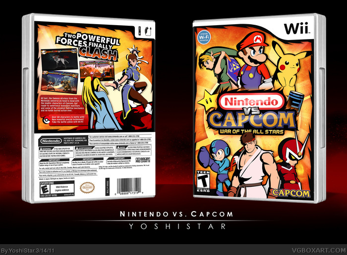
- I had the idea and I really wanted to execute it somehow, but the more realistic characters of Capcom usually don't fit with the kiddy characters of Nintendo. To combine them, I put them in one artstyle that, in my opinion, looks a lil dark and friendly at the same time.
- Mario was a bitch to finish.
- I made the three screenshots myself.
- I wouldn't really consider this custom artwork. I used various images as reference to create the same artworks in my style.
Love it :) Two things I would think would improve it though, use a normal template (it looks odd with the black instead of gray) and also brighten up the "capcom" segment of the logo as the nintendo part is a lot brighter.
#14: Yeah she does, I'm pretty sure I pointed that out in the WIP thread.
With a couple exceptions, I'm honestly not that much a fan of the artwork this time around. A few, Ryu for example, look rushed and flat compared to the other characters. The back in general is somewhat basic coming from you.
Your work with color and texture however, is stellar as always. Amazing concept, but I think the execution could have been better.
So looking back on this, I wanna make some changes to the artstyle. I feel like a sketchy and kinda artsy thing would look a lot better and more inspired. I was thinking kinda like a mix of Super Mario Strikers and the the liney kinda things that Drakxxx does on his art.
It's better, but not a drastic change in art direction. You've really only added some sketchy lines over top of the original image. And while it is an improvement, it's still basically the same art.
 Nintendo vs. Capcom Box Cover Comments
Finally. +fav
[ Reply ]
I like the front but I'm not crazy about the back.
[ Reply ]
This turned out pretty nice, good job on those screenshots.
[ Reply ]
A couple of things, I would have make Ryu a little more detailed, as he feels a little flat.
Also, I would add a little more detail to Samus as well, the pink/purple design on the back of her suit and have her laser gun/whip out.
All in all though, it's a design that we all know took a ton of effort and is mostly extremely well executed.
[ Reply ]
This... this is the guy.
[ Reply ]
i came.
twice.
[ Reply ]
i came.
twice.
[ Reply ]
i also posted twice
[ Reply ]
I agree that Ryu looks a little flat and I wish there were a character or two behind Chun-Li. Overall though, it's pretty cool. Good job.
[ Reply ]
Nice. Not your best, but nice.
[ Reply ]
I think you did a great job with this. I gotta say that I love the screenshots on the back and art-styles on the characters.
[ Reply ]
Thanks guys!
Things to note:
---------------
- I had the idea and I really wanted to execute it somehow, but the more realistic characters of Capcom usually don't fit with the kiddy characters of Nintendo. To combine them, I put them in one artstyle that, in my opinion, looks a lil dark and friendly at the same time.
- Mario was a bitch to finish.
- I made the three screenshots myself.
- I wouldn't really consider this custom artwork. I used various images as reference to create the same artworks in my style.
[ Reply ]
Love it :) Two things I would think would improve it though, use a normal template (it looks odd with the black instead of gray) and also brighten up the "capcom" segment of the logo as the nintendo part is a lot brighter.
[ Reply ]
Doesn't ZSSamus have that pink glowing mark on her back?
Nonetheless, fav :D
[ Reply ]
I'm waiting for SONY vs LG XD
[ Reply ]
No matter what, this has to get into the Hall.
+FAV
[ Reply ]
Congrats bro
[ Reply ]
Very Good work
[ Reply ]
#14: Yeah she does, I'm pretty sure I pointed that out in the WIP thread.
With a couple exceptions, I'm honestly not that much a fan of the artwork this time around. A few, Ryu for example, look rushed and flat compared to the other characters. The back in general is somewhat basic coming from you.
Your work with color and texture however, is stellar as always. Amazing concept, but I think the execution could have been better.
[ Reply ]
Thanks again guys!
So looking back on this, I wanna make some changes to the artstyle. I feel like a sketchy and kinda artsy thing would look a lot better and more inspired. I was thinking kinda like a mix of Super Mario Strikers and the the liney kinda things that Drakxxx does on his art.
Here's the front with that look:
link
Should I update or no?
[ Reply ]
It's really not all that different. There's certainly a difference, but that wouldn't be the difference between a fav and no fav for me.
[ Reply ]
Ah okay. But is it a good change or a bad change, however big or small the change is?
[ Reply ]
It's better, but not a drastic change in art direction. You've really only added some sketchy lines over top of the original image. And while it is an improvement, it's still basically the same art.
[ Reply ]
Yeah wasn't really meant to be drastic :)
[ Reply ]
that was quick! many congrats!
[ Reply ]
Beastly!!!!
[ Reply ]
#20, After is better.
[ Reply ]
FIX.
SAMUS.
Oh and I like after more...
[ Reply ]
#24: Yeah, I get that. And the "after" design is better, but not enough for me to change my opinion of the artwork in general.
[ Reply ]
#20, do it
and i just noticed, samus has a pink symbol on her back which you forgot
[ Reply ]
Awesome, totally expected it to be amazing.
[ Reply ]
Totally awesome, congrats!!
[ Reply ]
#30 Facepalm
[ Reply ]
Why is this NOT in Masterworks?
[ Reply ]
#34 Because it was made only five days ago.
Anyway, this is awesome! If this game isn't actually made, I'm going to end up assassinating people.
[ Reply ]
(too awesome for words) + fav
[ Reply ]
This is brilliant! The only thing, Link on the front the way he's holding the boomerang kinda awkwardly, but that's just me. +Fav
[ Reply ]
Nek minit CAPCOM is developing SSB4. This might actually happen ahah
[ Reply ]
We're almost there.... Megaman is coming in SSB "Universe"
[ Reply ]