I was going to wait and upload it this weekend.. or tomorrow, or something.. but Fuck that.
Here it is.. :l
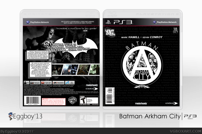
I've got quite a few boxes going on right now, all of which are about half way finished, this is one I started last night before last.. accidentally. Yeah, I don't know..
And yes, the front is supposed to look like a comic book cover, the back too, but more so the front, what with the barcode and release date.
Credit to scorpionsoldier and Jevan, for the temp, and the plastic.
Pretty interesting cover. The front has a distinct comic-book feel to it unlike most on this site, and limited edition-like as well. The DC logo could be smaller though.
#16, Wanna give this box my feeling, and here is it. :D
The front is really cool, I love the way you put these characters in the logo. I just don't like the background text font, this font too clean for this game. The back is nice but a bit simple to me. I can't find anything problem with this box, just not for me. :P
#16 Well it COULD do with a tad more on the front, maybe the symbol being bigger but, really its near perfect! but shouldnt Kevin's name be first? seeing as he voices batman, or have I got them mixed up :s
you've really nailed the comi style at the back! but there are some minor things to improve this box imo.
The front is kinda 'not getting the attention wich it's needs'
mainly, because of the colors and size of the logo.
Make it a tad bigger and add some more color tones to it.
get rid off the names on the front.
to put a scancode on the front isn't really necessary.
The logo is nice and the idea of merging batman,
the joker and hugo strange in the logo is very creative,
but they need more attention imo.
I can see that you put a lot of effort in creating this box and the fact that you didn't used any artwork or render of the game (ecxept the in-game screens at the back) is a real plus! it's stands out from the others like jevangod's Batman Arkham city's Boxart.
 Batman: Arkham City Box Cover Comments
I was going to wait and upload it this weekend.. or tomorrow, or something.. but Fuck that.
Here it is.. :l
I've got quite a few boxes going on right now, all of which are about half way finished, this is one I started last night before last.. accidentally. Yeah, I don't know..
And yes, the front is supposed to look like a comic book cover, the back too, but more so the front, what with the barcode and release date.
Credit to scorpionsoldier and Jevan, for the temp, and the plastic.
Coolness, later.
[ Reply ]
The screenshots would look better black and white.
[ Reply ]
#2 This...
[ Reply ]
#2, This
Also, it looks very good. You sure do love you Batman.
[ Reply ]
Not your best, but still very awesome.
[ Reply ]
Not your best, but still very awesome.
[ Reply ]
Not your best, but still very awesome.
[ Reply ]
Not your best, but still very awesome.
[ Reply ]
i found your screen name in the box on the front!
[ Reply ]
10/10 +fav
hey, can you check out my latest Captian America box please!?
[ Reply ]
Pretty interesting cover. The front has a distinct comic-book feel to it unlike most on this site, and limited edition-like as well. The DC logo could be smaller though.
[ Reply ]
#5, quad post?
anyway I love the comic book style of this box.
[ Reply ]
#2/3/4, I tried, looked awful. The game isn't black and white, just the box. But I did turn down the contrast.
#5, Most definitely not. This was entirely out of love for the classy, black on white design. Purely for fun. :]
#9, Props.
#10, I will, but it's generally unacceptable to advertise on other peoples boxes. Just a heads up.
#11, if you look on most any Batman comic, the DC logo is pretty large.
#12, Well thanks. ;D
[ Reply ]
#13, When I said 'contrast' I meant saturation. Sorry.
[ Reply ]
Pretty damn awesome man!
[ Reply ]
Kinda disappointed I didn't have more criticism to work with..
But thanks guys!
[ Reply ]
#16, Wanna give this box my feeling, and here is it. :D
The front is really cool, I love the way you put these characters in the logo. I just don't like the background text font, this font too clean for this game. The back is nice but a bit simple to me. I can't find anything problem with this box, just not for me. :P
[ Reply ]
#16 Well it COULD do with a tad more on the front, maybe the symbol being bigger but, really its near perfect! but shouldnt Kevin's name be first? seeing as he voices batman, or have I got them mixed up :s
[ Reply ]
#18, No, you've got them right.
I just put them that way because.. erm.. fuck da police.
[ Reply ]
The front is kind of "meh..." but I REALLY like the back. Well done man.
[ Reply ]
you've really nailed the comi style at the back! but there are some minor things to improve this box imo.
The front is kinda 'not getting the attention wich it's needs'
mainly, because of the colors and size of the logo.
Make it a tad bigger and add some more color tones to it.
get rid off the names on the front.
to put a scancode on the front isn't really necessary.
The logo is nice and the idea of merging batman,
the joker and hugo strange in the logo is very creative,
but they need more attention imo.
I can see that you put a lot of effort in creating this box and the fact that you didn't used any artwork or render of the game (ecxept the in-game screens at the back) is a real plus! it's stands out from the others like jevangod's Batman Arkham city's Boxart.
Edited at 1 decade ago
[ Reply ]
Good work man and congrats. Love the front
[ Reply ]
Wow this is actually pretty cool. Nice work on the title
For someone implying to be a Sonic fanboy by the nickname, you sure know your Batman shit
[ Reply ]
I was 12 years old and signing up for a Videogame fan-art website, but Batman has always been my religion.
[ Reply ]
what the shit
[ Reply ]
4 years, ha. That's got to be some kind of record.
[ Reply ]