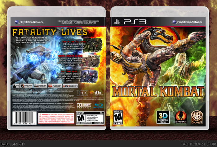
This box was fun to make. I love this game and I've wanted to make a box for it for a while now, but I couldn't think of any good designs. I think this turned out really well.
There's not enough green prominent in cases around here, so that front coloring is perfect in my eyes. A combination not seen too often. The blue may be a little too drastic a change from the front, but I'm cool with the layout. The tagline could use a drop shadow though.
I don't really think red and green go together that well. I just don't think those colors should be paired. That said, the effects are amazing and the effort alone is worth a fav.
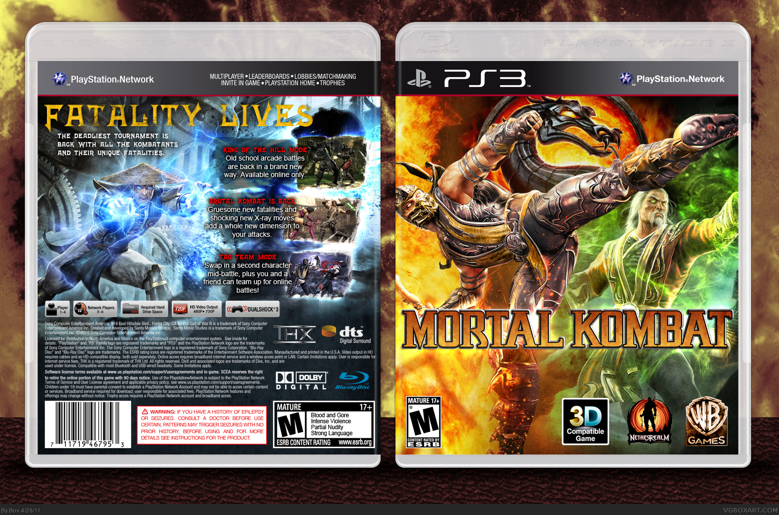
Well, it's a really colorful case and I don't know if all these colors flow well together. However, my main problem is the back. Text, for example, including the tagline does not fit the cover imo. The whole layout on the back seems too random and just "floating" in space.
I do like how the logo is "hidden" behind characters on the front and the quality of images is great too.
 Mortal Kombat Box Cover Comments
Template credit:
Sens
Scorpion Soldier
Deiviuxs
This box was fun to make. I love this game and I've wanted to make a box for it for a while now, but I couldn't think of any good designs. I think this turned out really well.
[ Reply ]
The colors of front are amazing. But I don't like the back too much. :D
[ Reply ]
This really nice... I Like it. =)
[ Reply ]
There's not enough green prominent in cases around here, so that front coloring is perfect in my eyes. A combination not seen too often. The blue may be a little too drastic a change from the front, but I'm cool with the layout. The tagline could use a drop shadow though.
Overall, it's good work, Box.
[ Reply ]
Okay, so I updated the back with some fire to make the colors match a little better, and I added a drop shadow to the tagline.
[ Reply ]
Love the mash of colours. Great work.
[ Reply ]
I don't really think red and green go together that well. I just don't think those colors should be paired. That said, the effects are amazing and the effort alone is worth a fav.
[ Reply ]
The text on the back is hard to see but it looks good.
[ Reply ]
Well, it's a really colorful case and I don't know if all these colors flow well together. However, my main problem is the back. Text, for example, including the tagline does not fit the cover imo. The whole layout on the back seems too random and just "floating" in space.
I do like how the logo is "hidden" behind characters on the front and the quality of images is great too.
[ Reply ]