I like the template and the back, but the front seems just too bland but over all i think its pretty good and well blended. One thing though, it says 12 on the front but the back says mature...
I don't like it that much. Where's the break between plastic-case and the actual cover (paper)? The cast shadow on the "cover" seems off, the legal stuff is hard to read on that texture, same for some parts f the copy-text and the red add "Directors Cut" on that hallway-image too, the Nintendo-Logo on the back is almost not existent, the serif-font doesn't fit the Metroid and Other M fonts, the Nintendo-logo on the front is wrong (IT IS NO LONGER RED FOR YEARS NOW) and the Directors Cut on the front seems to be placed rather uninspired, like that was the only place you could use.
It's rated M. Probably because the Director's Cut includes frequent swearing and nudity, correct?
Just kidding. I wouldn't be surprised if a Metroid game gets an M rating someday, but I doubt it will be for frequent swearing or nudity, lol.
Why would they need a Director's Cut instead of including everything in the original game (I know they did, but I'm creating a "what if" situation, for if this version of the game is ever released)? Maybe the designers went back and added new modes such as multiplayer, etc. to it? Lol, it'd be weird.
thanks for the critisism i'm making zelda boxart of the canceled( aparently!) oracle of time ( i think that is waht i's called) and i've made it to the best standard possible
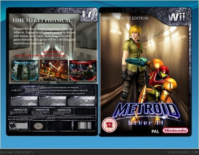
 Metroid : Other M (Directors Cut) Box Cover Comments
I like the template and the back, but the front seems just too bland but over all i think its pretty good and well blended. One thing though, it says 12 on the front but the back says mature...
[ Reply ]
only template i could find... i know its 12 but the template suited the game itself
Edited at 1 decade ago
[ Reply ]
I don't like it that much. Where's the break between plastic-case and the actual cover (paper)? The cast shadow on the "cover" seems off, the legal stuff is hard to read on that texture, same for some parts f the copy-text and the red add "Directors Cut" on that hallway-image too, the Nintendo-Logo on the back is almost not existent, the serif-font doesn't fit the Metroid and Other M fonts, the Nintendo-logo on the front is wrong (IT IS NO LONGER RED FOR YEARS NOW) and the Directors Cut on the front seems to be placed rather uninspired, like that was the only place you could use.
Its execution is very clean though.
[ Reply ]
What's with this new Wii template, it doesnt fit this at all.
[ Reply ]
thanks, i appreciate your critisism. i tried to make it to the best standard i could, this IS one of my first boxes, so im new to this kind of thing.
[ Reply ]
im making a psp cover for left 4 dead, i hope it would make up for this one!
[ Reply ]
It's rated M. Probably because the Director's Cut includes frequent swearing and nudity, correct?
Just kidding. I wouldn't be surprised if a Metroid game gets an M rating someday, but I doubt it will be for frequent swearing or nudity, lol.
Why would they need a Director's Cut instead of including everything in the original game (I know they did, but I'm creating a "what if" situation, for if this version of the game is ever released)? Maybe the designers went back and added new modes such as multiplayer, etc. to it? Lol, it'd be weird.
[ Reply ]
thanks for the critisism i'm making zelda boxart of the canceled( aparently!) oracle of time ( i think that is waht i's called) and i've made it to the best standard possible
[ Reply ]