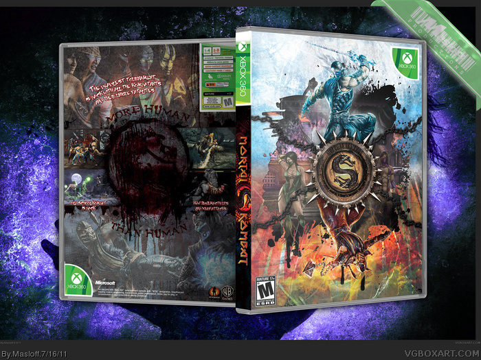
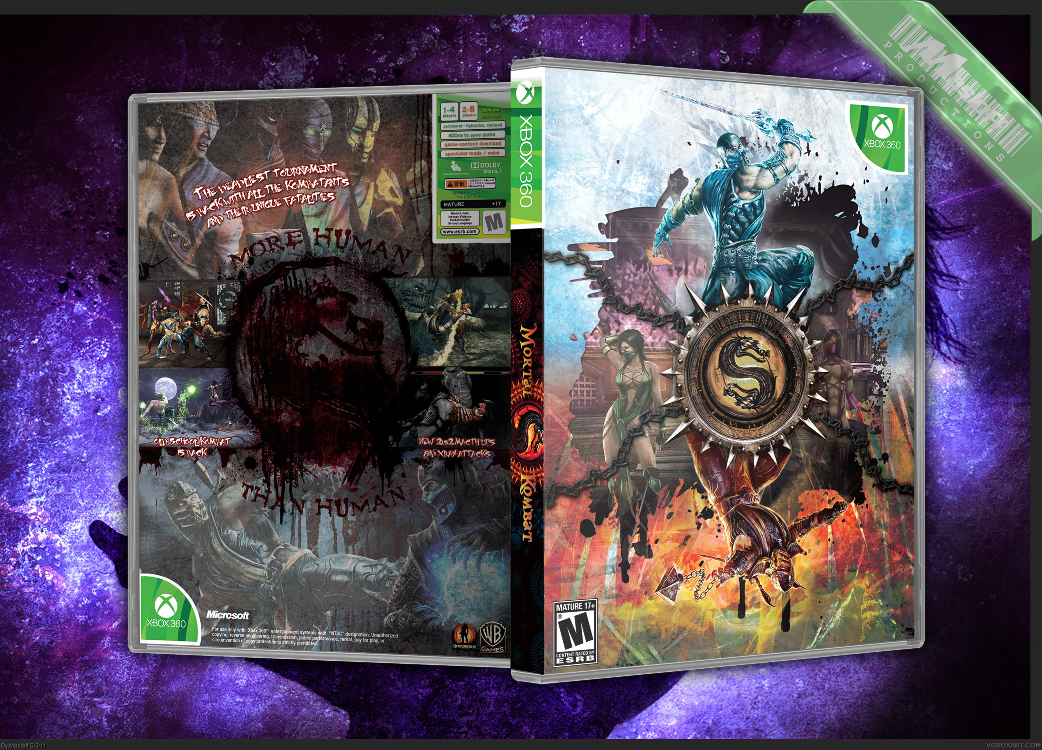
mortal_kombat [ Buy Mortal Kombat at Amazon ] By Masloff 44 on May 3rd, 2011 No Printable Available [ Box updated on July 16th, 2011 ] [ original ] Mortal Kombat Box Cover Comments Comment on Masloff's Mortal Kombat Box Art / Cover. Cancel Reply Masloff 44 [ 1 decade ago ] love it or hate it. I'm not going to stop anyone from hating it. but I like it, and I'm printing it. (this is the CMYK version, prolly going to upload the RGB version on DevaintArt) [ Reply ] jevangod 50 [ 1 decade ago ] Very nice. Not a big fan of the font on the side logo. [ Reply ] Masloff 44 [ 1 decade ago ] yeah i could'nt find anything... that has to be the worst part of the box [ Reply ] pigeon_face 30 [ 1 decade ago ] I actually like this a lot. It may as well be an essence box. Find a more suitable font or just get rid of it. [ Reply ] Daemon 46 [ 1 decade ago ] The front is absolutely brilliant. The back...not so much. [ Reply ] the7kEX 14 [ 1 decade ago ] Never would have thought to use the JP Dreamcast style in this way. The front is pretty amazing. [ Reply ] aelixus 46 [ 1 decade ago ] The front is awesome! But the back is too dark, and characters look like fading. [ Reply ] TandyQ 4 [ 1 decade ago ] Absolutely love this, especially the way you did the 360 branding. Very nice! [ Reply ] TandyQ 4 [ 1 decade ago ] Computer screwed up, my apologies. Edited at 1 decade ago [ Reply ] TheSlyder 41 [ 1 decade ago ] Most of it isn't really that amazing to me, but I'd really like to compliment you on the minimal console-template. I love it. [ Reply ] Masloff 44 [ 1 decade ago ] Spine fixed, Printable always uploads corrupted, so Printable must be requested personally - (both 360 & PS3 versions available) [ Reply ] Der HellRazor 15 [ 1 decade ago ] This is honestly amazing in my opinion. It's not often that you see a game front that is unique only by the logo and some characters. Also the back is also pretty effective. May I request a printable for Xbox 360? Favourite :) [ Reply ] nikolaz20 1 [ 9 years ago ] esta genial, como lo descargo¿' [ Reply ]
 Mortal Kombat Box Cover Comments
love it or hate it. I'm not going to stop anyone from hating it.
but I like it, and I'm printing it. (this is the CMYK version, prolly going to upload the RGB version on DevaintArt)
[ Reply ]
Very nice. Not a big fan of the font on the side logo.
[ Reply ]
yeah i could'nt find anything... that has to be the worst part of the box
[ Reply ]
I actually like this a lot. It may as well be an essence box. Find a more suitable font or just get rid of it.
[ Reply ]
The front is absolutely brilliant. The back...not so much.
[ Reply ]
Never would have thought to use the JP Dreamcast style in this way. The front is pretty amazing.
[ Reply ]
The front is awesome! But the back is too dark, and characters look like fading.
[ Reply ]
Absolutely love this, especially the way you did the 360 branding. Very nice!
[ Reply ]
Computer screwed up, my apologies.
Edited at 1 decade ago
[ Reply ]
Most of it isn't really that amazing to me, but I'd really like to compliment you on the minimal console-template. I love it.
[ Reply ]
Spine fixed, Printable always uploads corrupted, so Printable must be requested personally - (both 360 & PS3 versions available)
[ Reply ]
This is honestly amazing in my opinion. It's not often that you see a game front that is unique only by the logo and some characters. Also the back is also pretty effective.
May I request a printable for Xbox 360?
Favourite :)
[ Reply ]
esta genial, como lo descargo¿'
[ Reply ]