Yeah, I like this, it comes across more of a movie box than a game. Which is what Rockstar are going with the game in a way, so this matches perfectly.
Oh come on, this is BEGGING for more attention. Whilst the front is a little too pale, the whole feel of this box is epic, and the battered back is also amazing.
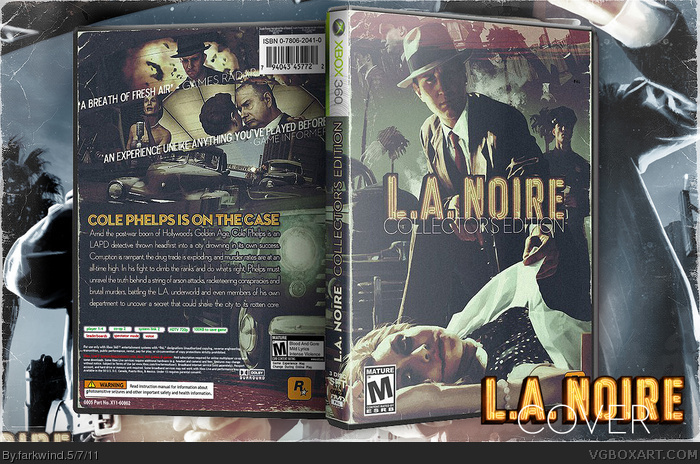
 L.A. Noire Box Cover Comments
Deliberately decided to leave the top label off to keep that blockbuster feel to it. I'm happy with it.
[ Reply ]
Yeah, I like this, it comes across more of a movie box than a game. Which is what Rockstar are going with the game in a way, so this matches perfectly.
[ Reply ]
Wow, really good! I just don't like story texts too much. They are too big.
[ Reply ]
Oh come on, this is BEGGING for more attention. Whilst the front is a little too pale, the whole feel of this box is epic, and the battered back is also amazing.
[ Reply ]
great work,please add printable ver.
[ Reply ]
#5, Will have it up by sometime tomorrow (that's what she said)
Thanks for the comments and fav's fellas.
[ Reply ]
dcgfbhjknhbgvfcdwsdefrgthyujkioojhbnjb vbhcdfghjhgfghjhgfghjvbbvcfvghnbvfgb-8767890-=po0i9u8yt6fr5e4dfr bhyjuikjhgfrd5t67y8ui
Sorry.. just wiping the jizz off my keyboard.
[ Reply ]
Elegant.
[ Reply ]
Grade A. Really reminds me of an old 40s/50s flick. Top stuff.
[ Reply ]
#9, Exactly what I was going for. Cheers!
[ Reply ]
I love the pale, faded look to the cover. Really adds to the feel of a 50's crime movie.
[ Reply ]
Printable will be added sometime this week!
[ Reply ]
Damn. It looks like someone just took a picture of it. The rough edges, it's amazing. 10/5!
[ Reply ]
Damn it looks so gooD!!!! Printable please.
[ Reply ]
Excellent! I really like the raw feel and the saturated color.
to bad for me, that it's made for 360 :( I own a PS3.
[ Reply ]