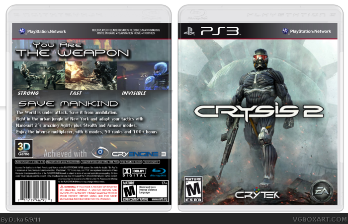
The front's nice, actually. The EA and Crytek logos are too large, though.
The back's main issue is the text. There's too many varying sizes and font types, and it's all a bit confusing and unappealing to look at. Usually in a cover, it's best to stick to two, maybe three fonts. A flashier one fitting of the game's theme for the tagline, and something more simple and easy to read for the synopsis. Of course, a synopsis is actually needed first. A smaller body of text would be easier on the eyes over what you have now.
I'd also mention the coloring on the back. The cover would be much more consistent and feel complete with a color scheme following through from the front to the back. More muted, foggy colors for the back would work.
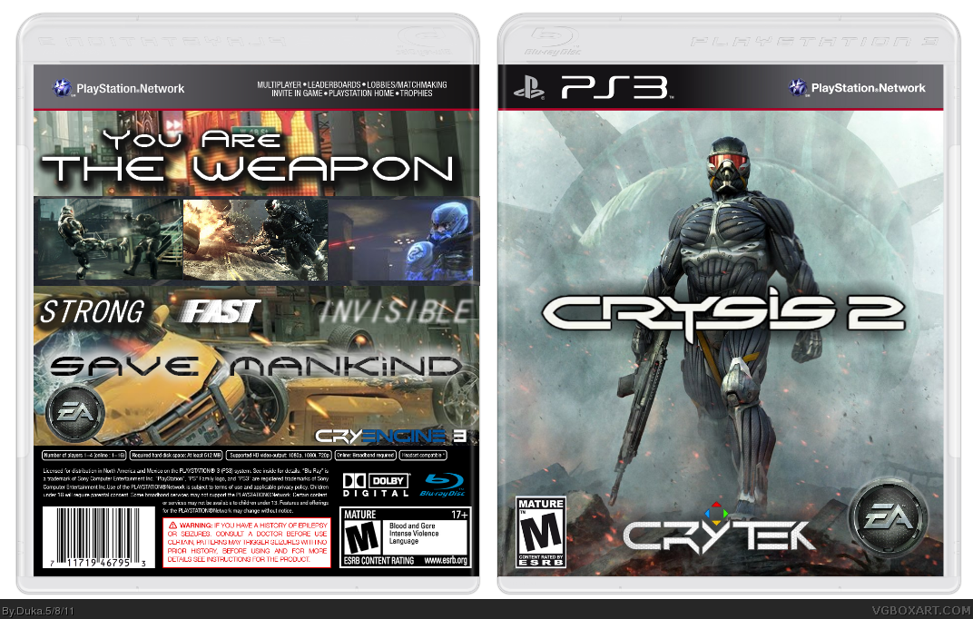
Definitely an improvement. It's great to see you can take criticism and apply it to better your design.
Now that the back is a little more organized, the drop shadow on the larger text seems a bit too prominent, due to it's size compared to the text itself.
 Crysis 2 Box Cover Comments
Credit: template by deiviuxs
[ Reply ]
The front's nice, actually. The EA and Crytek logos are too large, though.
The back's main issue is the text. There's too many varying sizes and font types, and it's all a bit confusing and unappealing to look at. Usually in a cover, it's best to stick to two, maybe three fonts. A flashier one fitting of the game's theme for the tagline, and something more simple and easy to read for the synopsis. Of course, a synopsis is actually needed first. A smaller body of text would be easier on the eyes over what you have now.
I'd also mention the coloring on the back. The cover would be much more consistent and feel complete with a color scheme following through from the front to the back. More muted, foggy colors for the back would work.
[ Reply ]
Is it better now?
[ Reply ]
Definitely an improvement. It's great to see you can take criticism and apply it to better your design.
Now that the back is a little more organized, the drop shadow on the larger text seems a bit too prominent, due to it's size compared to the text itself.
[ Reply ]