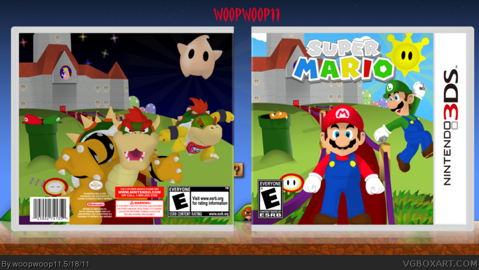
My most custom box yet and I think one of my best. Everything was drawn by me except the logo, as I wanted to make progress towards creating custom art. The logo is from tmrd in resources the template is from beardedwalrus.
Wow, very good! I love the concept :)
The only thing that isn't good about your custom work is there isn't very much shadowing on them. I posted a thread in the Tutorials section in the forums on how I make custom art. If you have a look in there you might be able to see in the last couple of steps how to make them look more realistic.
The layout and that though is fantastic! You're getting a fave from me :)
#2, Yeah this was my first real attempt at a custom box. I'll check out your tutorial.
#3, This was supposed to be without dev logos, etc. All of that got in the way of the stuff on the back and made it look pretty bad so I only left in those esrb logos.
I've got to be honest, it does look incomplete without anything on the back, and i think you could get it on there if you played around with it a bit.
However, the amount of effort you've put into making this is simply mind blowing. I've tried my hand at doing what you've done here, and i've got to say it certainly is quite time consuming and requires a bit of skill to get right. Kudos for having a go, and even a bigger kudos for actually pulling it off.
Good work, fav for the massive amount of effort here, along with an author fav for branching out and creating something this complex.
I think the back's issue speaks for itself. The lack of any information, both legal or game-related, is a turn off. It simply looks incomplete, and gives off a feeling of rushed work that lacks the same care that seems to have gone into the front.
Now about the front, I like the concept but the placement of a few pieces is bothering me. Pushing Luigi off to the side is strange, and I think you'd have been better off decreasing his size and giving the sense that he's further back, in the distance, and not cut off on the side. The logo could be centered too, and that tail isn't very appealing, especially with the grey color.
You have something good here, with just a few adjustments to the front it'd be really quite nice. The back, however, is in need of substantially more work to make it a complete package.
#6, thanks for the comment. I'll revise this, but there really isn't supposed to be any game related info on the back. I don't see how I can add this, but I will make those other adjustments and add legal info.
I really like this art style and I just like the box in general! I don't think seems that official though because you know how Nintendo is. Who wants my 3DS FC?
#8, I think anyone would like to see some work out of you. All you seem to do is complain, even if just a little, on so many boxes. What do you mean by 'FC'? Football club?
 Super Mario 3D Box Cover Comments
My most custom box yet and I think one of my best. Everything was drawn by me except the logo, as I wanted to make progress towards creating custom art. The logo is from tmrd in resources the template is from beardedwalrus.
[ Reply ]
Wow, very good! I love the concept :)
The only thing that isn't good about your custom work is there isn't very much shadowing on them. I posted a thread in the Tutorials section in the forums on how I make custom art. If you have a look in there you might be able to see in the last couple of steps how to make them look more realistic.
The layout and that though is fantastic! You're getting a fave from me :)
[ Reply ]
I noticed this in WiP and I don't quite get why you've uploaded it before finishing it. Unless it's meant to have no text, dev logos, screens, etc.
[ Reply ]
#2, Yeah this was my first real attempt at a custom box. I'll check out your tutorial.
#3, This was supposed to be without dev logos, etc. All of that got in the way of the stuff on the back and made it look pretty bad so I only left in those esrb logos.
[ Reply ]
I've got to be honest, it does look incomplete without anything on the back, and i think you could get it on there if you played around with it a bit.
However, the amount of effort you've put into making this is simply mind blowing. I've tried my hand at doing what you've done here, and i've got to say it certainly is quite time consuming and requires a bit of skill to get right. Kudos for having a go, and even a bigger kudos for actually pulling it off.
Good work, fav for the massive amount of effort here, along with an author fav for branching out and creating something this complex.
Edited at 1 decade ago
[ Reply ]
Nice custom work, the effort shows.
I think the back's issue speaks for itself. The lack of any information, both legal or game-related, is a turn off. It simply looks incomplete, and gives off a feeling of rushed work that lacks the same care that seems to have gone into the front.
Now about the front, I like the concept but the placement of a few pieces is bothering me. Pushing Luigi off to the side is strange, and I think you'd have been better off decreasing his size and giving the sense that he's further back, in the distance, and not cut off on the side. The logo could be centered too, and that tail isn't very appealing, especially with the grey color.
You have something good here, with just a few adjustments to the front it'd be really quite nice. The back, however, is in need of substantially more work to make it a complete package.
[ Reply ]
#6, thanks for the comment. I'll revise this, but there really isn't supposed to be any game related info on the back. I don't see how I can add this, but I will make those other adjustments and add legal info.
-updated
Edited at 1 decade ago
[ Reply ]
I really like this art style and I just like the box in general! I don't think seems that official though because you know how Nintendo is. Who wants my 3DS FC?
[ Reply ]
#8, I think anyone would like to see some work out of you. All you seem to do is complain, even if just a little, on so many boxes. What do you mean by 'FC'? Football club?
Edited at 1 decade ago
[ Reply ]
Woop I love it! Great job on the custom artwork too. Fav+ for the box and author :)
[ Reply ]
Excellent job, i love this!
[ Reply ]
Just amazing, but the back (top right corner) seems empty, even with the luma there.
[ Reply ]
This deserves a lot more attention.
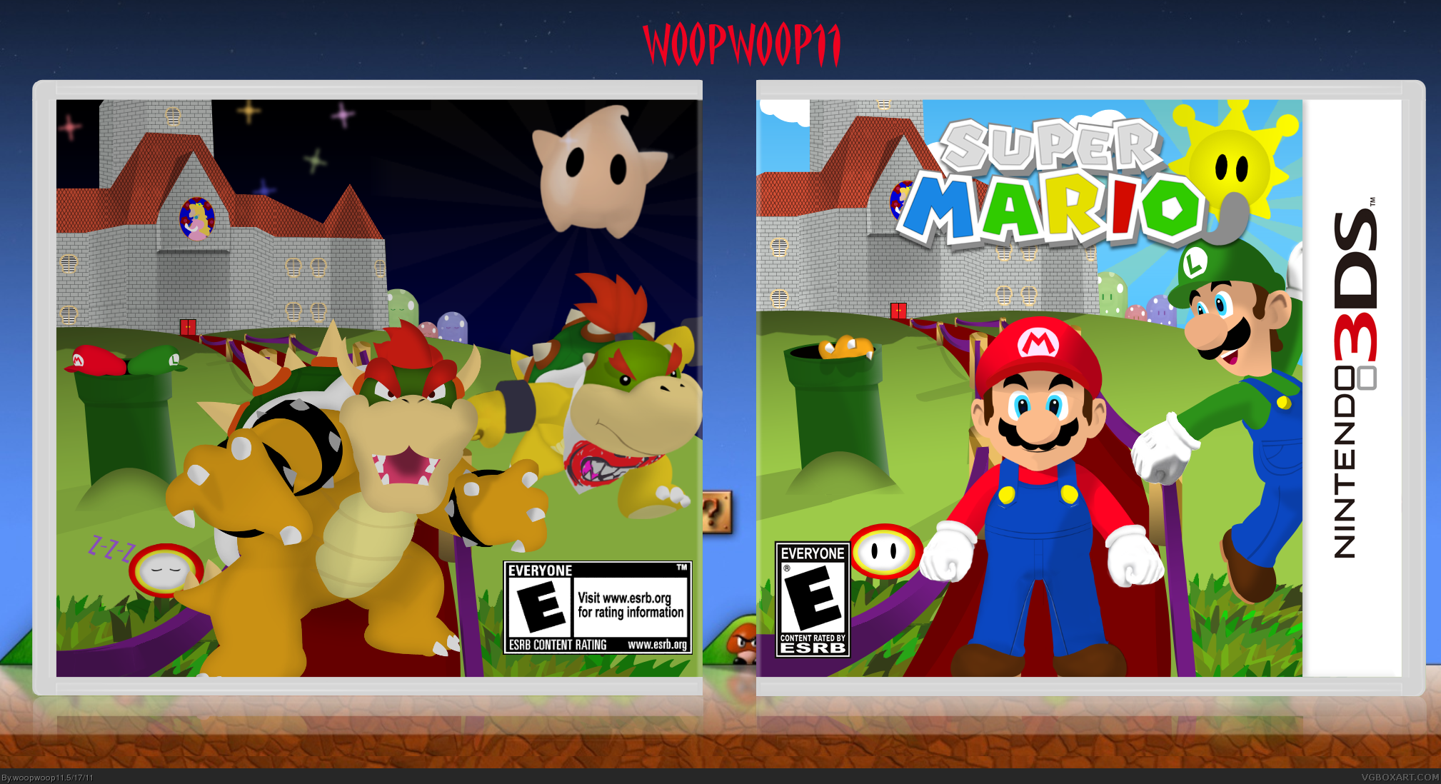
This update is very good, it seems more like a box.
[ Reply ]