So this was going to be my pink box for the VGBA Cup, then I remembered it had to be last gen. Anyway, this took some work. Enjoy and please comment if you have anything to say about the box.
Please view in full and credit goes to Pan for the template.
The layout isn't bad at all, but I don't think the grunge/dark background fits the game at all. It doesn't go well with the artwork/logos/tagline either. If you went with a simple background that matched the game better, I think this would be improved quite a bit.
You've made pink work well here, but I agree to a certain extent about the grunge backdrop, it could either use extra work, or just be changed from that style completely.
However, the one thing preventing me from favouriting is that horrid tagline. Change that up to something more appealing, and tell me so - I'll come back to favourite.
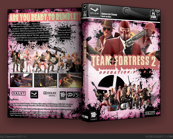
 Team Fortress 2 - Operation: P.I.N.K. Box Cover Comments
So this was going to be my pink box for the VGBA Cup, then I remembered it had to be last gen. Anyway, this took some work. Enjoy and please comment if you have anything to say about the box.
Please view in full and credit goes to Pan for the template.
[ Reply ]
Nicely done. I really like the pinky-ness of it, lol.
[ Reply ]
The layout isn't bad at all, but I don't think the grunge/dark background fits the game at all. It doesn't go well with the artwork/logos/tagline either. If you went with a simple background that matched the game better, I think this would be improved quite a bit.
[ Reply ]
Cool, pink really does suit this game, oddly enough
[ Reply ]
You've made pink work well here, but I agree to a certain extent about the grunge backdrop, it could either use extra work, or just be changed from that style completely.
However, the one thing preventing me from favouriting is that horrid tagline. Change that up to something more appealing, and tell me so - I'll come back to favourite.
[ Reply ]