Here is my submission, I had so many ideas for so many games, but it boiled down to this one game. I'm posting so late because I'm at McDonalds (because my Internet keeps shutting off, and I fear I will miss the deal-line)
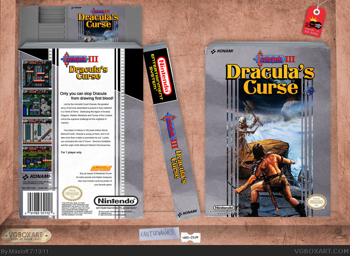
The presentation is supposed to look like a run-down old store
Stellar! My only complaint is that the creases and wear of the box doesn't show through on the art or the images on the back. You've also got a couple creases on the sticker for the NES cart that makes it look a little funny. Just nit-picking on that second one, though. It's almost negligible.
VERY well put together.
I can't help but notice the Sonic doodle and "Castlevania sucked" on the desk(?) in the presentation.
#4, I tried to make the wear and tear so on all of the parts, but some of the colors just don't cooperate. Thanks for the critique. And it's saposed to be a shelf in an old store, "Castlevania 2 sucked" is what I put... can't believe you spotted those XP
Wow, that's really cool. Why would you hide that, Masloff? Well, I guess it doesn't really look that 80's, but it's pretty cool image use. On my laptop, it looked stark white, and on my desktop I wasn't able to see it until Pan mentioned it.
Very official looking and well done. It's a shame you hid that image in the back center. My little nitpick is that you didn't use the red Nintendo logo. Don't worry much about that, though. Great job!
#9, I told him to get rid of the image on the back, because it's inconsistent with the artwork on the front. JUST to annoy me though, he lowered it to 1% opacity instead of really getting rid of it, he's done this to annoy me some times before.
#10, I'm sorry, his rebellious act gave me a chuckle. I absolutely see your point, though. It's a point that I made on Watson's box. Only Watson's was a much worse offense.
Anyway, I don't know if it's Masterworks level, but I would definitely like to see it hit HoF.
 Castlevania III: Dracula's Curse Box Cover Comments
Here is my submission, I had so many ideas for so many games, but it boiled down to this one game. I'm posting so late because I'm at McDonalds (because my Internet keeps shutting off, and I fear I will miss the deal-line)
The presentation is supposed to look like a run-down old store
Hope you all like it =D
[ Reply ]
Love it, fucking love it.
[ Reply ]
Just when you think you've seen the big hitters in this comp along comes this box.
SO.MUCH.WIN.
Edited at 1 decade ago
[ Reply ]
Stellar! My only complaint is that the creases and wear of the box doesn't show through on the art or the images on the back. You've also got a couple creases on the sticker for the NES cart that makes it look a little funny. Just nit-picking on that second one, though. It's almost negligible.
VERY well put together.
I can't help but notice the Sonic doodle and "Castlevania sucked" on the desk(?) in the presentation.
Edited at 1 decade ago
[ Reply ]
#2, thanks bro CX
#3, that is so nice to hear
#4, I tried to make the wear and tear so on all of the parts, but some of the colors just don't cooperate. Thanks for the critique. And it's saposed to be a shelf in an old store, "Castlevania 2 sucked" is what I put... can't believe you spotted those XP
[ Reply ]
#5, Also don't think I didn't notice the 1% opacity artwork on the back of the box. >:(
Edited at 1 decade ago
[ Reply ]
#6, link
Wow, that's really cool. Why would you hide that, Masloff? Well, I guess it doesn't really look that 80's, but it's pretty cool image use. On my laptop, it looked stark white, and on my desktop I wasn't able to see it until Pan mentioned it.
[ Reply ]
Not really any complaints here. It looks like an actual box from the era. And I do like the sketch as well.
[ Reply ]
Very official looking and well done. It's a shame you hid that image in the back center. My little nitpick is that you didn't use the red Nintendo logo. Don't worry much about that, though. Great job!
[ Reply ]
#9, I told him to get rid of the image on the back, because it's inconsistent with the artwork on the front. JUST to annoy me though, he lowered it to 1% opacity instead of really getting rid of it, he's done this to annoy me some times before.
[ Reply ]
Wow, this is really epic!
This is the way how a retro video game box should look.
I sniff a Masterwork here ;)
[ Reply ]
I don't think I'll get Masterworks (it's a nice thought)
consider the back art as an easter egg
[ Reply ]
#10, I'm sorry, his rebellious act gave me a chuckle. I absolutely see your point, though. It's a point that I made on Watson's box. Only Watson's was a much worse offense.
Anyway, I don't know if it's Masterworks level, but I would definitely like to see it hit HoF.
[ Reply ]
#12, well, than I'll have to make my own ;) presentation-wise it really does belong to MW.
Edited at 1 decade ago
[ Reply ]
#14, I couldn't find any materials for this box, so I used over 25 different pictures.
I used pretty much all the (classic) Castlevaina stuff in google
[ Reply ]