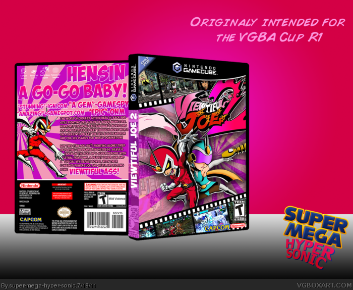
But the spine bugs me. It doesn't work with either the back nor the front. It's to "Patterned" to fit in. It's looks cut off, I guess.
That, and the white bits in the film.
Fix that, and you've got yourself a fav, my good sir!
Not to offend you or anything but I quite like the white bits in the film and to be frank it's my box and it's a creative decision that I want to keep them. However I will change the spine. Can you suggest a colour?
The front looks quite nice, but the back could use some work (even though I don't expect this cover to be updated since it was only used for a competition). It's a little bland with all that text, one Joe render, and that starburst background. You should cut the text almost in half and use the same "film-screenshot" effect you used on the front on the back. The front alone though warrants a fav for me.
3: Okay, okay, take a chill-pill.
Well, if you want to be true to the Gamecube covers, they usually just have black spines. But that's not too fun, is it?
Maybe try to incorperate the lighter pink rays onto the spine.
The spine is backwards, I think. The white text is boring, try adding the colors on the official on the text(e.g. "Viewtiful" pink, "Joe" red.). The tagline and quotes on the back are a little hard to read, try changing the colors up. Add some more of the film tapes on the back, for screenshots. And if it clearly says "Ass" on the box, why didn't you at least give a "Mild Language" rating?
The front is okay, I love it. And the presentation is probably the worst part here. a simple pink and red background, with a black and white gradient for the floor, no shadow or reflection under the box, simple pink text and a huge empty space. And on top of that, the redish pink in the presentation is an eyesore, and makes the box hard to see.
5/10
Depending on how/if you fix the problems above, you could get a 8/10.
#14, I put Viewtiful Joe screenshots into google and that's what came up. Sorry I haven't played A VJ game much at all. Expect a big over haul in a couple of days as I finish school for summer today so I should have some time.
 Viewtiful Joe 2 Box Cover Comments
This was going to be for the VGBA Cup R1 but I forgot to submit. Sorry guys.
[ Reply ]
Love it.
But the spine bugs me. It doesn't work with either the back nor the front. It's to "Patterned" to fit in. It's looks cut off, I guess.
That, and the white bits in the film.
Fix that, and you've got yourself a fav, my good sir!
[ Reply ]
Not to offend you or anything but I quite like the white bits in the film and to be frank it's my box and it's a creative decision that I want to keep them. However I will change the spine. Can you suggest a colour?
[ Reply ]
The front looks quite nice, but the back could use some work (even though I don't expect this cover to be updated since it was only used for a competition). It's a little bland with all that text, one Joe render, and that starburst background. You should cut the text almost in half and use the same "film-screenshot" effect you used on the front on the back. The front alone though warrants a fav for me.
[ Reply ]
#4, I agree, also you could add a faded pic over the back starburst to make it more interesting like the front.
[ Reply ]
I'll have a go at revamping the back tomorrow. I'll see what I can do.
[ Reply ]
3: Okay, okay, take a chill-pill.
Well, if you want to be true to the Gamecube covers, they usually just have black spines. But that's not too fun, is it?
Maybe try to incorperate the lighter pink rays onto the spine.
[ Reply ]
Okay thanks.
[ Reply ]
Whilst I find the back a bit overwhelmingly pink, the front is nothing short of superb.
[ Reply ]
A few problems I have:
The spine is backwards, I think. The white text is boring, try adding the colors on the official on the text(e.g. "Viewtiful" pink, "Joe" red.). The tagline and quotes on the back are a little hard to read, try changing the colors up. Add some more of the film tapes on the back, for screenshots. And if it clearly says "Ass" on the box, why didn't you at least give a "Mild Language" rating?
The front is okay, I love it. And the presentation is probably the worst part here. a simple pink and red background, with a black and white gradient for the floor, no shadow or reflection under the box, simple pink text and a huge empty space. And on top of that, the redish pink in the presentation is an eyesore, and makes the box hard to see.
5/10
Depending on how/if you fix the problems above, you could get a 8/10.
[ Reply ]
I think the back has to much text but the front is awesome!
[ Reply ]
The front is awesome, but the back has too much text...
[ Reply ]
Needs less text and some screenshots (on the back), but it's really too bad you didn't submit this.
Edited at 1 decade ago
[ Reply ]
I'm pretty sure I told you this in the WIP, but if I didn't or did, those screen shots on the front are all from Viewtiful Joe 1!
[ Reply ]
#14, I put Viewtiful Joe screenshots into google and that's what came up. Sorry I haven't played A VJ game much at all. Expect a big over haul in a couple of days as I finish school for summer today so I should have some time.
[ Reply ]
Beautiful.
[ Reply ]
Not bad at all. Spine is upside down ( gotcha (; ) but the design itself is real nice.
[ Reply ]