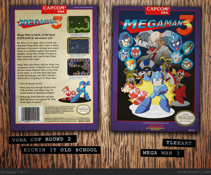
Here it is, ladies and gents, my box for Round 2. I had anticipated that I would need to make my own art, since the game is so old. Fortunately there's The Mega Man Network. link They have some nicely refurbished art, and I give them credit for all the character art.
I recreated the Capcom template from the official game's box, which I found on MobyGames. The logo is by me, based on the Rockman 3 logo.
I hope you guys like it. Also, for a good chuckle, go read the back of the official. The wording is really silly in parts, like "Mega Man goes berserk" and other gems.
I like it, it's so official, I am wondering about your submission though, it's sorta late. But maybe you got the ok for that. (just worried for your i guess)
looks damn official! hope you still can make it as a Competitor in the VGBA Cup?
with such a box (even if it's 2 days late) really deserves to be in it.
Damn, could have sworn the deadline said it was Wednesday, July 20th.
Sorry guys, I done goofed. I was way past the deadline, but I do want to show you guys what I did, since I worked so hard on it. So YEAH, thanks for stopping by. All I can say is I had a lot on my mind.
Again, sorry.
EDIT: Damn again, I read the Leaderboards date. Oh well. I didn't have much hope of winning, but I did have fun making the boxes I made for the comp, so that's what matters to me.
tleeart, because of the confusion I'm still offering you the chance to accept a 0 on this Round and move on. Next time I'll make a clear distinction between the two dates.
#8, Well, that further ensures that I'm gonna lose the competition, but why not? At least I can still officially make boxes for the comp this way.
I don't blame your wording at all for the mix-up, by the way. I accept that I hastily read the dates last time I checked on it, so I'm fully to blame for my confusion. However, I happily accept the opportunity. Thanks.
Certainly the best submission I've seen so far this round. A shame he won't let you submit... he hasn't even posted the Leaderboard yet. You would easily win this round.
If it makes you feel better, I would still take your submission, were it me. It's easy to make a mistake, especially when he has so many dates posted. Not taking a submission due to a mix-up seems a bit below-the-belt.
#12, I appreciate all the compliments, it means a lot coming from you. I'm completely fine with Flexx not accepting it, and I wouldn't ask him to. I was kinda surprised he offered to keep me in.
I'm really happy that people think this box is good.
#19, "Anyone else see anything wrong with this picture?"
Do we have to only choose one thing?
Tle, I think this is really good, but I disagree with Koopa/Thunder about it being the best in the competition. I feel like the gradient background leaves it lacking. Were the background different, I think it would give the box a lot of life and character. Aside from that I think it's a fantastic job, and you should certainly be proud.
I'm disappointed that it didn't make this round's entry deadline.
#19, The American version is even worse in some ways. It featured a Spark Man that looked nothing like himself. No Wily, no Proto Man.
On the EU Version, I love how the Proto Man render is a standing pose, tilted to look like he's jumping. Also, Wily looks deranged.
The Jap version is far and away the best. That was definitely a huge inspiration to this design.
#19, What would you have suggested for the background? I chose the simple gradient, since I have so much going with all the enemies. I mean no disrespect, I just can't think of a better way I could have solved this.
#24, I did not do much custom art. If I didn't word that well enough, I'm sorry. Much of the art was found on The Mega Man Network. Most of my work was in the template and logo.
#22, you could have experimented with things like a cityscape, or a solid colored background. Gradients like this weren't around in the 80's. Gradients existed, but they were usually the result of airbrushing or techniques like that.
I guess it's not that it's plain that makes it weird, it's that the gradient looks too much like "default photoshop gradient" technique" that often degrades the quality of an image.
#27, Yeah, I was aware that gradients were manually created, so they didn't happen much back then. I was hoping the two gradients I did wouldn't stick out too much. I'll see in a while if I can do something to make it look less 'shopped.
I am in love with this box. You have created something beautiful out of my favorite game of all time. I'm usually picky when it comes to my favorite games, but this is truly one of the greatest boxes I've seen!
Good luck in the competition, you deserve a good spot!
This box is all around amazing, if only this didn't post this too late, because I could see this box winning, or at the very least a step from the top.
 Mega Man 3 Box Cover Comments
Here it is, ladies and gents, my box for Round 2. I had anticipated that I would need to make my own art, since the game is so old. Fortunately there's The Mega Man Network. link They have some nicely refurbished art, and I give them credit for all the character art.
I recreated the Capcom template from the official game's box, which I found on MobyGames. The logo is by me, based on the Rockman 3 logo.
I hope you guys like it. Also, for a good chuckle, go read the back of the official. The wording is really silly in parts, like "Mega Man goes berserk" and other gems.
[ Reply ]
I like it, it's so official, I am wondering about your submission though, it's sorta late. But maybe you got the ok for that. (just worried for your i guess)
It's pretty great though.
[ Reply ]
One of greatest entries this round, though I thought the deadline was like 2 days ago.
Excellent job, nevertheless.
[ Reply ]
Agreed it looks really good, but I'm pretty sure you missed the deadline. Funny fact though, I also recreated the Capcom template and logo for my box.
[ Reply ]
looks damn official! hope you still can make it as a Competitor in the VGBA Cup?
with such a box (even if it's 2 days late) really deserves to be in it.
Edited at 1 decade ago
[ Reply ]
Damn, could have sworn the deadline said it was Wednesday, July 20th.
Sorry guys, I done goofed. I was way past the deadline, but I do want to show you guys what I did, since I worked so hard on it. So YEAH, thanks for stopping by. All I can say is I had a lot on my mind.
Again, sorry.
EDIT: Damn again, I read the Leaderboards date. Oh well. I didn't have much hope of winning, but I did have fun making the boxes I made for the comp, so that's what matters to me.
Edited at 1 decade ago
[ Reply ]
Dude, you would have gotten at least top 5 IMO. That sucks...
[ Reply ]
tleeart, because of the confusion I'm still offering you the chance to accept a 0 on this Round and move on. Next time I'll make a clear distinction between the two dates.
[ Reply ]
#8, Well, that further ensures that I'm gonna lose the competition, but why not? At least I can still officially make boxes for the comp this way.
I don't blame your wording at all for the mix-up, by the way. I accept that I hastily read the dates last time I checked on it, so I'm fully to blame for my confusion. However, I happily accept the opportunity. Thanks.
[ Reply ]
#9, Not giving up eh? Awesome!
[ Reply ]
#10, Of course not! If anything, this competition has been giving me interesting tasks to create more boxes.
[ Reply ]
Certainly the best submission I've seen so far this round. A shame he won't let you submit... he hasn't even posted the Leaderboard yet. You would easily win this round.
If it makes you feel better, I would still take your submission, were it me. It's easy to make a mistake, especially when he has so many dates posted. Not taking a submission due to a mix-up seems a bit below-the-belt.
[ Reply ]
This is stunning. Too bad it was late.
[ Reply ]
#12, I appreciate all the compliments, it means a lot coming from you. I'm completely fine with Flexx not accepting it, and I wouldn't ask him to. I was kinda surprised he offered to keep me in.
I'm really happy that people think this box is good.
[ Reply ]
Late or not, this is still great.
[ Reply ]
This is just simply out-standing.
[ Reply ]
A smile broke across my face when I saw this. :D
Great job!
[ Reply ]
Thanks so much, guys! Makes me feel like I did the game justice. It was the first Mega Man game I ever played.
[ Reply ]
#18, I am currently playing it now(playing all the classic mega man games). It does the game justice indeed, and looks a ton better than the official.
link
Does anyone else see anything wrong with this picture?
Edited at 1 decade ago
[ Reply ]
Very official looking. Clean and well done!
[ Reply ]
#19, "Anyone else see anything wrong with this picture?"
Do we have to only choose one thing?
Tle, I think this is really good, but I disagree with Koopa/Thunder about it being the best in the competition. I feel like the gradient background leaves it lacking. Were the background different, I think it would give the box a lot of life and character. Aside from that I think it's a fantastic job, and you should certainly be proud.
I'm disappointed that it didn't make this round's entry deadline.
[ Reply ]
#19, The American version is even worse in some ways. It featured a Spark Man that looked nothing like himself. No Wily, no Proto Man.
On the EU Version, I love how the Proto Man render is a standing pose, tilted to look like he's jumping. Also, Wily looks deranged.
The Jap version is far and away the best. That was definitely a huge inspiration to this design.
#19, What would you have suggested for the background? I chose the simple gradient, since I have so much going with all the enemies. I mean no disrespect, I just can't think of a better way I could have solved this.
Edited at 1 decade ago
[ Reply ]
Wow, this is amazing! It it probably my favourite box that was made for the round.
[ Reply ]
That's awesome, I love your custom art boxes!
Edited at 1 decade ago
[ Reply ]
#24, I did not do much custom art. If I didn't word that well enough, I'm sorry. Much of the art was found on The Mega Man Network. Most of my work was in the template and logo.
[ Reply ]
#25, Oh, sorry I didn't read carefully 1st comment, It still awesome, man. :D
[ Reply ]
#22, you could have experimented with things like a cityscape, or a solid colored background. Gradients like this weren't around in the 80's. Gradients existed, but they were usually the result of airbrushing or techniques like that.
I guess it's not that it's plain that makes it weird, it's that the gradient looks too much like "default photoshop gradient" technique" that often degrades the quality of an image.
[ Reply ]
I love it. Sorry I can't critique any thing, its just too awesome.
Edited at 1 decade ago
[ Reply ]
#27, Yeah, I was aware that gradients were manually created, so they didn't happen much back then. I was hoping the two gradients I did wouldn't stick out too much. I'll see in a while if I can do something to make it look less 'shopped.
[ Reply ]
I'm one of the rare people that has never played a Mega Man Game, but this box is quite well made. Good job, Tim.
[ Reply ]
#30, That's a shame. Go find a Mega Man game and play today!
But seriously, thanks!
[ Reply ]
#31, I'm about to go buy 4 of them. : D
But I'm already a big fan. : P
[ Reply ]
Had I not seen this cover here, I would've sworn it was official. Nice work, man.
[ Reply ]
#33, Yeah, I posted this while you were gone. Thanks, and thanks to everybody for their comments and favs!
[ Reply ]
I am in love with this box. You have created something beautiful out of my favorite game of all time. I'm usually picky when it comes to my favorite games, but this is truly one of the greatest boxes I've seen!
Good luck in the competition, you deserve a good spot!
fav + authour fav
[ Reply ]
#35, Well, I'm currently dead last, so I can't say how well I'll place, but I'm grateful for your words and support!
[ Reply ]
This box is all around amazing, if only this didn't post this too late, because I could see this box winning, or at the very least a step from the top.
[ Reply ]
#37, Thanks! Not to be cocky, but I'm pretty sure it would have done well.
[ Reply ]