This is nice.. Not your best... But defiantly good... Could you make a original Halo 4 cover... I haven't seen any... Maybe wait till we get some new screenshots for it.
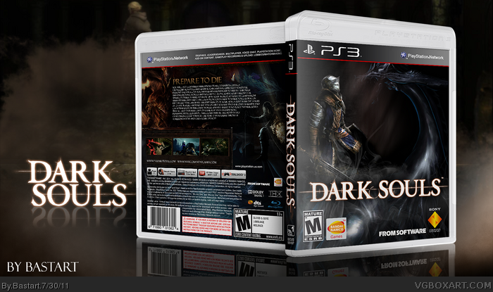
Not bad. The front nicely captures the essence of Dark Souls, if not in a more straightforward and traditional fashion. The lone soldier facing untold dark forces, a great image. If you can't tell by now, I'm very much looking forward to this game.
The back, while pretty text heavy, is a great continuation of the front. Dark and mysterious. Nice work.
#2, Thanks, Halo 4? Isn't that only for X360? I only have made PS3 boxes so far.
#3 Thanks, the front was the thing I was most proud of. Those things you mentioned
was ecxactly the idea I had, when I was making the cover, a soldier that has been beaten,
with a dragon circling around, ready to finish the job.
The back is most of the time a struggle, especially the synopsis.
with this game it's very hard to explain the whole element of the
game in a few words, at least I had trouble with it.
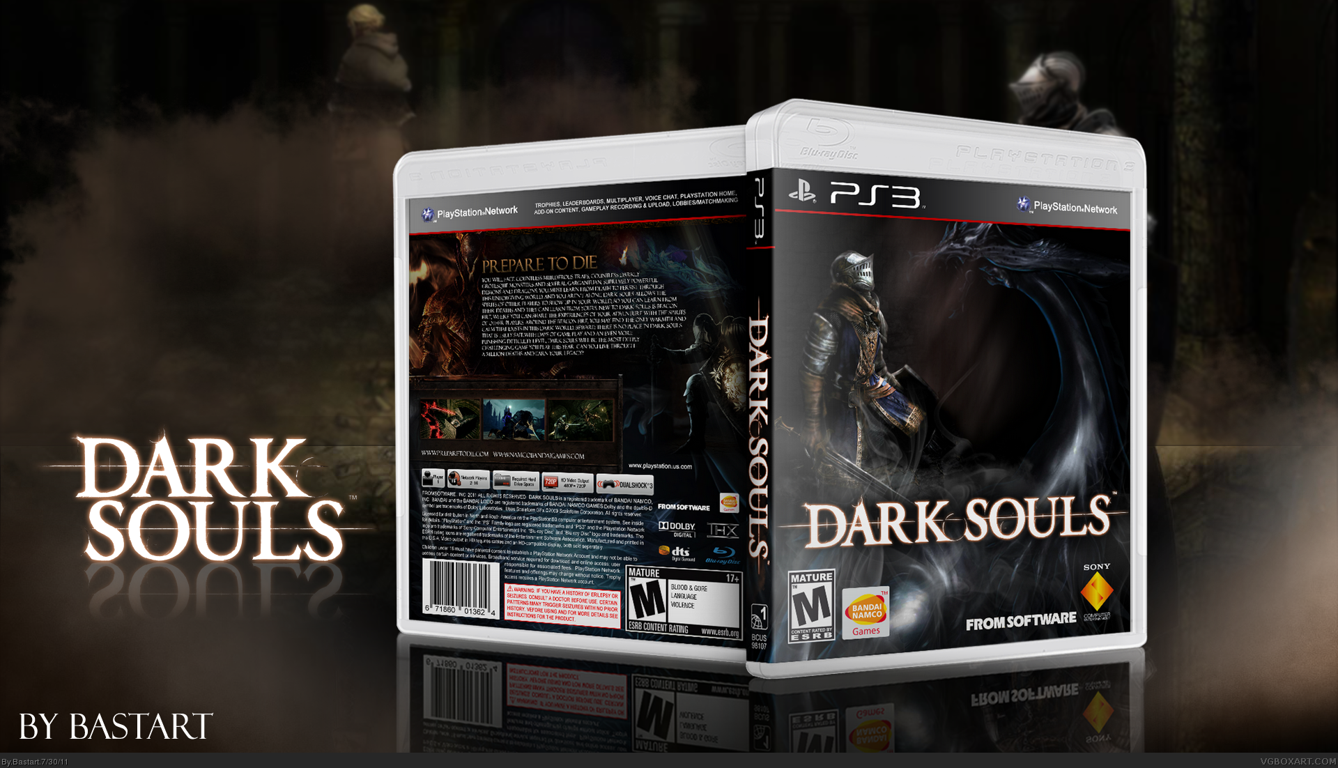
#3, Pretty much this, but I must say that I find the presentation a little too big, I want to see more of the box!
Still completely FAV worthy though :)
#5, Thanks, well I have pretty much left all the unnecessary parts out of the presentation, I see your point, though. Next time I'll try to make the box a bit bigger, it's a problem due the resolution, but I will try.
#7, if I make the box bigger it sill isn't readable. The resulotion of the box render done in Imandix,
is to low to make it bigger. Skewing isn't my best part, so I leave it to a program to make the render.
 Dark Souls Box Cover Comments
First off all I'd like to say I've cut out the Dark Souls logo myself,
later I saw that the logo was already in the resource section.
I've used this link wallpaper and this link piece of concept art to make the front.
Credits to Scorpion Soldier and Sens for the Templates.
Edited at 1 decade ago
[ Reply ]
This is nice.. Not your best... But defiantly good... Could you make a original Halo 4 cover... I haven't seen any... Maybe wait till we get some new screenshots for it.
[ Reply ]
Not bad. The front nicely captures the essence of Dark Souls, if not in a more straightforward and traditional fashion. The lone soldier facing untold dark forces, a great image. If you can't tell by now, I'm very much looking forward to this game.
The back, while pretty text heavy, is a great continuation of the front. Dark and mysterious. Nice work.
[ Reply ]
#2, Thanks, Halo 4? Isn't that only for X360? I only have made PS3 boxes so far.
#3 Thanks, the front was the thing I was most proud of. Those things you mentioned
was ecxactly the idea I had, when I was making the cover, a soldier that has been beaten,
with a dragon circling around, ready to finish the job.
The back is most of the time a struggle, especially the synopsis.
with this game it's very hard to explain the whole element of the
game in a few words, at least I had trouble with it.
Edited at 1 decade ago
[ Reply ]
#3, Pretty much this, but I must say that I find the presentation a little too big, I want to see more of the box!
Still completely FAV worthy though :)
[ Reply ]
#5, Thanks, well I have pretty much left all the unnecessary parts out of the presentation, I see your point, though. Next time I'll try to make the box a bit bigger, it's a problem due the resolution, but I will try.
[ Reply ]
Great box, but the box does need to be bigger, I cannot read any of the back synopsis, it could be the font or the size, but right now I'm not sure.
[ Reply ]
#7: The cover has definitely been downsized. Check out the printable.
[ Reply ]
#7, if I make the box bigger it sill isn't readable. The resulotion of the box render done in Imandix,
is to low to make it bigger. Skewing isn't my best part, so I leave it to a program to make the render.
The printable on the other hand, is much sharper.
Thanks for the faves everyone :)
Edited at 1 decade ago
[ Reply ]
I've tried to make it bigger, but it's still not readable from the render? any ideas how to make it sharper?
[ Reply ]