I Decided to post this before I go to the Beach today , Loll. I personally think this is my best box so far. This is also my First Box on Adobe Photoshop :D So View in Full and PLEASE Tell me What you Think ! ;)
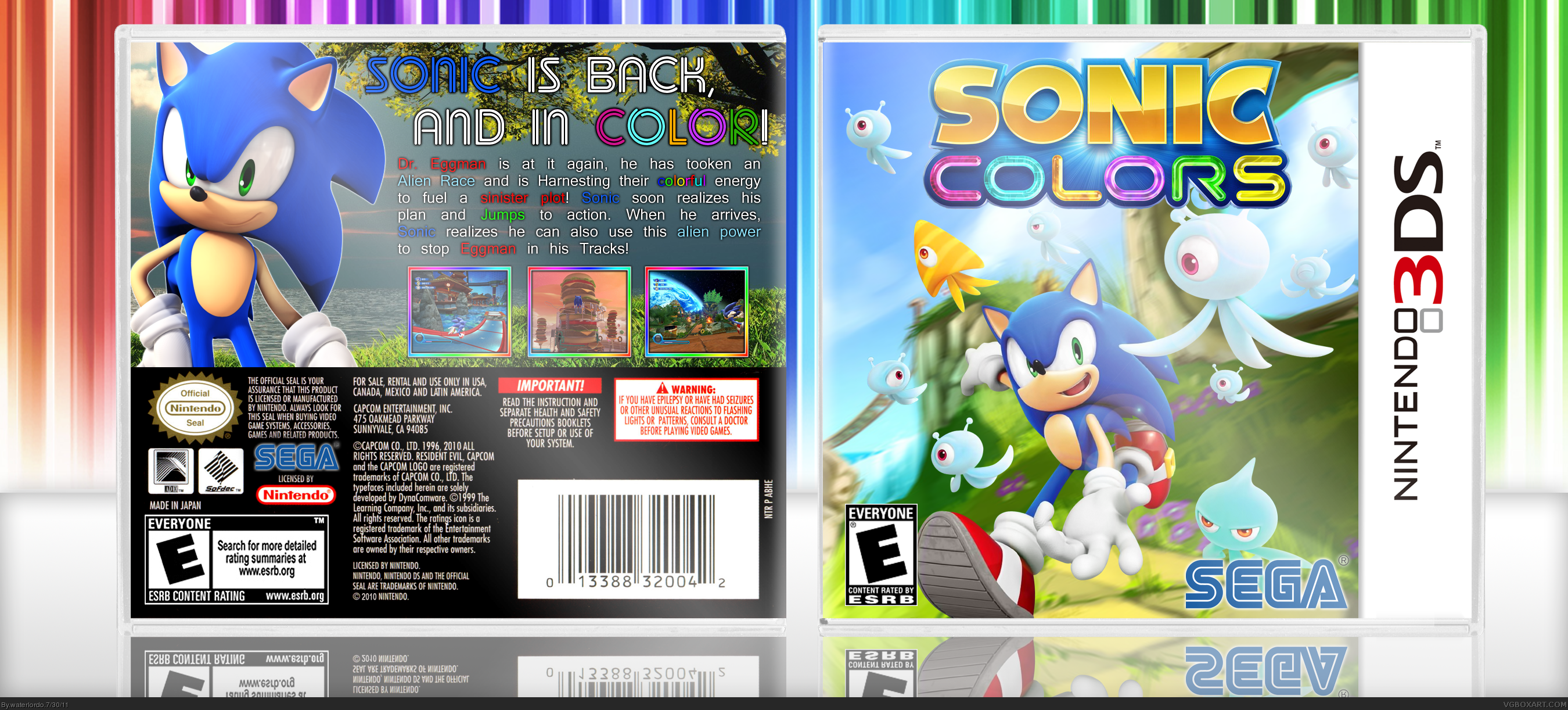
The front's not bad. Good quality material, nice colors and the blur gives a sense of speed and motion. I think it could be toned down though, assuming it was intentional in the first place. And a few of the Wisps could be removed, specifically the ones towards the outer edges of the cases. The large number and fact that most look similar make the cover much more crowded than necessary. Fix these issues and the front is solid.
Back has a few glaring flaws, almost exclusively with the text. The font selection is just a bit too plain and standard for a game like Sonic. You wouldn't necessarily have to use something in the vein of the Sonic logo, but simple edits like the glossy finish can go a long way in dressing up the text and making it more appealing. I'd also suggest, for the background, imagery from the game itself. The vibrancy and lighthearted feel is lost on the somewhat dreary, realistic scenery behind Sonic.
Really nice front...I like the lighting effects especially. The back, however, could use some work; the text especially is a little hard on the eyes. One of the hardest parts about making any boxart is the font choice...try www.dafont.com and search everything (they have thousands, so find a category that will suit your box,) and keep looking until you find a fit! Your concept is great...just fix the execution up a little, and you'll have a winner for sure.
I Updated it back to the original text , the other font looked horrible xD Now What do you guys think ? And IGNORE VERSION 2 , It was a Text Catastrophe xD
 Sonic Colors Box Cover Comments
I Decided to post this before I go to the Beach today , Loll. I personally think this is my best box so far. This is also my First Box on Adobe Photoshop :D So View in Full and PLEASE Tell me What you Think ! ;)
[ Reply ]
The front's not bad. Good quality material, nice colors and the blur gives a sense of speed and motion. I think it could be toned down though, assuming it was intentional in the first place. And a few of the Wisps could be removed, specifically the ones towards the outer edges of the cases. The large number and fact that most look similar make the cover much more crowded than necessary. Fix these issues and the front is solid.
Back has a few glaring flaws, almost exclusively with the text. The font selection is just a bit too plain and standard for a game like Sonic. You wouldn't necessarily have to use something in the vein of the Sonic logo, but simple edits like the glossy finish can go a long way in dressing up the text and making it more appealing. I'd also suggest, for the background, imagery from the game itself. The vibrancy and lighthearted feel is lost on the somewhat dreary, realistic scenery behind Sonic.
[ Reply ]
Really nice front...I like the lighting effects especially. The back, however, could use some work; the text especially is a little hard on the eyes. One of the hardest parts about making any boxart is the font choice...try www.dafont.com and search everything (they have thousands, so find a category that will suit your box,) and keep looking until you find a fit! Your concept is great...just fix the execution up a little, and you'll have a winner for sure.
[ Reply ]
Front: Excellent
Back: IDK why but i's not working =/
Overral: Great!
[ Reply ]
Front: Incredible :D
Back: Dull and bland D:
[ Reply ]
#4, Thanks and thanks for the Fav ;D #5, Thanks Also xD
[ Reply ]
Yeah, I pretty much agree. The front is really, really good but the back could use work.
[ Reply ]
#7, Thanks Loll , What is so bad about the Back ?! xD
[ Reply ]
#8, It's not offensively bad, but the text is kind of... eh. It could stand to maybe be in a different font and have a lighter shade to it.
[ Reply ]
#9, Should I Fix it and Update It ? Loll I Probably should xD
[ Reply ]
#10, That would be a good start, yes.
[ Reply ]
#11, What Kind of Font should I do ?
[ Reply ]
#12, This is just me, but something larger and blockier. Like, bright white. idklol
[ Reply ]
#13, The Description, right? Loll just making sure because I found a Perfect font for the Description :D
[ Reply ]
UPDATE TIME ! I Changed the Description font on the back , How do you guys like it ?! :D
[ Reply ]
The front is fantastic as others have said, the lighting is great. You have a good layout for the back, but the font choice for the text kills it.
[ Reply ]
I Updated it back to the original text , the other font looked horrible xD Now What do you guys think ? And IGNORE VERSION 2 , It was a Text Catastrophe xD
[ Reply ]
he front's prtty great, but the back has that darkness over it, and the text layout is kinda boring.
[ Reply ]