
[ Box updated on September 20th, 2006 ] [ original ]
 The Legend of Zelda: Twilight Princess Box Cover Comments
Comment on Selucresh's The Legend of Zelda: Twilight Princess Box Art / Cover.
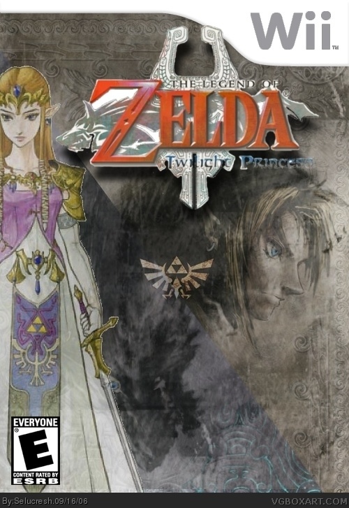
You're back! This box is AMAZING. I love the colors, and the Triforce in the center is great. If anything, I suggest moving the logo down a bit so it doesn't cover the Wii template, and you need to add dev logos. Since that'll be easy to do, I'll give you a 5/5 right away.
[ Reply ]
:D
Thanks alot! You're right about the dev logos. However, I put the logo on top of the template on purpose. I don't know, do you guys like it?
[ Reply ]
your best so far selucresh :)
but you should get a nintendo logo with white inside cause its hard to see. 5/5 nonetheless.
[ Reply ]
Not too shabby. The "Twilight Princess" text is hard to read and the title as a whole is a bit choppy. Also the Zelda image needs to be cut out better as you missed the spot between the sword and her. Overall i'm liking it. Keep it up.
[ Reply ]
You guys need to be way more selective, pay attention to detail. Don't throw around 5s so easily, otherwise everything is a 4 or 5.
The logo is poorly cut out, as is Zelda. Also the Nintendo logo is basically unreadable. I like where this is going, but at the moment it's around 2 or 2.5. Fix those issues and it'll bring it up a lot.
[ Reply ]
#5, You took the words right out of my mouth... or keyboard. :|
2.5/5
[ Reply ]
#5 yeah, the first ting i noticed was Zelda being cut out poorly. :(
i won't rate it unless you fix it, cause i think this has a lot of potential.
[ Reply ]
do u really need 2 nintendo logos? i dont really know if all nintendo made games have 2 of those but uh...if it does then i have nothing to say, but i seriously don't think there's a need for 2 nintendo logos. also fix every mentiobned b4 this...the template overall and idea is very unique. i would rate it 2/5 rite now, but it is one of the better ones ive seen so ill hold it off and c where in the spectrum it ends up...
[ Reply ]
Get Zelda out of the way, she's badly cut out and seems too off, and the overly glowing Nintendo logo, otherwise this is true to the template Nintendo put and a pretty darn good boxart.
[ Reply ]
flawed with minor errors...3/5
[ Reply ]
Fixed up zelda and added new logos. Hope you like it.
[ Reply ]
much better 4.5/5
[ Reply ]