I finally decided to ignore using screenshots and just upload this badboy. Yet another box in 3D. I recreated the official box aart using a few wallpapers, because of a lack of material (namely the balrog wallaper and the group wallpaper being the only ones I could find. Evevrything I sourced myself EXCEPT, the EA logo made by our own Bastart. I can send you a printable via PM, either console specific or console free. So enjoy and view via 3D glases to see it as it should be!
Here's a thought - Upload two versions, one with the 3D effect and one without. That way, people who don't have the glasses can see everything without feeling like we have a permanent hangover.
Anyway, on to the box - The back, as has been said, is pretty empty and giving off an unfinished vibe. The front is really good, but because it's so busy, it contrasts with the empty back.
I'm sorry, roza, but I don't like it. :(
The back seems very unfinished and the front is nearly identical to the official. I like that you made it 3D though.
Gotta agree with others. The back seems unfinished and empty and I don't like the fact that this is a 3D box. You should at least upload a 2D version as well. The colors are really nice though.
Agree with the others about the feeling of unfinished work of the back, and I agree with Deiviuxs that you should upload a non-3D version of the box, as well, though my principal complaint is that the logo in the spine uses the same font size for both title and subtitle; I think the subtitle should be smaller than the title, and maybe in a different style.
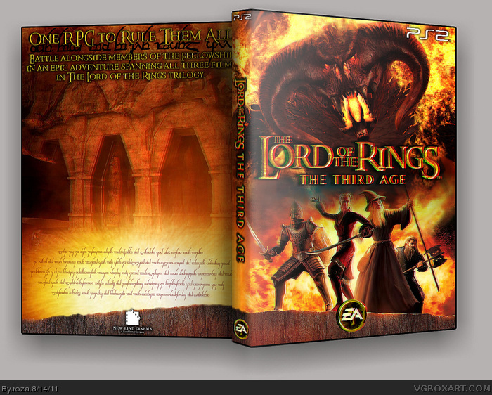
 The Lord of the Rings- The Third Age (3D) Box Cover Comments
I finally decided to ignore using screenshots and just upload this badboy. Yet another box in 3D. I recreated the official box aart using a few wallpapers, because of a lack of material (namely the balrog wallaper and the group wallpaper being the only ones I could find. Evevrything I sourced myself EXCEPT, the EA logo made by our own Bastart. I can send you a printable via PM, either console specific or console free. So enjoy and view via 3D glases to see it as it should be!
Edited at 1 decade ago
[ Reply ]
Would have looked better with screens IMO.
[ Reply ]
@2 I wanted to use screens but everything I tries was just off... I may try some other ways soon. But thanks for the fav man :)
[ Reply ]
#3, Okay man :)
[ Reply ]
It's a bit unfinished at the back, but that's already mentioned.
I really like the overall 'Flame Theme' You've used for the box,
Despite that the front looks similar to the original, you still
managed to give a different direction and a personal touch, great job!
I don't have a pair of 3D glasses, but I guess it looks 3D-ish.
Edited at 1 decade ago
[ Reply ]
Here's a thought - Upload two versions, one with the 3D effect and one without. That way, people who don't have the glasses can see everything without feeling like we have a permanent hangover.
Anyway, on to the box - The back, as has been said, is pretty empty and giving off an unfinished vibe. The front is really good, but because it's so busy, it contrasts with the empty back.
[ Reply ]
The back just seems empty...
[ Reply ]
I'm sorry, roza, but I don't like it. :(
The back seems very unfinished and the front is nearly identical to the official. I like that you made it 3D though.
[ Reply ]
Gotta agree with others. The back seems unfinished and empty and I don't like the fact that this is a 3D box. You should at least upload a 2D version as well. The colors are really nice though.
[ Reply ]
Agree with the others about the feeling of unfinished work of the back, and I agree with Deiviuxs that you should upload a non-3D version of the box, as well, though my principal complaint is that the logo in the spine uses the same font size for both title and subtitle; I think the subtitle should be smaller than the title, and maybe in a different style.
[ Reply ]