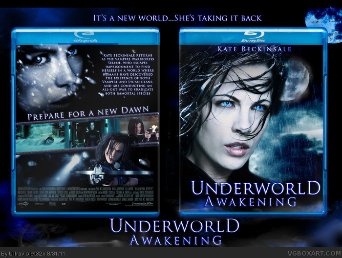
I just saw the new trailer for Underworld:Awakening yesterday and decided to make a box for it. There aren't too many pics released for the movie yet, but here's what I came up with. Enjoy! :)
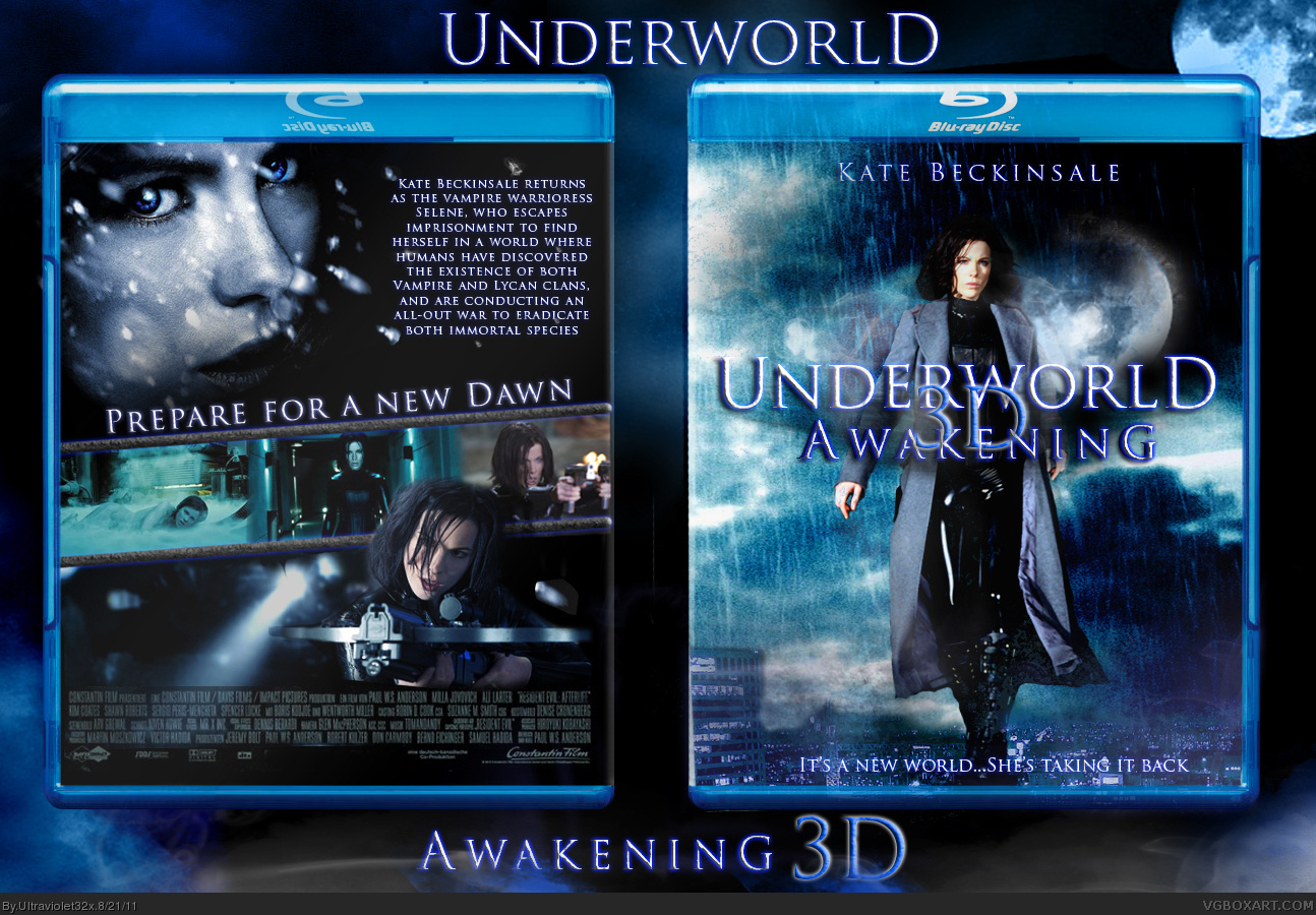
Update: I simplified the logo (took out the "3D" part). I think it makes it look a lot better. I also darkened the background a bit behind the tagline, making it clearer to read.
The front's actually pretty neat, although something looks off about Kate. She looks out of place, due to the colors/lighting. I like the blue color scheme though.
The new logo is an improvement, but I almost think it would be even better without that blue haze below "Underworld".
I've been trying to decide what to do with this box. I agree that Kate looked out of place. I decided to simplify the front design to feature mostly her face, rather than whole body. Hope everyone likes this one more!
 Underworld: Awakening Box Cover Comments
I just saw the new trailer for Underworld:Awakening yesterday and decided to make a box for it. There aren't too many pics released for the movie yet, but here's what I came up with. Enjoy! :)
[ Reply ]
I love it, but it's kinda hard to read the tagline on the bottom of the front, and that logo isn't all that appealing to me.
[ Reply ]
#2, I agree the logo looks a bit, thrown together.
but, I really like the back, very attractive.
[ Reply ]
Thanks everyone!
Update: I simplified the logo (took out the "3D" part). I think it makes it look a lot better. I also darkened the background a bit behind the tagline, making it clearer to read.
[ Reply ]
The front's actually pretty neat, although something looks off about Kate. She looks out of place, due to the colors/lighting. I like the blue color scheme though.
The new logo is an improvement, but I almost think it would be even better without that blue haze below "Underworld".
[ Reply ]
I've been trying to decide what to do with this box. I agree that Kate looked out of place. I decided to simplify the front design to feature mostly her face, rather than whole body. Hope everyone likes this one more!
[ Reply ]