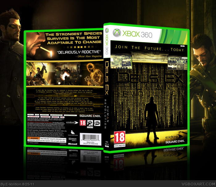
The title is incredibly hard to read, but the design is pretty nice. The screens on top of the front are a little distracting, and personally I think that it would look a lot better without them. The back is nice though.
When looking at it closer I really could see what you were trying to achieve. I only have a slight problem with the title, it really does blend in to much. try to figure out a way to make the title a little bit more visible. (as I wouldn't know what this game is about, I would read the back) but it just bugs me a bit, would definitely favor this, if you could find a way to solve this problem.
are those screens on top really necessary, I think it could do without :/
anyway, it's a really great design (just not so keen on the title)
well, I think you've got my message by now, I'll shut up about the 'Title' ;)
 Deus Ex: Human Revolution Box Cover Comments
Wow
[ Reply ]
The title is incredibly hard to read, but the design is pretty nice. The screens on top of the front are a little distracting, and personally I think that it would look a lot better without them. The back is nice though.
[ Reply ]
The back is epic but i dont like the front that much.
[ Reply ]
#2, I agree, but the concept is really nice, though.
[ Reply ]
#2, I worried about the title but I wanted it to come out from the "matrix code" and I didn't find another way to do it.
Otherwise thanks for comments and as always credit to ScorpionSoldier (Template)
[ Reply ]
unique look, well done!
at first i thought it was Neo on the front, but he had a longer coat:)
[ Reply ]
Maybe you could add a printable, so I could see a bit better, what you've done with the title?
Edited at 1 decade ago
[ Reply ]
#6, Thanks, I tried to be original.
#7, about the title, I painted it black to break with the gold matrix code, then I added a gold outline at the title to highlight it.
Also printable version added.
[ Reply ]
#8, Thanks for adding a printable version.
When looking at it closer I really could see what you were trying to achieve. I only have a slight problem with the title, it really does blend in to much. try to figure out a way to make the title a little bit more visible. (as I wouldn't know what this game is about, I would read the back) but it just bugs me a bit, would definitely favor this, if you could find a way to solve this problem.
are those screens on top really necessary, I think it could do without :/
anyway, it's a really great design (just not so keen on the title)
well, I think you've got my message by now, I'll shut up about the 'Title' ;)
Edited at 1 decade ago
[ Reply ]
#2, this.
[ Reply ]