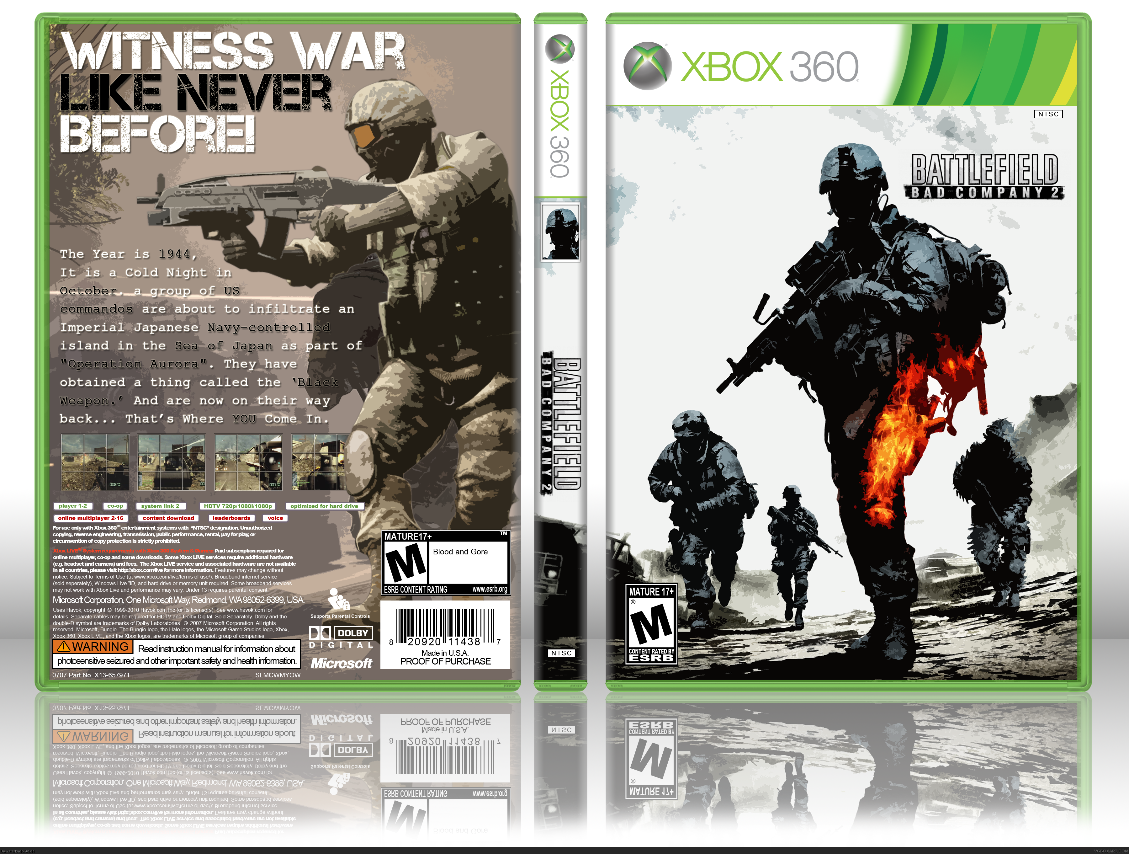
I think it's your best box, but you should make the back more white, to match the front, and make the screenshots bigger. Also, for the text on the back, try using a more readable font, and put less spacing between the lines. The logo on the front is way too tiny, and I don't like it's placement too much; make it bigger, lower it and center it.
 Battlefield: Bad Company 2 Box Cover Comments
Here It Is , My Battlefield Box. I spent ALOT of time on this so PLLEEEAASSSEE Comment ;) I think this is one of my Best Boxes so Far :D
Creds to Titan38 For The Template.
P.S: View In Full Please ! ;D
Edited at 1 decade ago
[ Reply ]
Anyone ... ? Loll.
[ Reply ]
I think it's your best box, but you should make the back more white, to match the front, and make the screenshots bigger. Also, for the text on the back, try using a more readable font, and put less spacing between the lines. The logo on the front is way too tiny, and I don't like it's placement too much; make it bigger, lower it and center it.
Your best box, anyway!
[ Reply ]
#3, I Tried matching the front to the back, I couldn't seem to do it. I don't know how to do that on Photoshop. :'( Loll
[ Reply ]
Nice box but it's missing dev logos on the front. Also, back text looks kinda strange. Other than that it looks really nice!
[ Reply ]
Update :P I added the Dev Logo :D
EDIT: Second Update xD I made the Dev logo smaller and Fixed the reflection :P
Edited at 1 decade ago
[ Reply ]
Nice job! the front box looks nice, i dont like the back cover.
[ Reply ]
#7, this.
Nothing seems to fit together.
[ Reply ]