
[ Box updated on September 21st, 2006 ] [ original ]
 Halo 3 Limited Collector's Edition Box Cover Comments
Comment on Radioactive Bob's Halo 3 Limited Collector's Edition Box Art / Cover.
[ Box updated on September 21st, 2006 ] [ original ]
Comment on Radioactive Bob's Halo 3 Limited Collector's Edition Box Art / Cover.
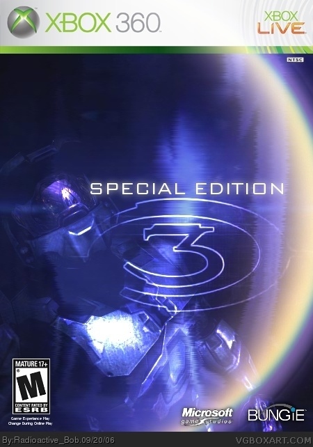
I did this one just for fun. So with that in mind, you can (hopefully) tell it looks a little...unique. anyways, i hope you like it :)
[ Reply ]
Cool. Has a great Special edition feel. 4/5.
[ Reply ]
not bad
[ Reply ]
I don't like it being like a rainbow though, maybe do a hue/satuartion thingy.
[ Reply ]
#2-3 thanx :)
#4, what do you mean "like a rainbow"? the ring on the right? i could do stuff with that ;)
[ Reply ]
#5, yeah is seems too colourfull and rainbow like for Halo which always has grittier colours, I'm just suggestion a color modify.
Its nice, could be better.
[ Reply ]
I made the ring a little more "dense" and made it look like it's part of the background, but still visible. i hope you like it :)
[ Reply ]
yeah I do, more suitable.
[ Reply ]
You did it for fun eh? lol dont we all? and I like version ONE! probably would have been a little better centerd.. the logo that is. :)
[ Reply ]
#8, thanx general
#9, when i mean "fun" i mean i wasn't starining my brain trying to make it look super awesome, just unique. but i'm glad you lik it, even if V1 suites you better =D
also, if the logo was centered, it was hard to make out and covered up Cortana quiet a bit.
[ Reply ]
#10, WOOPS! i meant it covers up Master Cheif more! lol, i forgot who got covered up until i looked back it...
[ Reply ]
I think this looks a lot cooler, i made it a little bit brighter, and made Cortana in the background easier to see and changed the logo position along with the Master cheif's position. :)
[ Reply ]
a 5? sweet, thanx to whoever gave me that score :)
[ Reply ]