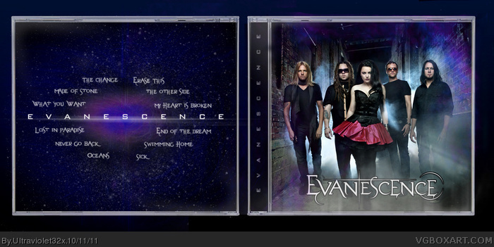
The front's nearly complete. I'd suggest moving the logo up a few notches so it isn't cut off at the edge, and maybe remove the top text. Having the band's name on the front twice is a bit redundant.
The back is an interesting concept, but I'm not sure of how well it works with a track listing, since each song name is going to vary in length and it ends up making the design feel lopsided and unbalanced. These are just my thoughts, of course.
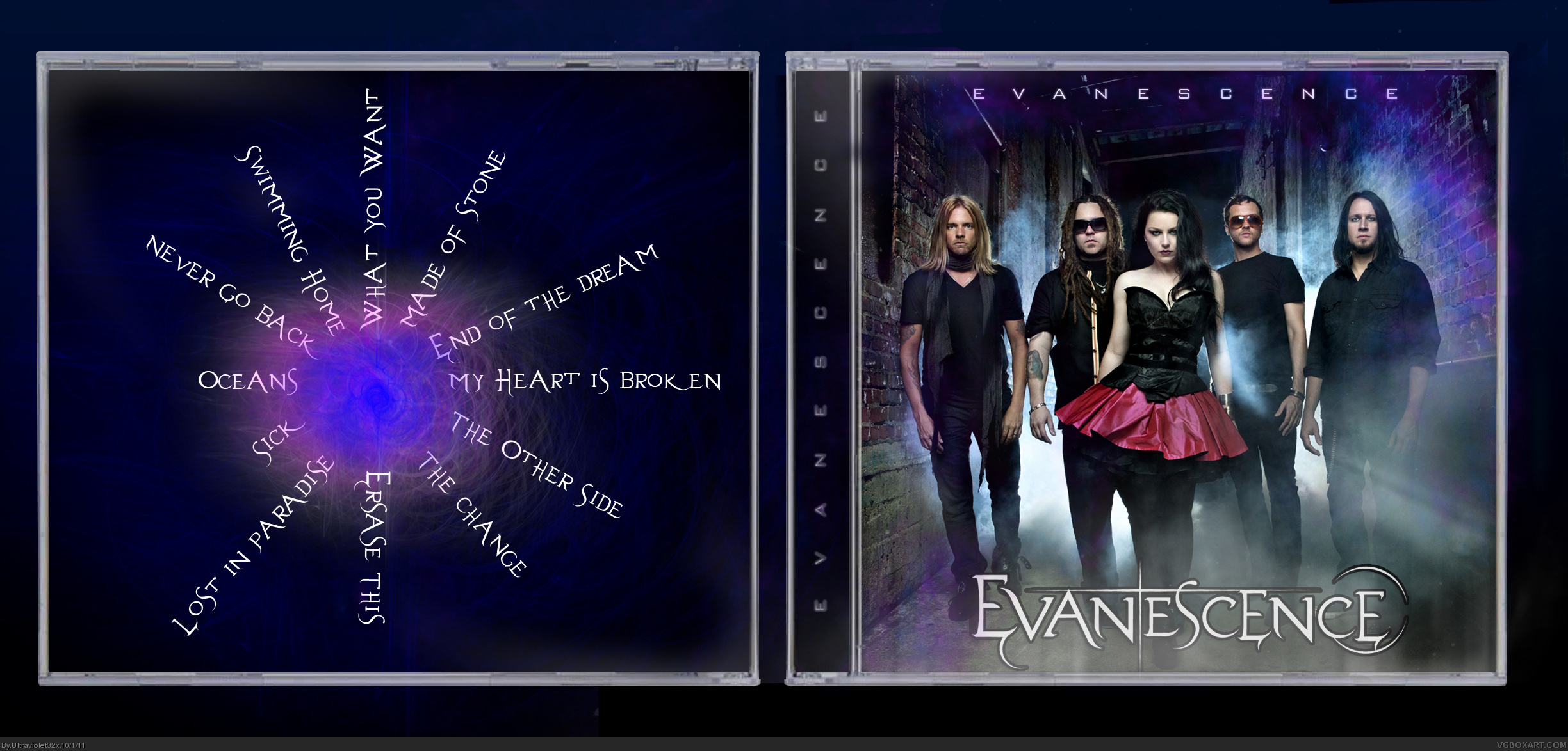
Update: I mainly kept the front the same, other than moving the "Evanescence" text slightly and removing the name from the top. As for the back, I kept the background, but decided to have the titles straight, rather than in a circle. I think it looks a lot more balanced.
 Evanescence - Evanescence Cover Comments
My album cover for Evanescence's new self-titled CD!
[ Reply ]
The front's nearly complete. I'd suggest moving the logo up a few notches so it isn't cut off at the edge, and maybe remove the top text. Having the band's name on the front twice is a bit redundant.
The back is an interesting concept, but I'm not sure of how well it works with a track listing, since each song name is going to vary in length and it ends up making the design feel lopsided and unbalanced. These are just my thoughts, of course.
[ Reply ]
Update: I mainly kept the front the same, other than moving the "Evanescence" text slightly and removing the name from the top. As for the back, I kept the background, but decided to have the titles straight, rather than in a circle. I think it looks a lot more balanced.
#2 Thanks for the feedback!
[ Reply ]
Doing good!
[ Reply ]
The back layout is much improved.
[ Reply ]