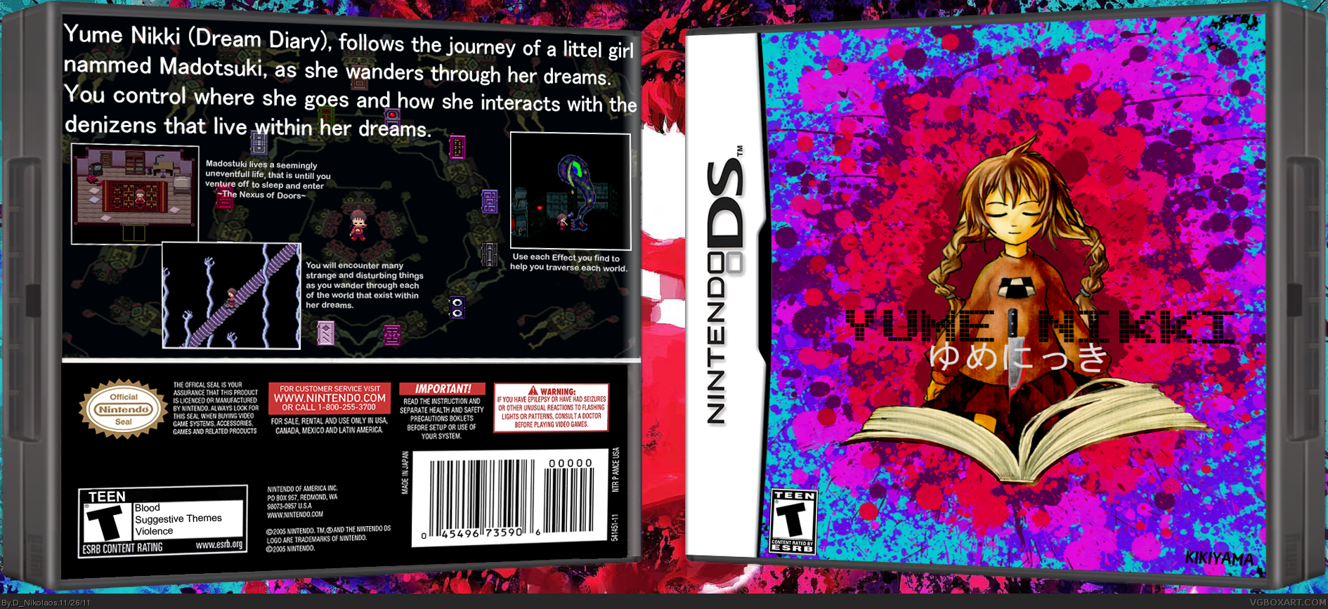
Hello everyone!
This is my second 3D rendered box, so I decided to make something that would just look good.
I used some fanart for the cover (which was done by NavyFurushima@ Iidabashi (?) link ), aswell as the image used behind the case (Unknown artist link ).
I actually took the concept for the cover itself from the image I used in the background, I loved the way they used colors and the blood splatter effect, so I did my best to recapture that effect wityhout using any of the original image. As for the image of Madotsuki on the cover, I only did minor touchups and some generic linework to make her look asleep. I also drew in her signature knife amidst the logo, I figured something Iconic from the game would look good.
This actually took me a lot longer than the Vampire Hunter D case I put up, taking up at least 5/6 hours.
Props to Ninty link & Sarashi link for their Templates, and to the people at Yume Nikki Wiki for their screen caps & info.
I hope that you all like this as much as I liked making it!
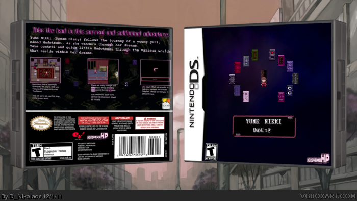
I've just updated my Yume Nikki Box, and thanks to some great critiquing at uboachan, I was able to revamp my box in a way that better suits the feel of the game.
Rather than the fan art based off of it.
I've updated logos, text, screen-shots, and cover.
All of the pixel art is directly taken from the game.
Props to Ninty and Sarashi for their Templates, the people at Yume Nikki Wiki, and last but not least props to the people at Uboachan who took the time to critique my original case.
love the source material :3 but I can't say i like the 2nd version the first could of just used some creative font choices and drop-shadow or outer glow, but i still like the version you had before just with some added stuff.
Thanks for commenting guys!
I went to uboachan because I wasn't actually getting any feedback here, and since it was a fan site devoted to this game I had the best chance to get some critiquing.
On Uboachan I got this critique:
"Apart from the spelling errors, I don't think it is actually wise to
show areas of the game apart from her room and the Nexus, since it would defeat the purpose of players finding those areas in the game for themselves.
Also, the cover seems a bit too brightly colored, which conflicts with the limited palettes that the game uses. Perhaps use a palette closer to the game's palette? The title is also a bit off-center, and it might be best to use the title screen in-game to give off a sense of mystery that the game has. The "KIKIYAMA" at the bottom right of the cover is a bit overshadowed by the colors as well.
Your font choice in the back cover is a bit wonky. Perhaps the large text should be a bit smaller.
Your ESRB rating is proper for the game. I give you props for that.
In general, it kinda needs a bit more work to be honest."
------
So after getting this message this morning I decided to go and re-make my case from scratch, since I accidentally only saved the original case as a .PNG, instead of first saving it as a .PSD
And so after another 4/5 hours of looking for either quality screen shots, or making them myself, I posted a new version in the thread I had made, which had new screen shots, borders, cover, text, dev logos. But after looking at it, it seemed to give off the same feel on the back; the text just kind of came off as unprofessional.
So, I went back and made some small edits to make this version here.
------
@twoxT - I greatly appreciate the fav.
@Biohazardbox7 - "Font choices and drop-shadow or outer glow, but i still like the version you had before just with some added stuff."
I'm not familiar with either of the terms "drop shadow" or "outer glow", are they a type of Photoshop tool? And if you've got some suggested fonts I should use, please link them, I could always use new font types.
------
And just so you guys know I also liked the cover I used before, again the reason I made it in the first place was to be a type of homage to the fan artists as well as the game itself. But I can also understand why it wouldn't fit for a game like this.
But please guys if you've got anything else on your minds please tell me, I want is to make this the best case that I can.
I didnt like the front at first but after a while it looked unique and creative but maybe you can add a texture to the background or some borders. As for the back, the layout could use some changes. Like maybe you can have the screenshots aligned. And for the font on the tagline try making it bold and put a outline to it. Pink font and black outline would look good.
I was actually going to try and put the same border for the screens on the back around the front, but it didn't seem to want to align right, but I could always give it another go. As for textures, I honestly wouldn't know what to do, but like I said before I'll give it a shot.
I'll also try what you suggested for the tag line.
Thanks a lot for your feedback and the fav! It's greatly appreciated!
Alright everyone!
I think I finally finished the Box!
But I'm going to do this in two updates, because I liked the way they both turned out but I'm going to put my favorite version as my "Final".
I took Deathmania's advice and decided to try out a few textures, but honestly when I started this I had no freaking clue what I was doing, so I used google to help me find my way around.
I found a lot of awesome and interesting textures, but two stood out to me the most, on my first "Final" version I used a "Dark Water Image". It gave off the mysterious and dark aspect that I wanted to capture with the cover that I had tried to do earlier with a simple black background.
Secondly I used a "Starry Sky Image", and after messing with it I found it gave off a much more visually pleasing sense of a mysteriously dark dream. I found this one to suit the game better than the first, but I still liked both versions.
I again took Deathmania's advice for the Tagline Font, and honestly this was THE MOST CHALLENGING THING FOR THIS BOX! I cannot stress that enough, I'd been trying to get a nice look going, but nothing seemed to work. That's when I found out why; I'd been thinking like I was using MSPaint, trying to make my fonts overlap to give a 3D kind of depth to them. After that it donned on me, all I had to do was choose the right font and then paint some color and blend, and TADA!
I also added and rearranged my dev logos, which are in fact the dev logos for RPG Maker 2003. I only made a slight personalization to one of them, because honestly I wanted to have my name on the box in some way/shape/or form.
(Hopefully I didn't fuck anything up and things can stay this way)
Anywho I want to thank you all for your feedback on this, and I can honestly say that I would've never gotten to this point without it.
I hope that you all like these new additions, and please if you have any further critiquing for this box, it is as always humbly accepted.
[EDIT]
Alright for some reason when I uploaded my first "Final" version the cover became WAY too dark and you can barely see the water in the background. If I'm only having this issue because of my monitor then my bad, but if anyone wants to see it I'll upload it to my DevianArt account (upon request) and place a link on my author page.
[I hate it when I'm right and all it does is make me look like a fool...]
Alright, well I didn't notice this last night but I guess I messed up on my so called "Final" box, I left the texture on the Cover unintentionally Pixelated, and so I'm going to update and post the corrected version of this box.
Thanks to everyone for your feedback on this, and please if you have any further critiquing for this box, go on and say what's on your mind.
Because I'm well aware that there is always room for human error.
----
Btw everyone I'm sorry for bumping my own box with these updates, and I'm really sorry if I bumped any new boxes off of the front page because of these updates.
Love it... I'm so, so glad Cave Story 3D was made. It is beautiful and people who hate it are only blinded by... er... bias.. of somekind. This is one of my favorite games of all time and mmmman I wish they did a 3D remake of this for the 3DS. They're kind of porting Corpse Party for the 3DS... it's not a 3D model remake, but... at least they're doing something. Ib and any other indie pixel game would be just perfect for the 3DS.
I do know there's a certain charm in pixel art and I like it a lot too, but... there's also a charm in remaking and demaking games and I freaking love that stuff.
Yeah, and I just registered just to comment this. I'm just really passionate about all this. I have other big dreams, but I could almost live only creating and supporting all things I just talked about.
 Yume Nikki Box Cover Comments
Hello everyone!
This is my second 3D rendered box, so I decided to make something that would just look good.
I used some fanart for the cover (which was done by NavyFurushima@ Iidabashi (?) link ), aswell as the image used behind the case (Unknown artist link ).
I actually took the concept for the cover itself from the image I used in the background, I loved the way they used colors and the blood splatter effect, so I did my best to recapture that effect wityhout using any of the original image. As for the image of Madotsuki on the cover, I only did minor touchups and some generic linework to make her look asleep. I also drew in her signature knife amidst the logo, I figured something Iconic from the game would look good.
This actually took me a lot longer than the Vampire Hunter D case I put up, taking up at least 5/6 hours.
Props to Ninty link & Sarashi link for their Templates, and to the people at Yume Nikki Wiki for their screen caps & info.
I hope that you all like this as much as I liked making it!
[ Reply ]
Hello Everyone!
I've just updated my Yume Nikki Box, and thanks to some great critiquing at uboachan, I was able to revamp my box in a way that better suits the feel of the game.
Rather than the fan art based off of it.
I've updated logos, text, screen-shots, and cover.
All of the pixel art is directly taken from the game.
Props to Ninty and Sarashi for their Templates, the people at Yume Nikki Wiki, and last but not least props to the people at Uboachan who took the time to critique my original case.
[ Reply ]
love the source material :3 but I can't say i like the 2nd version the first could of just used some creative font choices and drop-shadow or outer glow, but i still like the version you had before just with some added stuff.
[ Reply ]
It's a bit empty, but it's not too bad.
[ Reply ]
Thanks for commenting guys!
I went to uboachan because I wasn't actually getting any feedback here, and since it was a fan site devoted to this game I had the best chance to get some critiquing.
On Uboachan I got this critique:
"Apart from the spelling errors, I don't think it is actually wise to
show areas of the game apart from her room and the Nexus, since it would defeat the purpose of players finding those areas in the game for themselves.
Also, the cover seems a bit too brightly colored, which conflicts with the limited palettes that the game uses. Perhaps use a palette closer to the game's palette? The title is also a bit off-center, and it might be best to use the title screen in-game to give off a sense of mystery that the game has. The "KIKIYAMA" at the bottom right of the cover is a bit overshadowed by the colors as well.
Your font choice in the back cover is a bit wonky. Perhaps the large text should be a bit smaller.
Your ESRB rating is proper for the game. I give you props for that.
In general, it kinda needs a bit more work to be honest."
------
So after getting this message this morning I decided to go and re-make my case from scratch, since I accidentally only saved the original case as a .PNG, instead of first saving it as a .PSD
And so after another 4/5 hours of looking for either quality screen shots, or making them myself, I posted a new version in the thread I had made, which had new screen shots, borders, cover, text, dev logos. But after looking at it, it seemed to give off the same feel on the back; the text just kind of came off as unprofessional.
So, I went back and made some small edits to make this version here.
------
@twoxT - I greatly appreciate the fav.
@Biohazardbox7 - "Font choices and drop-shadow or outer glow, but i still like the version you had before just with some added stuff."
I'm not familiar with either of the terms "drop shadow" or "outer glow", are they a type of Photoshop tool? And if you've got some suggested fonts I should use, please link them, I could always use new font types.
------
And just so you guys know I also liked the cover I used before, again the reason I made it in the first place was to be a type of homage to the fan artists as well as the game itself. But I can also understand why it wouldn't fit for a game like this.
But please guys if you've got anything else on your minds please tell me, I want is to make this the best case that I can.
Edited at 1 decade ago
[ Reply ]
I didnt like the front at first but after a while it looked unique and creative but maybe you can add a texture to the background or some borders. As for the back, the layout could use some changes. Like maybe you can have the screenshots aligned. And for the font on the tagline try making it bold and put a outline to it. Pink font and black outline would look good.
[ Reply ]
Awesome, I'll try that out!
I was actually going to try and put the same border for the screens on the back around the front, but it didn't seem to want to align right, but I could always give it another go. As for textures, I honestly wouldn't know what to do, but like I said before I'll give it a shot.
I'll also try what you suggested for the tag line.
Thanks a lot for your feedback and the fav! It's greatly appreciated!
Edited at 1 decade ago
[ Reply ]
Alright everyone!
I think I finally finished the Box!
But I'm going to do this in two updates, because I liked the way they both turned out but I'm going to put my favorite version as my "Final".
I took Deathmania's advice and decided to try out a few textures, but honestly when I started this I had no freaking clue what I was doing, so I used google to help me find my way around.
I found a lot of awesome and interesting textures, but two stood out to me the most, on my first "Final" version I used a "Dark Water Image". It gave off the mysterious and dark aspect that I wanted to capture with the cover that I had tried to do earlier with a simple black background.
Secondly I used a "Starry Sky Image", and after messing with it I found it gave off a much more visually pleasing sense of a mysteriously dark dream. I found this one to suit the game better than the first, but I still liked both versions.
I again took Deathmania's advice for the Tagline Font, and honestly this was THE MOST CHALLENGING THING FOR THIS BOX! I cannot stress that enough, I'd been trying to get a nice look going, but nothing seemed to work. That's when I found out why; I'd been thinking like I was using MSPaint, trying to make my fonts overlap to give a 3D kind of depth to them. After that it donned on me, all I had to do was choose the right font and then paint some color and blend, and TADA!
I also added and rearranged my dev logos, which are in fact the dev logos for RPG Maker 2003. I only made a slight personalization to one of them, because honestly I wanted to have my name on the box in some way/shape/or form.
(Hopefully I didn't fuck anything up and things can stay this way)
Anywho I want to thank you all for your feedback on this, and I can honestly say that I would've never gotten to this point without it.
I hope that you all like these new additions, and please if you have any further critiquing for this box, it is as always humbly accepted.
[EDIT]
Alright for some reason when I uploaded my first "Final" version the cover became WAY too dark and you can barely see the water in the background. If I'm only having this issue because of my monitor then my bad, but if anyone wants to see it I'll upload it to my DevianArt account (upon request) and place a link on my author page.
Edited at 1 decade ago
[ Reply ]
[I hate it when I'm right and all it does is make me look like a fool...]
Alright, well I didn't notice this last night but I guess I messed up on my so called "Final" box, I left the texture on the Cover unintentionally Pixelated, and so I'm going to update and post the corrected version of this box.
Thanks to everyone for your feedback on this, and please if you have any further critiquing for this box, go on and say what's on your mind.
Because I'm well aware that there is always room for human error.
----
Btw everyone I'm sorry for bumping my own box with these updates, and I'm really sorry if I bumped any new boxes off of the front page because of these updates.
Edited at 1 decade ago
[ Reply ]
Love it... I'm so, so glad Cave Story 3D was made. It is beautiful and people who hate it are only blinded by... er... bias.. of somekind. This is one of my favorite games of all time and mmmman I wish they did a 3D remake of this for the 3DS. They're kind of porting Corpse Party for the 3DS... it's not a 3D model remake, but... at least they're doing something. Ib and any other indie pixel game would be just perfect for the 3DS.
I do know there's a certain charm in pixel art and I like it a lot too, but... there's also a charm in remaking and demaking games and I freaking love that stuff.
Yeah, and I just registered just to comment this. I'm just really passionate about all this. I have other big dreams, but I could almost live only creating and supporting all things I just talked about.
[ Reply ]