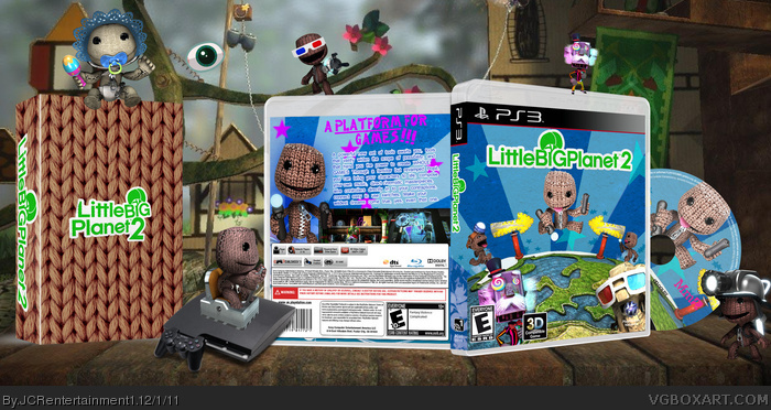
Not bad for a second. Of aspects that could be improved upon, image quality is probably most prevalent. That texture used for the background is undoubtedly low-res, especially seen on the disc. I doubt it'd be too difficult to find a new one of higher quality.
For the front layout, everything's here, and Sackboy jumping above the planet works well as the center focus of the design. I just think it could do with more vibrancy, more of the almost childlike innocence that seems to emanate from LittleBigPlanet. The new texture I mentioned could actually help with this. It's mainly the dark blue sky that's causing this, I think.
The text on the back is a little overbearing, although it's the only real issue. I'd recommend scaling it down and changing it's position to clear way for screenshots or additional renders. In addition to this, a simple drop shadow can go a long way in giving the illusion of paper cutouts, the text looking like it's really laying on a physical object.
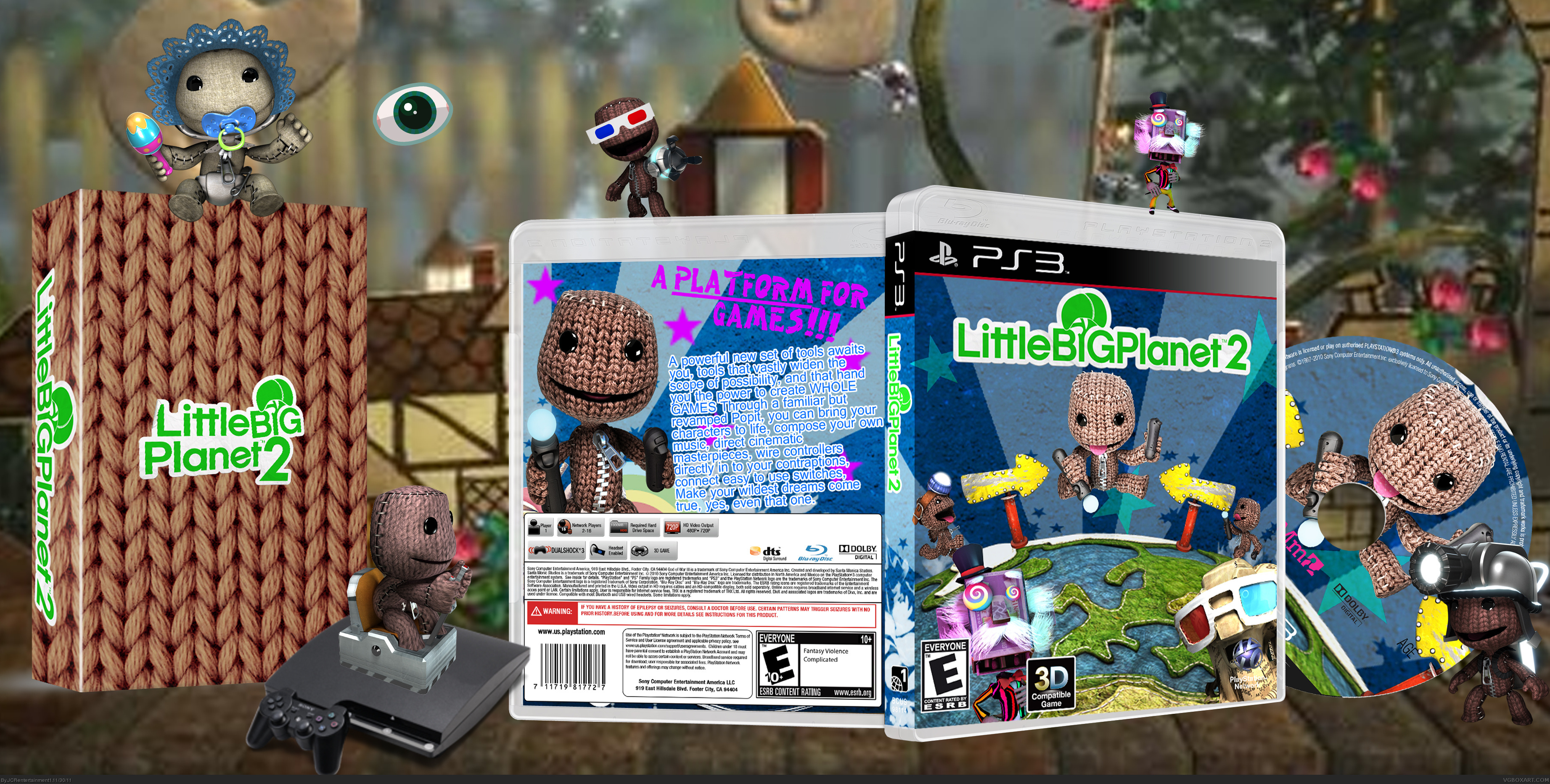
I like this a lot. Makes me want to start playing LBP2 again. Although I do find the presentation a little too large and distracting from the overall boxart.
Still, a good job here bud :)
 Little Big Planet 2 Box Cover Comments
My second box I hope you like it!
[ Reply ]
Not bad for a second. Of aspects that could be improved upon, image quality is probably most prevalent. That texture used for the background is undoubtedly low-res, especially seen on the disc. I doubt it'd be too difficult to find a new one of higher quality.
For the front layout, everything's here, and Sackboy jumping above the planet works well as the center focus of the design. I just think it could do with more vibrancy, more of the almost childlike innocence that seems to emanate from LittleBigPlanet. The new texture I mentioned could actually help with this. It's mainly the dark blue sky that's causing this, I think.
The text on the back is a little overbearing, although it's the only real issue. I'd recommend scaling it down and changing it's position to clear way for screenshots or additional renders. In addition to this, a simple drop shadow can go a long way in giving the illusion of paper cutouts, the text looking like it's really laying on a physical object.
Let me know if this is of any help.
[ Reply ]
Thanks ill do some of that soon
[ Reply ]
Ive done it but i uploaded the wrong one so i then i did it again. Thats why there are 3 updates. Is this what you wanted it to look like
(sd1833)?
[ Reply ]
I like this a lot. Makes me want to start playing LBP2 again. Although I do find the presentation a little too large and distracting from the overall boxart.
Still, a good job here bud :)
[ Reply ]
Thanks mate. Im glad you like it. I thought that the presentation was ok though.
[ Reply ]
The updated version looks much better. More like what I'd expect from a LBP cover while maintaining a level of professionalism. Nice work.
[ Reply ]
Thanks
[ Reply ]
I like it
[ Reply ]
I like how it looks childlike and proffesional at the same time.
[ Reply ]
#9-#10 Thanks
[ Reply ]
I have added a printable now
[ Reply ]