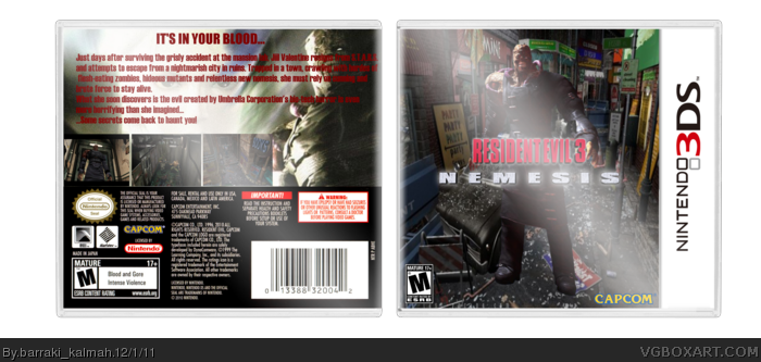
All of the right elements are in place, it's just that some of the choices and positioning could be better. For example, the angle of the backdrop don't match up with that of Nemesis. He looks like he's floating above the image rather than being a part of it.
The back's screenshot placement is a bit erratic. I'd suggest trying more consistent sizes, a cleaner layout too. You'd have some more space to work with the text, which is suffering because of the overbearing screens.
The screenshots are all over the place. Try keeping them all the same size, or at least make the differences less drastic. The one on the left takes up about half of the back cover, space that could be used to better organize the text.
Nice first box, but I think it would be a little better with this template link , and try a different font for the text on the back. Welcome to the site! Template made by jevangod.
Here's the new version. Changes:
As sd1833 says I changed size of screenshots and rotated Nemesis(bad, but I think it's okay). As darthnater says, changed font, It's In your blood was and stay Impact. Text now written by haetenschweiler, in first I used Arial.
And last, if you thinking it's Photoshop, you're wrong. I used Paint.NET, y'know.
 Resident Evil 3 Box Cover Comments
OK. It"s my first box.
I'll wait for your critics(and rotten tomatoes)
Credit to jevangod for the template of 3DS
box.
Edited at 1 decade ago
[ Reply ]
All of the right elements are in place, it's just that some of the choices and positioning could be better. For example, the angle of the backdrop don't match up with that of Nemesis. He looks like he's floating above the image rather than being a part of it.
The back's screenshot placement is a bit erratic. I'd suggest trying more consistent sizes, a cleaner layout too. You'd have some more space to work with the text, which is suffering because of the overbearing screens.
Keep at it, take critique and you'll do fine.
[ Reply ]
With background on face and Nemesis I know, I just rotate him. Back's shots - I don't understand what are you talking about. Text - okay.
Edited at 1 decade ago
[ Reply ]
I also have a cart image, but I don't want to publish it - it's just a logo of game on black background.
[ Reply ]
The screenshots are all over the place. Try keeping them all the same size, or at least make the differences less drastic. The one on the left takes up about half of the back cover, space that could be used to better organize the text.
[ Reply ]
Okay
[ Reply ]
I made(very quick. Will it depend on quality?) version 2, but I wait for other critics.
[ Reply ]
Nice first box, but I think it would be a little better with this template link , and try a different font for the text on the back. Welcome to the site! Template made by jevangod.
Edited at 1 decade ago
[ Reply ]
I downloaded both, but I think this template, which I used is , ugh, w/o problems with changing of ratings and all like this. But thanks for advice.
[ Reply ]
Here's the new version. Changes:
As sd1833 says I changed size of screenshots and rotated Nemesis(bad, but I think it's okay). As darthnater says, changed font, It's In your blood was and stay Impact. Text now written by haetenschweiler, in first I used Arial.
And last, if you thinking it's Photoshop, you're wrong. I used Paint.NET, y'know.
[ Reply ]