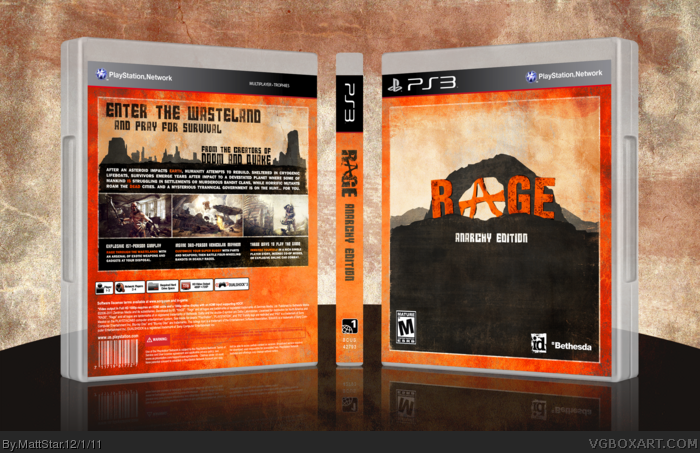
I ran out of inspiration 100% on this one, I'll be honest with you. I really like what I have, but hopefully I can update it in the future. This actually came to me in a dream (as oddly enough, a lot of my inspiration does) and I jumped on Photoshop at 5 am and got my idea down. In the end I'm happy with what I've made, and I hope you guys like it.
When I first saw this, I thought it was a Red Dead Redemption cover. I think it's the font on the back mainly (the tagline). Regardless, it's well made as usual. I really like it.
#9, Funny you should say that, the rock with the circle shape missing (whatever the hell those are called) on the front was based off of the rock in Mexico on Red Dead Redemption. I used the one from RDR as a base to trace, then I skewed it in a bit.
To be sure people will not mistake the box with Red Dead, why don't you try to put a vehicule as a shadow or an outline on the front? It's similar to #7.
I love this box, it just misses something on the front to make it awesome.
The text used for R, G and E on the front isn't sitting well with me. It's the textures, they're much heavier than that of the A, and looks out of place. Otherwise, the minimal layout and colors are pretty nice to look at.
Excellent design you got here, MattStar. I'm not too fond of the way the space under the legal info looks empty, and I think the logo on the spine should've been darker, but still an awesome design. Great work.
 Rage Box Cover Comments
I ran out of inspiration 100% on this one, I'll be honest with you. I really like what I have, but hopefully I can update it in the future. This actually came to me in a dream (as oddly enough, a lot of my inspiration does) and I jumped on Photoshop at 5 am and got my idea down. In the end I'm happy with what I've made, and I hope you guys like it.
[ Reply ]
Wow, words cant describe it.
[ Reply ]
5am??...lol
Anyways, the box is nice. Even though the front seems empty, I do like the overall look and warm colors. Good job.
+FAV
[ Reply ]
The back is awesome, but the front is a bit empty. Anyway, nice work!
[ Reply ]
Missing ESRB on the back, otherwise great work
[ Reply ]
Thanks guys.
[ Reply ]
It looks great. You could add this guy link as a bright silhouette in the dark area. Just a thought.
[ Reply ]
Yeah I was thinking of doing that, but I'm too afraid it will look unoriginal.
[ Reply ]
When I first saw this, I thought it was a Red Dead Redemption cover. I think it's the font on the back mainly (the tagline). Regardless, it's well made as usual. I really like it.
[ Reply ]
#9, Funny you should say that, the rock with the circle shape missing (whatever the hell those are called) on the front was based off of the rock in Mexico on Red Dead Redemption. I used the one from RDR as a base to trace, then I skewed it in a bit.
[ Reply ]
To be sure people will not mistake the box with Red Dead, why don't you try to put a vehicule as a shadow or an outline on the front? It's similar to #7.
I love this box, it just misses something on the front to make it awesome.
[ Reply ]
I like the simplicity of the box, and the colours are nice as well.
Good job ;)
[ Reply ]
I like it just the way it is, man. Great job.
[ Reply ]
Very creative. Great job. You get a fav from me.
[ Reply ]
The text used for R, G and E on the front isn't sitting well with me. It's the textures, they're much heavier than that of the A, and looks out of place. Otherwise, the minimal layout and colors are pretty nice to look at.
[ Reply ]
The front seems a little empty but I faved anyways because it's sexy.
[ Reply ]
Wow thanks for all the favs and comments everyone. I've been away for a couple days, and wow!
[ Reply ]
Excellent design you got here, MattStar. I'm not too fond of the way the space under the legal info looks empty, and I think the logo on the spine should've been darker, but still an awesome design. Great work.
Edited at 1 decade ago
[ Reply ]
I happen to like the emptiness of the front, and the style of the back reminds me of RDR, which is not a bad thing.
[ Reply ]
Thanks.
[ Reply ]
This cover is amazing, wish I had the PS3 version instead of the Xbox of it now. Just awesome, well done.
[ Reply ]
Thanks man
[ Reply ]
Congrats Matt . . .
[ Reply ]
That's well deserved, Matt.
[ Reply ]
Awesome! Thanks again everyone!
[ Reply ]