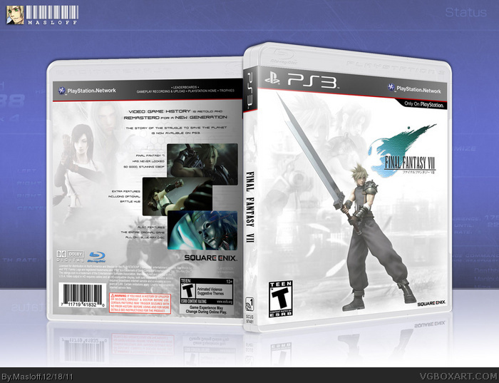
To be honest, I don't think that this looks like the FFXIII box.
It looks really plain; but enough to see the fading as a sort of faded memories way, which suits the game well. I would bring up the opacity of some of the important stuff for the background
I really think that the collage design for screenshots on the XIII cover would have been much cooler, but whatever.
I think the back really is very lacking in terms of content, and the same font recyled for all the text is quite boring.
I'm also not sure about the official VII box, but I think that JENOVA would be a big spoiler to those who had not played the game.
Finally, I would definetely upscale the SE logo, as it really should look bigger.
I hope that you find this more constructive than attacking; but I thought I could share my ideas.
I like the front, actually. It's simple, almost classy in a sense, and holds true to the original while adding a modern touch of it's own. All I'd suggest is fading Cloud to white - or at the very least brightening him up - towards the bottom half. How the background is ultra bright and washed out, with Cloud remaining dark and shaded, makes the image look off.
 Final Fantasy VII Box Cover Comments
The official FF7 box + the official FF13 box = my box
that's the formula I used to make this box. I tried to keep it.
I've had no time to really put my heart into it, as i've been working so much. I put work into it, but I feel I could've done more.
But with this being "my" last chance to post, better then nothing
[ Reply ]
Pretty sexy. In a minimal way.
[ Reply ]
To be honest, I don't think that this looks like the FFXIII box.
It looks really plain; but enough to see the fading as a sort of faded memories way, which suits the game well. I would bring up the opacity of some of the important stuff for the background
I really think that the collage design for screenshots on the XIII cover would have been much cooler, but whatever.
I think the back really is very lacking in terms of content, and the same font recyled for all the text is quite boring.
I'm also not sure about the official VII box, but I think that JENOVA would be a big spoiler to those who had not played the game.
Finally, I would definetely upscale the SE logo, as it really should look bigger.
I hope that you find this more constructive than attacking; but I thought I could share my ideas.
Edited at 1 decade ago
[ Reply ]
Damn! It was gonna do a remake FF7 box! Curses, you sort of beat me to it! Ah well, your is better than mine, anyway. :D
[ Reply ]
#3, That same Jenova screen shot is on the original box, it's not a spoiler.
[ Reply ]
I'll take this as a hint.
*gets up, walks out the door*
[ Reply ]
I like the front, actually. It's simple, almost classy in a sense, and holds true to the original while adding a modern touch of it's own. All I'd suggest is fading Cloud to white - or at the very least brightening him up - towards the bottom half. How the background is ultra bright and washed out, with Cloud remaining dark and shaded, makes the image look off.
Otherwise, nice work.
[ Reply ]
#7, Thank you for the very helpful critique , Much appreciated.
I will change it as soon as I get some time.
what a good friend
[ Reply ]