I felt 1/1/2012 was appropriate because this is like a 'fresh start' for me: I plan on becoming much more active with my boxes, I have many ideas that I feel I'm finally good enough to do right. Plus it's my 17th birthday :]
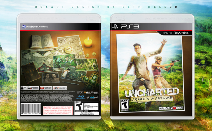
I had a lot of fun with this one, especially the back! Mainly this was a personal project, not mean't to be too official looking, I was really trying to practice things like lighting, prospective, and color balance. If you can't already tell, the concept for the back is Nathan's 'work' desk. I think it came out pretty nice.
Let me know what you guys think, I'd love some feedback!
Nice concept. I really like the back. I think the front would look nicer if it was just full picture (at the moment it gives the impression of a Platinum title, where the original game cover is set inside a border), but I guess that would look a bit out of sort with the back and spine.
Good job, what I am trying to figure out with the front, is what's happening. It would look more like a poster if their feet weren't shown, right now it looks like they are kind of floating, and Drake is jumping towards the screen over what looks like either a backdrop, or a large map.
It looks great but there are a couple of issues that bug me. The first one is the render of drake on the front, he just doesn't look right jumping towards the camera. The second one is that you have an uncharted 2 screenshot on the back.
But other than these problems, it looks awesome!
For the most part, I really like the back and all of the elements in play. I just wish it were... larger? Perhaps? Certain images, like the journal holding the synopsis, feel too small and out of focus. A bit more polish could have gone into the production, I think. Combining some of the more traditional aspects of a cover into the realism of Drake's documents scattered about, like strips of paper describing key features in the game, would have benefited the box as a whole. If I were to put it simply: there's a lot of potential, but it looks incomplete.
The front I don't have much to suggest. It's fine as is, the lighting is strong and the colors are nice. I'd have liked it even more if you would have gone the extra mile and continued the back's theme, with stuff scattered about around the picture.
All in all, it's solid but not without its flaws. Good work.
 Uncharted: Drake's Fortune Box Cover Comments
And finally, a new box!
I felt 1/1/2012 was appropriate because this is like a 'fresh start' for me: I plan on becoming much more active with my boxes, I have many ideas that I feel I'm finally good enough to do right. Plus it's my 17th birthday :]
I had a lot of fun with this one, especially the back! Mainly this was a personal project, not mean't to be too official looking, I was really trying to practice things like lighting, prospective, and color balance. If you can't already tell, the concept for the back is Nathan's 'work' desk. I think it came out pretty nice.
Let me know what you guys think, I'd love some feedback!
~Seth
[ Reply ]
Awesome job one the box and happy birthday! :)
[ Reply ]
Nice concept. I really like the back. I think the front would look nicer if it was just full picture (at the moment it gives the impression of a Platinum title, where the original game cover is set inside a border), but I guess that would look a bit out of sort with the back and spine.
Great job.
[ Reply ]
This came along nicely, great work.
And happy birthday, you're about a month older than me. :P
Edited at 1 decade ago
[ Reply ]
Thanks a lot guys, and Nonny I didn't even think about that, you're right.
[ Reply ]
Im not sold on the front but the back is flawless.
Edited at 1 decade ago
[ Reply ]
#6 Thank you. My weak point is definitely fronts, but all I can do is practice!
[ Reply ]
I'm actually not sold on the back. But the front I do like.
[ Reply ]
Good job, what I am trying to figure out with the front, is what's happening. It would look more like a poster if their feet weren't shown, right now it looks like they are kind of floating, and Drake is jumping towards the screen over what looks like either a backdrop, or a large map.
[ Reply ]
lol, This one looks like Nathan really happy when he have a great adventure! Love it, and Happy B-day too!
Edited at 1 decade ago
[ Reply ]
#10 Yea that was the goal! To make it bright and fun but still keep the gritty Uncharted theme lol
[ Reply ]
I was wondering why you deleted this.
I saw it on the front page and was all o:
Then it was gone.. D:
I love it.
Wait.. is your name really Seth Mcleod?.. That's badass.
Edited at 1 decade ago
[ Reply ]
Well the site is a few hours behind me, so it wasn't 1/1/12 yet lol, thank you though.
And it is, how's that badass? Haa, more like Scottish
Edited at 1 decade ago
[ Reply ]
#13, I'm American, to me that sounds pretty badass. xD
I don't think people around here know how to give their kids awesome names.
[ Reply ]
It looks great but there are a couple of issues that bug me. The first one is the render of drake on the front, he just doesn't look right jumping towards the camera. The second one is that you have an uncharted 2 screenshot on the back.
But other than these problems, it looks awesome!
[ Reply ]
Looks amazing. :)
[ Reply ]
Where the heck did you get that Elena render?
[ Reply ]
#17 It surprised me no one else had used those renders, so I kept it to myself, but they were from Naughty Dog's Flickr: link
And thanks everyone else, I found a screenshot from the right game that fit.
Edited at 1 decade ago
[ Reply ]
For the most part, I really like the back and all of the elements in play. I just wish it were... larger? Perhaps? Certain images, like the journal holding the synopsis, feel too small and out of focus. A bit more polish could have gone into the production, I think. Combining some of the more traditional aspects of a cover into the realism of Drake's documents scattered about, like strips of paper describing key features in the game, would have benefited the box as a whole. If I were to put it simply: there's a lot of potential, but it looks incomplete.
The front I don't have much to suggest. It's fine as is, the lighting is strong and the colors are nice. I'd have liked it even more if you would have gone the extra mile and continued the back's theme, with stuff scattered about around the picture.
All in all, it's solid but not without its flaws. Good work.
Edited at 1 decade ago
[ Reply ]
#19 Thank you very much for the critique, I may soon update this with your suggestions.
[ Reply ]
Awesome stuff as usual.
[ Reply ]
>January 2012
> Last comment: 1 decade ago
God damn
[ Reply ]