![]() »
»
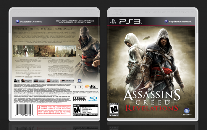
This is the first box I'm posting at VGBA 3.0, and I have to say
that I love the new site. I'm also very happy with the box, it turned out the way I imagined.
View full size. =)
[ Box updated on January 14th, 2012 ] [ original ]
 Assassin's Creed: Revelations Box Cover Comments
Comment on swe 08's Assassin's Creed: Revelations Box Art / Cover.
Awesome shit right there. fav+
[ Reply ]
Nice. It's unique from other Assassin's Creed boxarts.
[ Reply ]
Love it! Awesome work!
[ Reply ]
Very sleek design! Well done!
[ Reply ]
I really love what you did with this.
[ Reply ]
Fantastic.
[ Reply ]
Thanks everyone!
[ Reply ]
Very nice and official looking. I think the brown colour scheme works really well here.
[ Reply ]
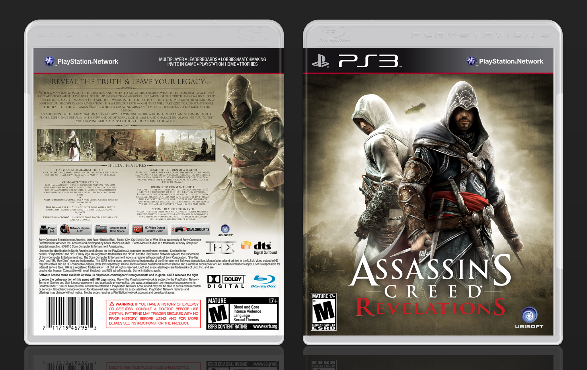
The brown color scheme worked better than I would have expected, and the front has a distinct atmosphere to it I find very appealing. The back is nice on it's own, but I'm afraid it lacks what I like about the front. It could be darkened in areas, around the edges and corners, and I feel Ezio's original colors should be more prominent over the sepia tone.
[ Reply ]
I agree, Ezio should have a bit more color on the back. Anyways, the box is beautiful, especially the front.
[ Reply ]
Okay, thanks for the feedback. I'll play around with the back and see what I can come up with.
[ Reply ]
Looks awesome, might give vgba 3.0 a go later.
[ Reply ]
Unique and different which is always good in my book. :) That front is especially neat and badass.
[ Reply ]
The front is incredible, but the back seems kinda crowded with small text. Nonetheless, fav!
[ Reply ]
Stunning, one of your best yet.
[ Reply ]
The back is pretty text heavy as others have pointed out but I like how Ezio feels like he's emerging from the mist ready to pounce. Despite the text being gratuitously rationed and hard to read I quite like the back. In terms of the front the ESRB and Ubisoft logos feel small and rest too close to the edge/corner of the box. Otherwise, phenom. Great work.
[ Reply ]
Woo! :D
[ Reply ]
Who said brown couldn't be attractive?...Damn! This is nice, especially the front.
[ Reply ]
The design certainly is sleek but I would have liked to see some more color. The brown looks good, but it needs some bright colors to pop.
[ Reply ]
I thought I already said how much I love this. Oh well idk where it went.
[ Reply ]
Updated the back. I didn't change very much, but it shouldn't look as washed out anymore.
[ Reply ]
Can't believe I missed this masterpiece!
[ Reply ]
That's a lot of text on the back, but whatever, it's well presented, and the box is extremely well made overall. I love it.
[ Reply ]
Congrats on the Hall
[ Reply ]
Congrats ! I was wondering, when it will get in the Hall. It take time, but you deserve it well !
[ Reply ]
Thanks everyone!
[ Reply ]
Printable version please? :)
[ Reply ]
Hello!!! :) where is the printable?, i want to use it.
[ Reply ]