@BoricuArtePR You might want to watch it a little bit. Ever hear the expression respect your elders? SilentMan has been here a very long time and has done some incredible work. You have just recently joined and you seem to have a little bit of a Mr. Know it all kind of attitude and that is not going to get you far here. You can point out things and give your opinion but if you sound like an ass doing it, thats not okay. Just a friendly heads up :)
@Deividas @Deividas Was I disrespectful? i just gave him my opinion.
Does my opinion count here? "Mr. Know it all kind of attitude and that is not going to get you far here." mmm... im not planning to get far here u know but what i want from all of you its fair criticism of what i show here cause that will make me stronger. Was i unfair to let him know that i can't see the name? what about that DS box on a gamestop between a full shelve of a lot of different DS game. Will you spot that game by the name without asking the gamestop employee in a rushed gamestop in Xmas? My point is that you can notice more the character than the name of the game?
but hey i hope he goes like that on me the next time i leave a box here because at that moment he will be my client ;)
Deividas R U mad at me because i have an opinion? Im not mad at your opinion.
"respect your elders?" yes i heard that before BUT what about Respect everybody equally? Was I disrespectful?
I like a lot of covers he have in his portfolio and it very impresive because he have been in all category something that im aiming too.
so yeah he is good but i never call him an elderly but you did :)
@BoricuArtePR Considering the game that he is making. He doesn't even have to put a title in there for people to go to the "shelf" and grab it. Link is actually one of the biggest icons in Gaming so actually, him making a title that stands out is actually probably worse for the game. Think about it, since you keep talking so much about clients and stuff, the DS system overall is leaned more towards the younger audience. And kids actually are attracted to images more than words so therefor, making Link stand out is actually a very good idea for a DS game because most people that go to look at DS games, are younger (not saying its ONLY younger kids). So you have a flawed philosophy about the Logo design, and clearly dont understand that a lot more factors come in to play when designing a cover and the title. Each game is different.
And as for were you disrespectful?...The way you were talking, yes, you sounded like an ass.
And Silent man has been here for a LONG time, so yes, it does make him an elder of the site and should be respected. Which is a huge compliment.
@Deividas "So you have a flawed philosophy about the Logo design" mmm...
THIS was my respond to his 1st comment and he knows what he commented 1st. (he deleted his 1st comment)
ME -> "Calm down :)
Can i have an opinion? :)
The title The Legend of Zelda... can that title have color? "
hen follow the comments he reply to me with: "@BoricuArtePR Really? Honestly, I can see the title perfectly. "
I din't get mad at his respond and i bet he din't get mad at mine either.
THEN u came like superman without a cape and leave that 1st comment directed at me.
HEY SilentMan 101 R U mad @ me bro? because im not.
Question... Why r u defending him so hard?
@Daemon i think a few of you are being twice the ass as Boricu. I mean, he said his opinion quite plainly and obvious, to which Silentman gave no hate to. Instead, it seems like you guys were looking for an argument. As for this typing/language, have you guys considered that maybe english is not his first language? I mean, I can see by a lot of the phrasing that maybe its not. Oh and finally - way for the elitist attitude. If I leave a box on the site and some newbie gives his critique, I'm not going to merely disregard it because "i've been around for longer and obviously know more". 'Respect your elders' is a broken phrase that is out-of-date in the modern world. So how about you just drop that and respect an opinion instead?
@Daemon and Deividas, He has just as much right to post and critique as anyone else here. And I for one agree with what he said about the logo. Does that make it any better since I've been here longer, because it shouldn't. You all need to get off your high horses and take critiques no matter who is giving them.
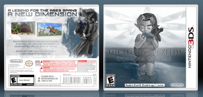
Its not bad. The front is quite cool, even though it still looks like hes in water (I know you dont see it but thats because you made it and you know exactly what it is :) ) The logo is a bit hard to see, I do like the way it is though just needs to stand out a tiny bit more...nothing too drastic. The back is very plain though, I liked the start with link but after that, its way too plain. I do like the idea and where its heading...i just dont think it has gotten there yet. I like it though :)
This design could use some small changes, as said earlier, such as making the ''The legend of Zelda'' part of the logo white. However, I really like the overall design and for that, +fav.
I like the back. The selection of the artwork ist good and I kinda like the blueish, greyish style. Though I must say, this monocolour doesn't quite harmonize with the colourful screenshots you've chosen.
The front is too empty in my opinion. I approve of the others stating that the title is difficult to read. And I think it should be more explosive, more playful. It is difficult to create a logo - I know. But that's the way to go.
Apart from that: Great job! I really like the artwork and I think it would look great, if you would have both the young Link and the older Link in one picture (and maybe Zelda on the back?)
Its a nice box that I think the colour scheme works on - however, i think a few minor improvements (such as the logo) could be made, and the back could be built upon to be so much more.
Still, though, nice work and yay for creativity on a Ocarina of Time box!
 The Legend of Zelda: Ocarina of Time 3D Box Cover Comments
Calm down :)
Can i have an opinion? :)
The title The Legend of Zelda... can that title have color?
[ Reply ]
It looks a little bland. Everything sorta splats together in one grey-blue blob.
[ Reply ]
See people need to give me this feedback in the WIP thread.
Still I think it looks fine.
[ Reply ]
@SilentMan101 ""Still I think it looks fine." mmm ok looks fine BUT remember that we are the clients. I can't see the name of the game.
[ Reply ]
@BoricuArtePR Really? Honestly, I can see the title perfectly.
[ Reply ]
@BoricuArtePR You might want to watch it a little bit. Ever hear the expression respect your elders? SilentMan has been here a very long time and has done some incredible work. You have just recently joined and you seem to have a little bit of a Mr. Know it all kind of attitude and that is not going to get you far here. You can point out things and give your opinion but if you sound like an ass doing it, thats not okay. Just a friendly heads up :)
[ Reply ]
@Deividas @Deividas Was I disrespectful? i just gave him my opinion.
Does my opinion count here? "Mr. Know it all kind of attitude and that is not going to get you far here." mmm... im not planning to get far here u know but what i want from all of you its fair criticism of what i show here cause that will make me stronger. Was i unfair to let him know that i can't see the name? what about that DS box on a gamestop between a full shelve of a lot of different DS game. Will you spot that game by the name without asking the gamestop employee in a rushed gamestop in Xmas? My point is that you can notice more the character than the name of the game?
but hey i hope he goes like that on me the next time i leave a box here because at that moment he will be my client ;)
Deividas R U mad at me because i have an opinion? Im not mad at your opinion.
"respect your elders?" yes i heard that before BUT what about Respect everybody equally? Was I disrespectful?
I like a lot of covers he have in his portfolio and it very impresive because he have been in all category something that im aiming too.
so yeah he is good but i never call him an elderly but you did :)
[ Reply ]
@BoricuArtePR Considering the game that he is making. He doesn't even have to put a title in there for people to go to the "shelf" and grab it. Link is actually one of the biggest icons in Gaming so actually, him making a title that stands out is actually probably worse for the game. Think about it, since you keep talking so much about clients and stuff, the DS system overall is leaned more towards the younger audience. And kids actually are attracted to images more than words so therefor, making Link stand out is actually a very good idea for a DS game because most people that go to look at DS games, are younger (not saying its ONLY younger kids). So you have a flawed philosophy about the Logo design, and clearly dont understand that a lot more factors come in to play when designing a cover and the title. Each game is different.
And as for were you disrespectful?...The way you were talking, yes, you sounded like an ass.
And Silent man has been here for a LONG time, so yes, it does make him an elder of the site and should be respected. Which is a huge compliment.
[ Reply ]
@Deividas "So you have a flawed philosophy about the Logo design" mmm...
THIS was my respond to his 1st comment and he knows what he commented 1st. (he deleted his 1st comment)
ME -> "Calm down :)
Can i have an opinion? :)
The title The Legend of Zelda... can that title have color? "
hen follow the comments he reply to me with: "@BoricuArtePR Really? Honestly, I can see the title perfectly. "
I din't get mad at his respond and i bet he din't get mad at mine either.
THEN u came like superman without a cape and leave that 1st comment directed at me.
HEY SilentMan 101 R U mad @ me bro? because im not.
Question... Why r u defending him so hard?
[ Reply ]
@BoricuArtePR By the way Deividas i love/like a lot of his work :)
[ Reply ]
And i am officially done talking to you after you say something like...."R U mad @ me bro?" Wow...
[ Reply ]
@Deividas lol :)
[ Reply ]
@BoricuArtePR
At least you have a very good sense of humor. Anyways best of luck on the site!
[ Reply ]
@Deividas ;)
[ Reply ]
@BoricuArtePR popcorn.gif
[ Reply ]
@BoricuArtePR Well damn, I missed it.
[ Reply ]
@BoricuArtePR Seriously, who the hell are you?
[ Reply ]
@Daemon i think a few of you are being twice the ass as Boricu. I mean, he said his opinion quite plainly and obvious, to which Silentman gave no hate to. Instead, it seems like you guys were looking for an argument. As for this typing/language, have you guys considered that maybe english is not his first language? I mean, I can see by a lot of the phrasing that maybe its not. Oh and finally - way for the elitist attitude. If I leave a box on the site and some newbie gives his critique, I'm not going to merely disregard it because "i've been around for longer and obviously know more". 'Respect your elders' is a broken phrase that is out-of-date in the modern world. So how about you just drop that and respect an opinion instead?
[ Reply ]
@Daemon and Deividas, He has just as much right to post and critique as anyone else here. And I for one agree with what he said about the logo. Does that make it any better since I've been here longer, because it shouldn't. You all need to get off your high horses and take critiques no matter who is giving them.
[ Reply ]
@Daemon " Seriously, who the hell are you? "
Im Batman.
[ Reply ]
Its not bad. The front is quite cool, even though it still looks like hes in water (I know you dont see it but thats because you made it and you know exactly what it is :) ) The logo is a bit hard to see, I do like the way it is though just needs to stand out a tiny bit more...nothing too drastic. The back is very plain though, I liked the start with link but after that, its way too plain. I do like the idea and where its heading...i just dont think it has gotten there yet. I like it though :)
[ Reply ]
Well im glad you liked it overall :)
[ Reply ]
This design could use some small changes, as said earlier, such as making the ''The legend of Zelda'' part of the logo white. However, I really like the overall design and for that, +fav.
[ Reply ]
You know I might go back and change it. But thanks :)
[ Reply ]
I like the back. The selection of the artwork ist good and I kinda like the blueish, greyish style. Though I must say, this monocolour doesn't quite harmonize with the colourful screenshots you've chosen.
The front is too empty in my opinion. I approve of the others stating that the title is difficult to read. And I think it should be more explosive, more playful. It is difficult to create a logo - I know. But that's the way to go.
Apart from that: Great job! I really like the artwork and I think it would look great, if you would have both the young Link and the older Link in one picture (and maybe Zelda on the back?)
[ Reply ]
Its a nice box that I think the colour scheme works on - however, i think a few minor improvements (such as the logo) could be made, and the back could be built upon to be so much more.
Still, though, nice work and yay for creativity on a Ocarina of Time box!
[ Reply ]