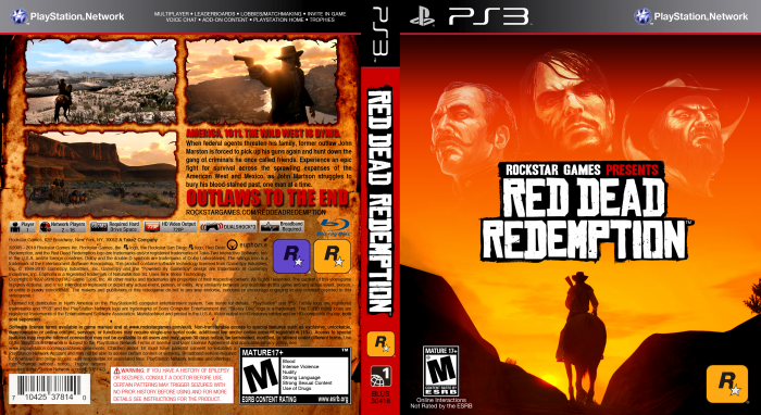
A custom-made game cover of Rockstar Games', "Red Dead Redemption" for the PlayStation 3. I really didn't like the original game cover for the game as it didn't give off much of a "Western" feel to it, so I decided to make my own. Feel free to download the image and use it for yourself. All the legal info that is written on the back is the same as the original cover. This was done for a class project so enjoy!
 Red Dead Redemption Box Cover Comments
Comment on Michael Pothos's Red Dead Redemption Box Art / Cover.
Nice work! Welcome!
[ Reply ]
I think a good thing to add to this site, is a way for mods to properly organize a game into its correct category when something like this happens.
[ Reply ]
What? It is in the right category...
[ Reply ]
Very nice work.
[ Reply ]
Awesome dude. This is amazing for a first!
[ Reply ]
I've got to say, this is better than the REAL box art! Im not kidding!
[ Reply ]
I know, I didn't really like the original game cover; when you first look at that one, it doesn't have much of a western feel to it. ;) But ya, thanks.
[ Reply ]
Very Nice for a first, great job ;)
You managed to tell so much, with such little space on the back (mainly due the much lines of legal info). and the front is defenitily better than the original, in terms of bringing the western feel, serious.
but to give you some cronstuctive critism right away, I'd say the red spine doesn't go well with the mainly orange scheme that you've used all around the box.
Two Rockstar logo's on the back, are also a bit unnecassery.
[ Reply ]
Hey thanks for all the feedback... Ya, you're right about the red spine, but idk? I could've done some kind of gradient or texture on it. And as for the 2 Rockstar logo's on the back... they're supposed to be that way, it's the same on the original, one is for Rockstar and the other is for Rockstar San Diego.
[ Reply ]
The back could use a better layout. Screen+screen+screen+info feels too specific. Not creative enough for my taste.
The front it pretty legit!
[ Reply ]
muito bom esse site
[ Reply ]