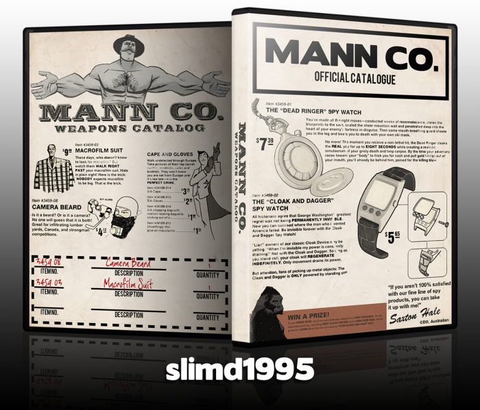
Woo, Team Fortress 2.
Who those who don't get the box, Mann Co. is a fictional establishment in the Team Fortress 2 universe.
 Team Fortress 2 Box Cover Comments
Comment on slimd1995's Team Fortress 2 Box Art / Cover.
Nice one, you gadget freak :P
[ Reply ]
Definitely a new turn in TF2 boxes.
[ Reply ]
Nice dude. I love it.
[ Reply ]
I'm really liking the new front
[ Reply ]
Came out great.
[ Reply ]
Looks pretty authentic.
[ Reply ]
I never really was on your side.
[ Reply ]
Like I said in Steam, cool!
[ Reply ]
I genuinely love this.
It's brilliant.
[ Reply ]
It's a clever idea, but IMO, thats about where it ends. I mean, it really doesn't look very appealing for a box, and if I saw it in a store I would have no idea what it is for as it doesn't even mention the name of the game.
[ Reply ]
"if I saw it in a store I would have no idea what it is for as it doesn't even mention the name of the game."
Yeah, that's not the point.
[ Reply ]
@slimd1995 I get that it's artistic, but IMO, this doesn't look even like a creative boxart, it just looks like a really creative piece of art slapped on a template. I really like the art itself but I just don't think it works as a boxart.
[ Reply ]
That looks great!
[ Reply ]
Perfect, like I mentioned on Steam and in the WIP thread. I do see where tmrd is coming from, but I don't think that really applies with this (Not to me anyway). It's something I would print out and put in a case for TF2, and even though I may be the only one in my house that knows what it's for, it doesn't matter. Great box that goes incredibly well with the game, that should be all that matters. It's just fitting a different audience, and not the average consumer.
[ Reply ]
Ah, very clever. Design wise, I'm not sure where to start as your idea and execution insinuates heavily that this isn't to be criticized as an ordinary box art. It's very creative, and you have perfectly mimicked the classic catalog style, and as a piece of artwork I am very impressed. However, as a box art, although aesthetically innovative, it has a poor sense of balance as well as flow of design.
[ Reply ]
I concur. For some reason, this design seems better suited to a paper manual or something of the sort. It's still very nice in the context of an old-fashioned catalog and the humorous text is about what I'd expect from Team Fortress 2.
[ Reply ]
I certainly like it, but I feel like it might be better suited as a booklet insert for the game rather than the cover.
[ Reply ]
It looks pretty cool. I'd definitely say it's your best box. Good job.
[ Reply ]
It's a rather interesting cover. It's done greatly, and the idea is very good too. Even if I didn't knew it was for TF2 (I just discovered in your WIP thread, when there was the crate on the front), I would still love you you did here.
[ Reply ]
Well, as I mentioned before this is not something I would see on the shelves representing TF2, however, it is a creative and unique box art. Good job!
[ Reply ]
I'm still in love with it.
[ Reply ]