![]() »
»
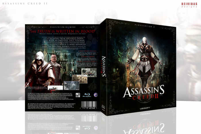
A new box. I am quite proud of this one. I wanted to go for a very nice dark tone and feeling with it. Usually these boxes are very bright and I felt like that was getting stale. So yea thanks to everyone in the forum who helped with the WIP :) I appreciated it. And I hope you all like and comments/favs are appreciated :)
[ Box updated on February 13th, 2012 ] [ original ]
 Assassin's Creed II Box Cover Comments
Comment on Deividas's Assassin's Creed II Box Art / Cover.
The dark tone works very well, but I can't help but feel as if the title doesn't stand out enough.
Very nice box though, has a very Da vinci like feel to it.
[ Reply ]
Right after my cover..awesome! :)
[ Reply ]
Yea thats my bad, I started to upload it before yours showed up and when it finished it ended up being right after you just uploaded yours. I promise that was not my intention lol
[ Reply ]
The assassin's emblem should be grey(er) and the "assassin's" part of the logo should be white. Looks awkward as is. Otherwise great work.
[ Reply ]
Your right, will fix in the next update :)
[ Reply ]
Dat back.
[ Reply ]
thankssss :)
[ Reply ]
OMG, This is awesome!
[ Reply ]
very good !
[ Reply ]
Updated. Logo issue fixed.
[ Reply ]
Yet another fine addition to your vastly growing library. Design is cohesive, works extremely well and it's unique. Great!
[ Reply ]
As I said in the WIP, I love this. The dark tone works great, and the whole box is laid out very well.
[ Reply ]
Oh my god, that's so majestic, so beautiful, so wonderful, I just love it!
Well done, man, this is awesome.
[ Reply ]
Beautiful, love everything about this box!
[ Reply ]
Damn dude, nice!
[ Reply ]
Very nice, I love when people decide to take a different tone than the general one.
[ Reply ]
If it weren't for the blurry images I would easily say this is my favorite box of this year so far. Very very nice job, it's nice to see AC represented in a darker tone and done well.
[ Reply ]
I'm jealous of your talent my friend.
[ Reply ]
It looks awesome... until you zoom in. The background is really low res and blurry but the colors are everything are really nice.
[ Reply ]
One word: sexy.
[ Reply ]
I really like the way you experiment with different styles of templates and color schemes to bring something new to the site.
I think you've nailed it again, with this beautiful box.
[ Reply ]
<3
[ Reply ]
I can't help but respect an artist's ability to take an overused game - furthermore, an overused batch of artwork - and create a wholly original cover. Good work.
[ Reply ]
Holy boxart!
[ Reply ]
Thanks everyone for all the comments and favs :) i appreciate it all very muchh
[ Reply ]
I find myself wanting to say, "best new artist", but you aren't new, you've been good since NBA 2K11.
[ Reply ]
Probably most improved.
[ Reply ]
Coming from two artists I highly respect....I am honored :) Thank you very much
[ Reply ]
Completely agreed with Thro
[ Reply ]
Really good! The front is awesome!
[ Reply ]
I like this a lot.the tones clash well. though i would have imagined the tones of this game like red or something. this is good.
[ Reply ]
Hot damn. Love dark colours. Makes a nice change from the white/blue/red combo.
[ Reply ]
este diseño esta excelente
[ Reply ]
Why is this still not in HoF?
[ Reply ]
Very, very nice! I absolutely LOVE this dark colourful background. Ezio really stands out. And it's very different from the boxes you usually see for Assassin's Creed. I thinks it's fantastic. :)
[ Reply ]
hi mate superb work. would you please put the printable?
[ Reply ]
Way to go. It's about time this got in.
[ Reply ]
Thanks Daemon! and thanks to everyone who helped it get in the HoF :)
[ Reply ]
Congrats! Honestly, I was really surprised to see my BioShock 2 cover make it to HOF before this cover which had much more favorites.. :)
[ Reply ]
Very very nice job on this, the front is beautiful!
[ Reply ]
gracias
[ Reply ]
great
[ Reply ]