![]() »
»
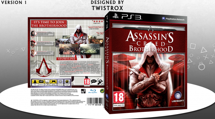
Hey guys,
A new box that has been an on and off project. The back may seem similar to my other Brotherhood boxes, but I believe I've changed it enough. Thanks to everyone in the WiP thread for their help.
Credit to ScorpionSoldier for the template and outside sources for most of the other images.
Your feedback is much appreciated, thanks.
 Assassin's Creed: Brotherhood Box Cover Comments
Comment on TwistRox's Assassin's Creed: Brotherhood Box Art / Cover.
that's awesome
[ Reply ]
I really like this. I like how it is quite different from the original box art but you can still link it instantly to the same product. The use of red is amazing. Bravo!
[ Reply ]
This is pretty awesome, Good work!
[ Reply ]
Although it does not really show anything extremely new or too exciting, it is still a very well made box that looks very professional and sleek. Nice job man
[ Reply ]
Idk how I feel about the logo being in front on ezio's head, looks awkward to me. But then again, if you put him in front, he would cover too much of the logo. IDK maybe its me XD
[ Reply ]
great job with the red colors on the front and the screenshot alignment on the back
[ Reply ]
This is very, very nice. I love the use of the blood red, and the texture is gorgeous. My only concern would be the way the logo covers Ezio's head. I find it quite obscuring, especially as they're both so light. But that's easily forgiven, forgotten and Fav'd :P
[ Reply ]
Amazing job! The colors are perfect. I'm surprised it didn't get more attention, it's an outstanding box!
[ Reply ]
Thanks. :)
[ Reply ]
nice
[ Reply ]
It's Pretty, and I agree with Oddmania.
[ Reply ]
Nice dude...
[ Reply ]
Congrats Twist,Well Deserved . . .
[ Reply ]