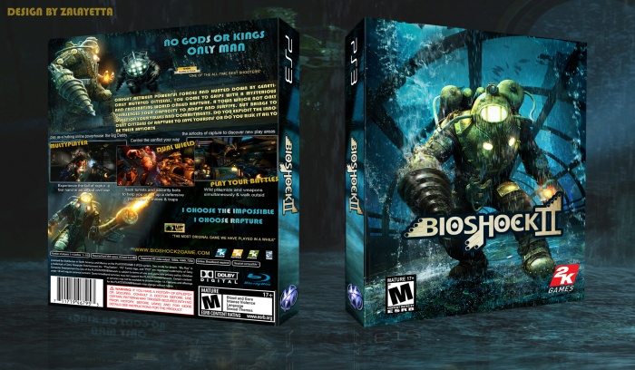
a new box of bioshock2, this is my first attempt on a bioshock2 cover,
Hope you guys like it...
please comment...
[ Box updated on March 29th, 2012 ] [ original ]
 Bioshock 2 Box Cover Comments
Comment on zalayetta's Bioshock 2 Box Art / Cover.

Nice design . enjoyed a lot
[ Reply ]
thank you!
[ Reply ]
Hey, you should try aligning the yellow block of text with the screenshots, not really a problem, just when it comes to typography in my opinion everything should be aligned in the same direction, right now it looks skewed too much downward.
[ Reply ]
thank you for comment...
[ Reply ]
It all kinda looks horizontally stretched, especially when it comes to the logos and text. One of the biggest issues I have is that there are two ESRB's on the front, one that's just just kinda sitting there in the water and a badly stretched one in the correct position. Nice design, but the stretching is pretty bad in certain areas and you only need one ESRB on the front.
[ Reply ]
thankx for steer...
[ Reply ]
Very nice man, I live it :)
[ Reply ]
Appreciated :)
[ Reply ]
This is pretty good, I like the background presentation. My only nitpick is the lines of text may be too close together.
[ Reply ]
Thanx.
[ Reply ]
please add to printable
[ Reply ]