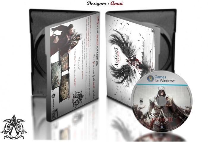
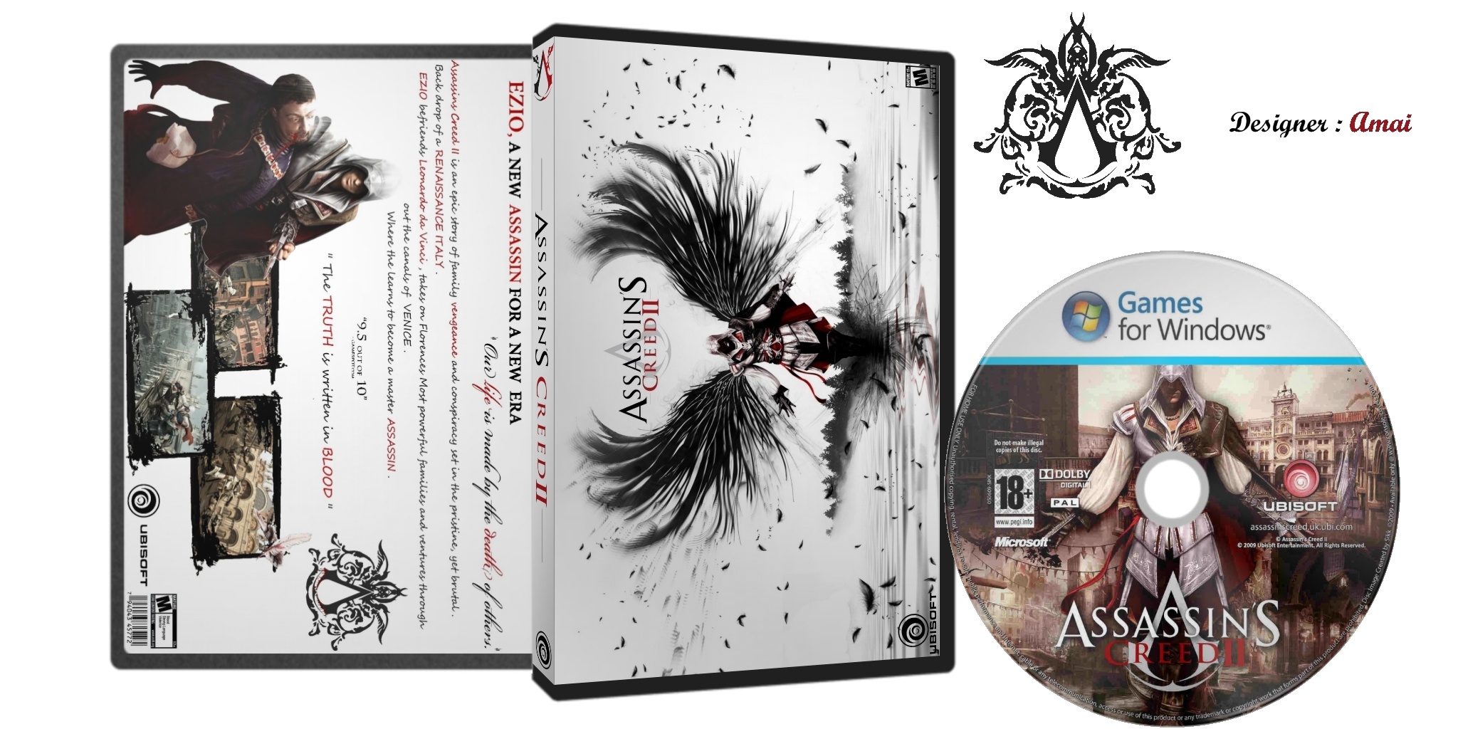
Hi again , an other Assassin's Creed II box art , please comment .
[ Box updated on April 18th, 2012 ] [ original ]
 Assassin's Creed II Box Cover Comments
Comment on amia's Assassin's Creed II Box Art / Cover.
nice...!
[ Reply ]
Thanks , good comment .
[ Reply ]
like the front... it's nice to see that you change the windows logo :D
[ Reply ]
I find this design really interesting. For one, the use of bird wings. Not just bird wings, but an artistically swooping bird wing that looks almost torn from the pages of a horror novel. The sharp contrast and use of black and white imagery is amazing, and I love how Ezio blends into the background of the city. Even his outstretched arms look like a bird taking flight. The back is also interesting, for its simplicity, and the use of a single large image to draw attention to the purpose behind the game.
Here's what I would suggest:
Take out the disk. It's not in proportion to the box (it's too big), and your box design is far more interesting than the disk. Besides that, the disk is in color, and it goes against what you tried to achieve with the box.
I know some people use horizontal templates like this, but I'm not a fan of it. I can see why you did it... the design wouldn't have worked without it. But for me, if you're going to do a horizontal template like this, use a different style of presentation, so that we can actually see the design without having to break our necks.
Besides that, you might want to put a bit more effort into your presentation. The stark white background is off-putting, and does little to improve the look of your design. A good presentation should compliment the box without overpowering it. You want people to realize it's good, without ever realizing it's there. It shouldn't be remembered at all... rather it should improve the design simply be existing, and fade from memory once you are not looking at it. The presentation is your vehicle to showing your design, but the design itself is the key player. You want people to remember the package, not the wrapping paper.
[ Reply ]
+1
[ Reply ]
Thanks for the comment & for suggests .
[ Reply ]
kheili ghashange
[ Reply ]
Mamnoon .
[ Reply ]
i would like this but the front iis just a wallpaper. link
[ Reply ]