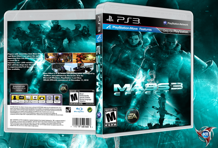
Everything seems a little squished, especially the screenshots and top image on the back. The blue is quite overwhelming too. You should also work on your text placement.
It's a good start though, don't get me wrong. Just a few hiccups I think need fixing. Also, who's HX?
The blue is a bit strong. Maybe blend it with reds and oranges to make a nice contrast. As for the back, the text placement could definitely be better, and I'd definitely remove the numbers in the square brackets that Wikipedia puts in there. I'd also recommend some sort of drop shadow for the text, to help it stand out against the lighter parts of the background.
Good concept though, keep at it :)
 Mass Effect 3 Box Cover Comments
Everything seems a little squished, especially the screenshots and top image on the back. The blue is quite overwhelming too. You should also work on your text placement.
It's a good start though, don't get me wrong. Just a few hiccups I think need fixing. Also, who's HX?
[ Reply ]
i like the front.what is mean HX
[ Reply ]
by hx
[ Reply ]
The blue is a bit strong. Maybe blend it with reds and oranges to make a nice contrast. As for the back, the text placement could definitely be better, and I'd definitely remove the numbers in the square brackets that Wikipedia puts in there. I'd also recommend some sort of drop shadow for the text, to help it stand out against the lighter parts of the background.
Good concept though, keep at it :)
[ Reply ]
THNX
[ Reply ]
THNX
[ Reply ]