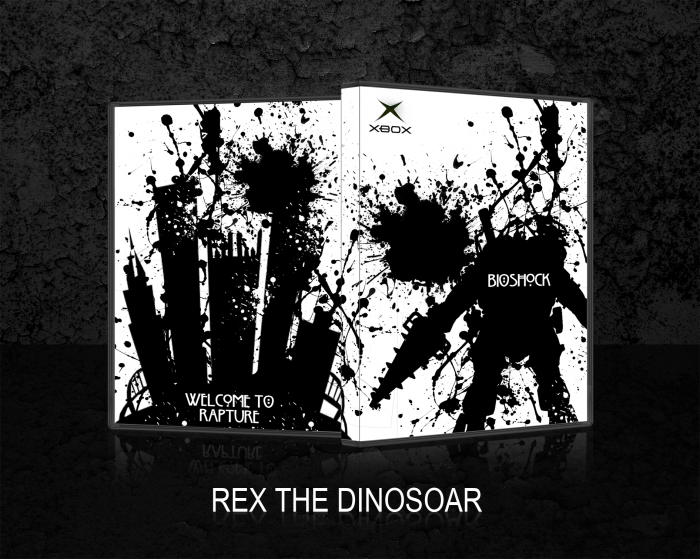
Just something I've been working on a bit throughout the week. This is meant to be a 360 cover but I used the original logo because I thought it looked better. THIS IS MEANT TO BE MINIMALIST.
 BioShock Box Cover Comments
Comment on Rex_the_dinosoar's BioShock Box Art / Cover.

Personally, I think there's a bit too much splatter going on. +Fav for the idea and the evidence of effort, however. Great work. =)
[ Reply ]
i like your idea
[ Reply ]
I like it
[ Reply ]
A little too heavy on the paint splatters. The Bioshock games pride themselves on their atmospheric environments. I'm not sure the splatters can translate that well, at least not to this degree.
[ Reply ]
Interesting
[ Reply ]
I don't really like the splatters and don't think they fit the game well. Also, you put this under 360 put have the original Xbox logo on the box.
[ Reply ]
It was intended to have the original logo, I thought it suited it more ;)
[ Reply ]
Great effort on it, except its dosent tell me anything about the game
[ Reply ]
Get used to that, it's "artistic".
[ Reply ]