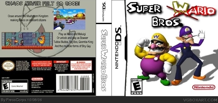
Haza! My second box, sorry it took so long to submit another one, just that I was going to make a Bomberman DS one but I couldn't get it just right. Anywho, I put all of my known skill in to this box. I know I should put borders around those screenshots but.....I don't know how to do it all fancy like.
I made the logo in paint, but fix it up in GIMP. and you know how you put 4.5/5, I would really apprisiate ( ah can't spell) if you actually did vote. ^.^
im not the one who gave this a 2.5, i gave it a 3/5, but the person was probably thinking "nintendo logo is too high, spine is plain, as is front...template is choppy, and the bottom of the back doesnt go well witht he overall look of the box"...see? cowards dont give reasons for their votes...i personally think this is a good idea, and id play it..good second box, keep it up
Thats a good point. I was thinking about that but I decided against it because, I would have to figure out what to put as a background (believe me, I had enough trouble with the back background before I decided to but the Big Boo there) and it would show the little touch ups I did on Wario and Waluigi and I'd have to fix that up and I wasn't really in the mood to do it. maybe I'll update it sometime. probally not, but maybe lol
 Super Wario Bros. Box Cover Comments
Haza! My second box, sorry it took so long to submit another one, just that I was going to make a Bomberman DS one but I couldn't get it just right. Anywho, I put all of my known skill in to this box. I know I should put borders around those screenshots but.....I don't know how to do it all fancy like.
[ Reply ]
Very creative and original!
[ Reply ]
Thanks man!
[ Reply ]
absolutely great second box i like the x and then w over the m and is this going to be a real game or did you make the logo. 4.5/5.0
[ Reply ]
I made the logo in paint, but fix it up in GIMP. and you know how you put 4.5/5, I would really apprisiate ( ah can't spell) if you actually did vote. ^.^
[ Reply ]
Some idot give this a 2.5/5 ?
I think it sloud get a 3.5/5 or a 4/5 but not a 2.5/5 .
[ Reply ]
im not the one who gave this a 2.5, i gave it a 3/5, but the person was probably thinking "nintendo logo is too high, spine is plain, as is front...template is choppy, and the bottom of the back doesnt go well witht he overall look of the box"...see? cowards dont give reasons for their votes...i personally think this is a good idea, and id play it..good second box, keep it up
[ Reply ]
Gee dude, I know you were trying to be nice, but you just showed all the flaus of the boxart v.v
[ Reply ]
I think boxart is good but i think it sloud have a background on the cover .
[ Reply ]
Thats a good point. I was thinking about that but I decided against it because, I would have to figure out what to put as a background (believe me, I had enough trouble with the back background before I decided to but the Big Boo there) and it would show the little touch ups I did on Wario and Waluigi and I'd have to fix that up and I wasn't really in the mood to do it. maybe I'll update it sometime. probally not, but maybe lol
[ Reply ]
Pointing out the flaws is kinda the whole idea, #8. I agree with LnknPrkDude. 3/5
[ Reply ]
Hmm... really good, except that not much is happening on the front or back. I like the logo idea of the crossed out "M", too. 4/5
[ Reply ]